- Date
What is Cohort Analysis and How it helps to drive retention?
 Andrii Romasiun
Cohort analysis is all about grouping users together based on a shared experience within a set time. Instead of lumping everyone into one giant, anonymous bucket, you break them down into smaller, related groups—or "cohorts"—to see how their behavior changes over time.
This simple shift in perspective is what reveals the real story behind your user retention and engagement.
Understanding Cohort Analysis Beyond The Buzzword
Think of it like a school principal tracking each graduating class. Instead of just looking at the entire student body's performance, they follow the "Class of 2020," the "Class of 2021," and so on, to see how each group's career paths and successes differ over the years. That’s cohort analysis in a nutshell.
You're taking that giant, confusing pool of all your users and sorting them into "classes" based on when they joined or what they did. Suddenly, the noise turns into a series of clear, distinct stories, making it a must-have tool for any product, marketing, or growth team serious about making smart, data-backed decisions.
For a quick overview, here's a breakdown of the core ideas.
Cohort Analysis at a Glance
| Concept | What It Means | Why It Matters |
|---|---|---|
| Cohort | A group of users who share a common characteristic, like their sign-up date or first purchase. | It turns a messy, single user pool into clean, comparable groups. |
| Behavioral Analytics | The practice of tracking how these groups act over time (e.g., do they keep coming back?). | It reveals patterns in engagement and retention that are hidden in broad data. |
| Retention Rate | The percentage of users from a cohort who are still active after a certain period. | This is the key metric for measuring product stickiness and long-term value. |
This table just scratches the surface, but it highlights how cohort analysis frames user data in a much more insightful way than just looking at overall numbers.
Why Grouping Users Matters
Relying only on big-picture metrics, like your overall churn rate, is a great way to get tricked by your own data. A stable retention rate might be hiding a massive problem—or a huge win. For example, your average user retention could look fine, but a cohort analysis might show that new users from last month's campaign are churning out twice as fast as those from last year.
This is where cohort analysis shines: it adds much-needed context to your data. By isolating specific groups, you can finally answer the critical questions that broad analytics can't even begin to address:
- Did the onboarding flow we redesigned last quarter actually improve long-term user retention?
- Are users who signed up during our Black Friday sale more valuable over their lifetime than users from our content marketing?
- What specific features do our most loyal customers use in their first week?
The Privacy-First Advantage
In an era of growing privacy concerns, cohort analysis has become a powerful, respectful way to understand user behavior. For privacy-focused analytics platforms like Swetrix, it’s a perfect fit. We can track how groups of users behave over time without resorting to invasive methods like third-party cookies or cross-device tracking. You can learn more about how to find the story in your user retention metrics on our blog.
The goal isn't to track individuals; it's to understand the collective journey of a group. This shift in perspective allows you to pinpoint what makes your best customers tick and address friction points for those who leave, all while respecting user privacy.
By focusing on these group trends, you learn why people stay, why they leave, and what makes your best customers so valuable. It’s the foundation for building a product that doesn’t just get users, but keeps them around for good.
The Different Types of Cohorts You Need to Know
To get a real grip on cohort analysis, you have to understand that not all cohorts are the same. The way you group your users is the whole foundation of your analysis, and it dictates the kinds of questions you can actually answer. Think of yourself as a detective sorting through clues—how you categorize the evidence will completely shape the story it tells.
Broadly speaking, user cohorts fall into two main camps, each serving a different purpose. Getting comfortable with both is how you move from just tracking basic retention to truly understanding why your users stick around.
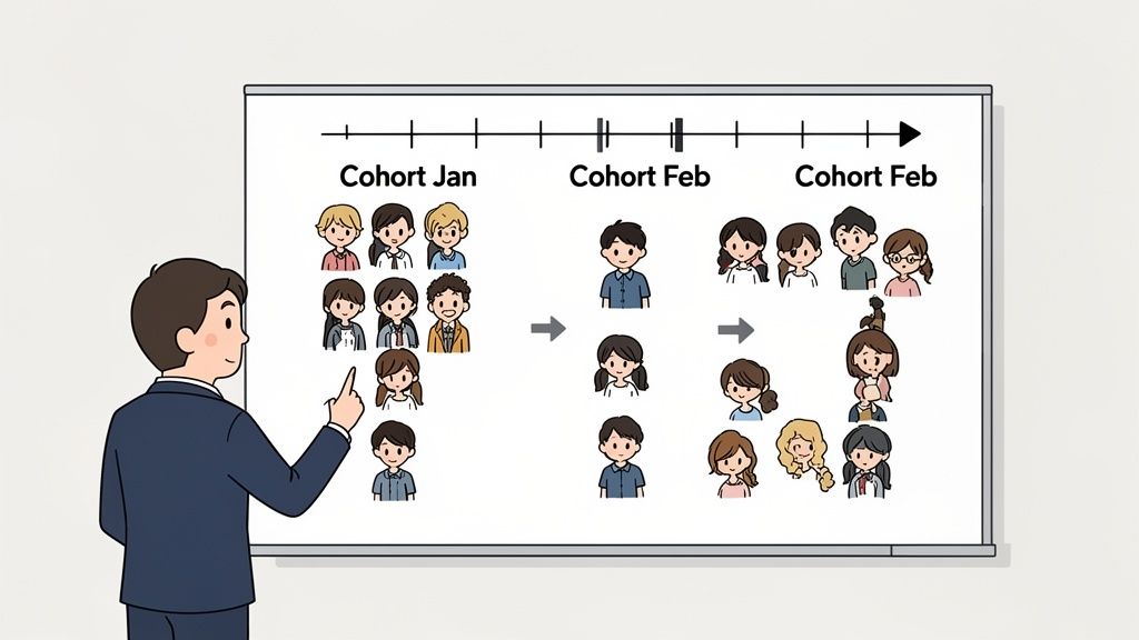
Acquisition Cohorts: Grouping by When They Joined
The most common and straightforward type is the acquisition cohort, which is really just a fancy way of saying a time-based cohort. This approach groups users based on when they started using your product. You're essentially creating "graduating classes" of users based on their sign-up period.
This is the perfect way to see how your user base is changing over time. For example, you could create cohorts like:
- "January 2024 Signups" to see how users from that month are doing months later.
- "Q2 2024 Users" to compare their long-term engagement against the folks from Q1.
- "Black Friday Campaign Cohort" to figure out if users you snagged during a big sale behave differently than your typical user.
By lining these time-based groups up against each other, you can spot trends almost instantly. You might discover that users who signed up in March, right after you launched a new onboarding tutorial, have a 15% higher retention rate after three months compared to the February cohort. That’s a direct line connecting your product change to a better user outcome.
Behavioral Cohorts: Grouping by What They Did
While acquisition cohorts tell you when users showed up, behavioral cohorts tell you what they did. This is where the analysis gets really interesting and powerful. Instead of grouping by a date, you group users based on specific actions they took—or didn't take—within a certain window, usually right after they signed up.
These cohorts are defined by those critical first interactions that often predict who will become a long-term, loyal customer.
A behavioral cohort isn't just a random bunch of users; it's a group with a shared story. They all performed a specific, meaningful action that set them on a particular path, and analyzing that path is how you uncover your product's "aha!" moments.
This method lets you ask much sharper, action-oriented questions. Examples of behavioral cohorts could be:
- Users who used "Feature X" within their first 7 days.
- Customers who made their first purchase using a discount code.
- Users who actually completed your entire onboarding checklist.
- Visitors who found you through an organic search.
By tracking these groups, you can figure out which initial actions are tied to the highest customer lifetime value (LTV). For instance, you might find that users who invite a teammate in their first week are four times more likely to still be subscribed a year later. Now that's a powerful signal telling you to push that specific action in your onboarding flow.
Choosing The Right Cohort Type
So, which one should you use? The distinction is critical. Modern analytics tools support both because they answer different business questions. Time-based cohorts are the go-to for general retention tracking, with studies suggesting they are used by 60-70% of analytics teams. Meanwhile, behavioral cohorts are gaining ground for more predictive work, helping teams pinpoint what creates a high-value customer. You can learn more about the different approaches to cohort analysis on julius.ai.
Ultimately, the best type of cohort depends entirely on the question you're trying to answer.
- To measure the impact of a time-sensitive event (like a marketing campaign or a major product update), use an acquisition cohort.
- To understand what actions drive long-term retention and high LTV, use a behavioral cohort.
Mastering both gives you a flexible and powerful toolkit for slicing and dicing your user data. This clarity is what allows you to get beyond surface-level metrics and find the real, actionable insights that will move the needle for your business.
A Step-By-Step Guide To Performing Cohort Analysis
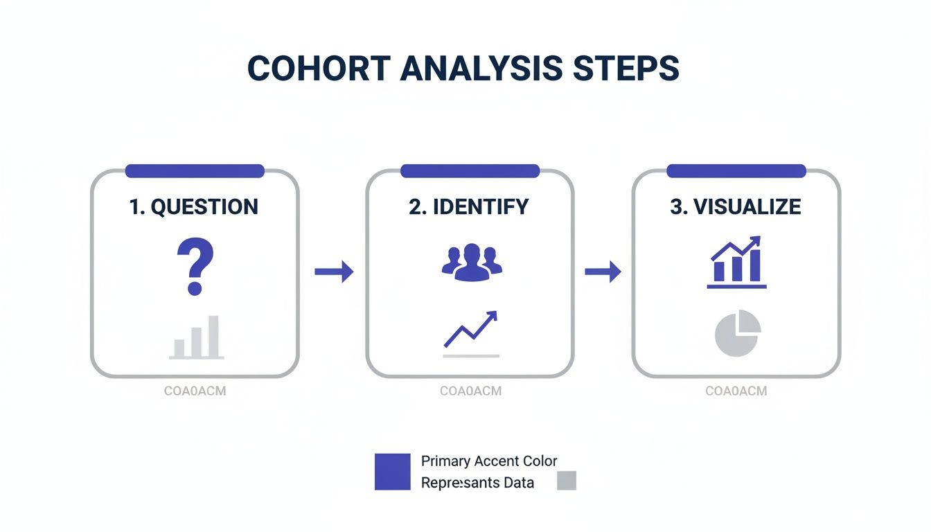
Theory is great, but let’s get our hands dirty. This is where cohort analysis really comes to life. I'm going to walk you through a simple, four-step process that takes this seemingly complex technique and makes it a straightforward part of your workflow.
To make this real, let's imagine we work for a SaaS company. We just shipped a new interactive onboarding checklist, and now we need to know if it's actually helping. This is the perfect job for cohort analysis.
Step 1: Start With A Sharp Question
Before you even think about looking at data, you need a crystal-clear question. Something vague like "I want to improve retention" won't cut it—it's too broad. A great question is specific, measurable, and points you toward a clear hypothesis.
For our SaaS example, a sharp question looks like this: "Does our new onboarding checklist, launched on March 1st, improve user retention in the first 30 days compared to users who never saw it?"
See how specific that is? We have a timeline, a user action (the checklist), and the metric we care about (30-day retention). This focus is your best defense against getting lost in the weeds of your data.
The quality of your analysis is directly tied to the quality of your initial question. A well-defined question acts as a compass, guiding every subsequent step and preventing you from getting lost in a sea of irrelevant data.
With a question this sharp, you can sidestep "analysis paralysis" and get right to the good stuff.
Step 2: Identify Your Cohorts And Key Metrics
Okay, question in hand. Now we need to define the groups we're comparing. Based on our question, we'll need two distinct cohorts:
- The Control Group: Users who signed up in February, before the new checklist was launched. This is our baseline.
- The Test Group: Users who signed up in March, after the checklist went live.
This is a classic acquisition cohort setup, perfect for measuring the impact of a change you made at a specific time. You could even get fancier and create a behavioral cohort within that March group, comparing users who actually completed the checklist to those who didn't. That would give you an even richer insight.
Next, what are we measuring? Our question already told us: the user retention rate. We'll want to track the percentage of each cohort that is still active on Day 7, Day 14, and Day 30 after they first signed up.
Step 3: Gather And Organize Your Data
Time to pull the numbers. You’ll need to grab the user activity data for both your cohorts from your analytics tool, focusing on their first 30 days.
If you're using a privacy-first tool like Swetrix, this is simple and doesn't involve tracking individuals. You’re just tracking anonymized events. You could easily set up a custom event, like onboarding_checklist_completed, to build your behavioral cohorts. To get a better sense of this, check out our guide on how to implement effective event tracking on Swetrix.
Once you have the data, you’ll want to arrange it in a simple table. The rows will be your cohorts (February and March signups), and the columns will be the time intervals since they joined (Day 0, Day 7, Day 14, and so on).
Step 4: Visualize The Cohort Data
Staring at a spreadsheet of raw numbers is a recipe for a headache. The final step—and the most satisfying one—is to visualize the data. A cohort chart, often called a retention table, is the classic way to do this. These charts often use a color scale, like a heatmap, which makes patterns and differences jump right off the page.
Here’s what a simplified version might look like:
| Cohort | Day 0 | Day 7 | Day 14 | Day 30 |
|---|---|---|---|---|
| Feb 2024 | 100% | 45% | 32% | 21% |
| Mar 2024 | 100% | 55% | 48% | 35% |
Just a quick glance tells a powerful story. The March cohort—the one with the new checklist—is sticking around longer at every single checkpoint. Their 30-day retention is 14 percentage points higher (35% vs. 21%). That's some pretty compelling evidence that the new feature is a winner.
This four-step process—Question, Identify, Gather, Visualize—is a reliable framework you can use again and again. By starting with a focused question and ending with a clear picture, you can consistently turn raw data into decisions that move the needle.
How To Read Cohort Charts And Find The Story
At first glance, a cohort chart can look like a complex, color-coded spreadsheet. But it’s not just a grid of numbers—it’s a treasure map. It visualizes the journey of your user groups over time, showing you exactly where they get hooked and where they fall off. Learning to read one is how you turn raw data into a compelling story that fuels smarter decisions.
This whole process boils down to three core steps: you start with a question, identify the right user groups to answer it, and then visualize their behavior to spot the patterns.
This simple flow keeps your analysis focused. You're not just swimming in data; you're actively hunting for answers to specific, important questions.
Decoding The Retention Table
The most common cohort chart you'll encounter is the retention table, which usually has a distinct triangular or diagonal look. Once you understand its basic layout, the insights start jumping off the page.
Here’s a quick guide to what you’re seeing:
- Rows: Each row is a unique cohort, typically grouped by when they signed up (e.g., January 2024, February 2024). Think of each row as a "graduating class" of new users.
- Columns: The columns track time since those users joined, measured in days, weeks, or months (e.g., Month 0, Month 1, Month 2). This shows you their journey from the very beginning.
- Cells: Every cell contains a percentage. This number tells you how many users from a specific cohort were still active during that specific time period.
For example, find the cell where the "January 2024" row meets the "Month 3" column. That percentage is the slice of January's new users who were still around three months later. The colors act as a heatmap—darker shades usually mean higher retention, while lighter ones signal a drop-off.
A cohort chart isn’t just data; it’s a visual narrative of your product's health over time. Each row tells the unique story of a user group, allowing you to compare their journeys side-by-side and spot the moments that truly matter.
This structure is powerful because it lets you compare different user "classes" to see if your product experience is actually improving over time.
Common Cohort Patterns and Their Meanings
Once you can read the chart, you can start hunting for patterns. These visual cues are where the real story is hidden, pointing to problems that need fixing and wins you should build on. The table below breaks down a few of the most common patterns you'll see.
| Pattern Observed | What It Likely Means | Next Action to Consider |
|---|---|---|
| Steep Initial Drop-Off | Your onboarding is broken or confusing. New users aren't finding value quickly and are leaving almost immediately. | Re-evaluate your first-time user experience. Add a product tour, simplify the setup, or clarify your core value proposition. |
| Improving Diagonal | Your product updates and changes are working! Newer cohorts are sticking around longer than older ones at the same lifecycle stage. | Identify what changes were made during this period and double down on them. Celebrate the win with your team! |
| Sudden Dip in One Cohort | A specific event negatively impacted this group. This could be a major bug, a server outage, or a bad marketing campaign. | Investigate what happened during that specific time period. Check commit logs, marketing campaign data, and support tickets. |
| Flat, Low Retention | Your product has a "leaky bucket" problem. It's not retaining users long-term, suggesting a lack of ongoing value or engagement. | Focus on long-term engagement features. Think about notifications, new content, or community-building initiatives. |
Recognizing these patterns moves you from just reporting numbers to diagnosing the health of your product.
Spotting Critical Patterns In Detail
Let's dig a bit deeper into what these patterns tell you.
The Steep Drop-Off: If you see a massive drop in retention in the very first column (Day 1 or Week 1) across the board, that’s a huge red flag. It’s a clear sign that your onboarding has friction. New users are hitting a wall and churning out before they even get a chance to see your product's value. This is a critical fire you need to put out. If you need help with this, you can learn more about how to calculate and reduce your churn rate in our detailed guide.
The Improving Diagonal: This is the pattern every team wants to see. Look at the chart diagonally from top-left to bottom-right. Are the colors getting consistently darker? That's great news. It means your newer cohorts are retaining better than your older ones. For example, maybe your March cohort has 40% retention in Month 2, while your January cohort only had 30% at that same point. This is strong evidence that your product changes are having a positive impact.
The Sudden Dip: What if one cohort—say, the "April 2024" group—looks way worse than the ones before and after it? This almost always points to a specific, isolated problem. Maybe a nasty bug was deployed that month, or a new marketing campaign brought in a flood of poorly qualified users who were never going to stick around anyway.
Beyond Retention Metrics
While retention is the star of most cohort analyses, you can use this same framework to track other vital metrics. Simply swap out the retention percentage for something else.
For example, you could analyze:
- Customer Lifetime Value (LTV): Instead of retention, each cell could show the average revenue generated by that cohort up to that point. This is perfect for figuring out which acquisition channels deliver the most profitable customers over the long haul.
- Feature Adoption: You could track the percentage of each cohort that uses a specific new feature. This tells you whether your new signups are actually discovering and engaging with the key parts of your product.
By learning to read these charts and spot the stories they tell, you graduate from being a data collector to a data storyteller. You can translate numbers into a clear narrative that your entire team can get behind and act on.
How Product and Marketing Teams Use Cohort Analysis in the Real World
Knowing the theory behind cohort analysis is one thing, but seeing it in action is where the magic happens. Let's move beyond the definitions and look at how this tool helps teams make smarter decisions. For both product and marketing, cohort analysis is what separates data-driven strategy from pure guesswork. It uncovers the "why" behind the numbers.
Instead of staring at a giant, messy pool of user data, teams use cohorts to isolate specific groups and see how their actions truly affect behavior over time. Vague questions turn into clear, answerable ones.
For Product Managers Measuring Feature Impact
Product teams are constantly shipping new features, hoping they’ll stick. But how do you know if a new feature is just a flash in the pan or if it genuinely makes your product better and your users stick around longer? This is a classic problem cohort analysis was born to solve.
The Problem: A SaaS company just launched a big new feature: "Project Templates." The goal is to help users get value faster. Initial signups for it look good, but the team needs to know if this feature is creating more engaged, long-term users.
The Cohort Analysis: The product manager creates two behavioral cohorts from everyone who signed up in the last quarter:
- "Template Adopters": Users who created a project using a template within their first week.
- "Manual Creators": Users who started a project from scratch during their first week.
After tracking both groups for three months, a clear story emerges. The "Template Adopters" cohort has a 25% higher retention rate after 90 days. Not only that, but they also log in more often and use other core features more heavily.
The Strategic Action: The data is undeniable—the new feature is a massive win for long-term engagement. Armed with this proof, the team decides to double down. They make the "Project Templates" a more central part of the onboarding experience and launch an email campaign to new users specifically showing off its benefits.
For Marketers Proving Channel ROI
Marketers are always on the hook to prove their campaigns are worth the money. A common trap is to measure a channel's success just by the number of signups it drives. Cohort analysis helps marketers dig deeper to see which channels are actually bringing in the best customers.
The Problem: A marketing team is spending a lot on both organic content (SEO) and paid search ads. Paid search brings in more raw signups, but they have a hunch that these users aren't as valuable. They need to figure out which channel is truly delivering better long-term value.
Cohort analysis shifts the marketing conversation from "How many leads did we get?" to "Which channels are bringing us customers who actually stay and pay?" This focus on lifetime value is essential for sustainable growth.
The Cohort Analysis: The team sets up two acquisition cohorts based on how users found them:
- "Organic Search Cohort": Users who first came to the site from an organic search result.
- "Paid Search Cohort": Users who came from a paid search ad campaign.
They then watch the Customer Lifetime Value (LTV) and churn rate for each group over six months. The results are eye-opening. While the Paid Search Cohort started out larger, the Organic Search Cohort boasts a 30% higher LTV and a much lower churn rate. In fact, data shows that customers who come from organic search often have 25-35% longer lifespans than those from paid ads. If you want to dive deeper into these kinds of benchmarks, you can discover more insights about cohort analysis applications on Saras Analytics.
The Strategic Action: This isn't just an interesting tidbit; it's a game-changer for their budget. The team reallocates a significant chunk of their paid search spend into their content and SEO strategy, knowing it will deliver more profitable customers down the road. They also tweak their ad targeting to find an audience that looks more like their high-value organic users.
Bringing Cohort Analysis to Life with Swetrix
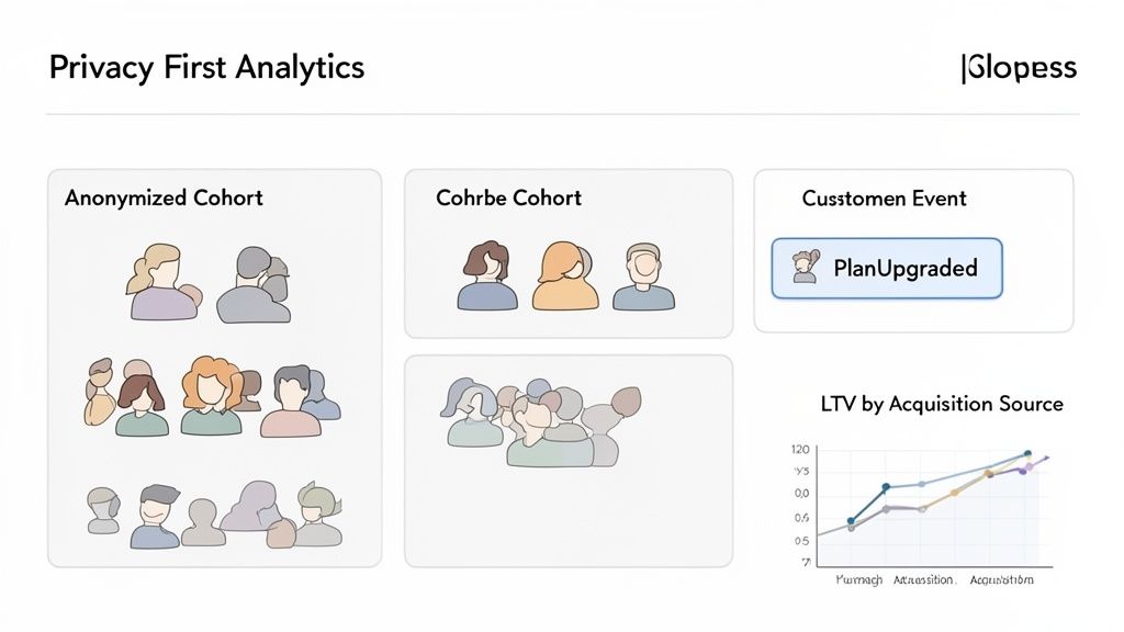
Alright, theory is great, but let's talk about putting this into practice. You don't need a complex, invasive tool to get started. In fact, a privacy-first analytics platform like Swetrix is perfect for this, because it’s built to deliver deep insights without collecting personal data.
Since Swetrix is cookie-less, your analysis naturally shifts from tracking individuals to understanding actions. This is the perfect foundation for building powerful behavioral cohorts that reveal what truly drives long-term value.
How to Set Up Your First Behavioral Cohorts
The first step is to start tracking key user actions with Swetrix's custom event feature. This lets you define the exact moments that matter for your product.
Here are a couple of ideas to get you started:
- Track a commitment milestone: Let's say you set up an event called
PlanUpgraded. This instantly creates a cohort of users who've pulled out their credit cards. Now you can analyze their long-term engagement and LTV compared to everyone who stays on the free plan. - Monitor core feature usage: You could also create an event like
FirstReportGenerated. This groups together everyone who has successfully used a key feature. Watching this cohort's retention rate will tell you just how essential that feature is for making your product "stick."
This is what that kind of data looks like inside the Swetrix dashboard, where you can see user behavior visualized over time.
The trends in user sessions and events laid out here are exactly what you'll use to build and analyze your cohorts.
By focusing on anonymized events, you get right to the good stuff: what actions make users stick around? This approach makes powerful analytics both accessible and fully compliant with privacy regulations like GDPR. It’s proof you don't have to trade user trust for great data.
Even better, Swetrix can integrate with payment platforms like Stripe. This allows you to directly connect your acquisition cohorts to their lifetime value, closing the loop and giving you a clear, practical way to implement everything we've talked about.
Common Questions About Cohort Analysis
As you start working with cohort analysis, you'll naturally run into a few common questions. Getting these sorted out early will help you sidestep common pitfalls and really get a handle on this powerful technique.
What's the Difference Between Cohort Analysis and Segmentation?
This one trips a lot of people up. It's easy to mix up "cohorts" and "segments," but they represent two fundamentally different ways of slicing your user data. Understanding the distinction is key.
Segmentation is like taking a quick photo of your user base. It groups people based on static attributes they have right now—things like their subscription tier, country, or the device they're using. It’s perfect for answering questions about the present, like, "How many of our Pro plan users are based in Canada?"
Cohort analysis, in contrast, is more like watching a movie of your users' journey. It groups them by a shared experience over a specific period, such as the month they signed up. This lets you track how their behavior changes over time. It helps you answer questions like, "Are users who signed up in May sticking around longer than those who joined in April?"
Simply put, segmentation tells you who your users are now, while cohort analysis tells you how a specific group has behaved over time.
What's the Biggest Mistake to Avoid?
By far, the most common mistake is jumping into the data without a clear question in mind. This is a surefire recipe for "analysis paralysis," where you end up drowning in charts and spreadsheets without finding a single thing you can actually act on. You just get lost in the noise.
The best analysis never starts with the data. It starts with a sharp, specific question. That question becomes your compass, guiding you through the numbers and keeping you on track.
Before you even think about pulling up a chart, force your team to define what you’re trying to figure out. A vague goal like, "Let's check retention," is useless. A focused question like, "Did our new onboarding tutorial improve 30-day retention for users who signed up after it launched last month?" gives you a clear path to a real answer.
How Does Cohort Analysis Fit in With Privacy Laws?
This is where cohort analysis really stands out, especially with regulations like GDPR in the picture. At its core, the technique is incredibly privacy-friendly because it's all about the collective behavior of anonymized groups, not the specific actions of identifiable individuals.
You're not tracking what "Jane Doe" did. Instead, you're looking at the trends of the "January Signups" cohort as a whole. This approach lets you uncover powerful insights about user engagement and product value without needing to collect personal data or use invasive cookies.
For privacy-first tools like Swetrix, this makes cohort analysis the ideal way to make smart, data-informed decisions while completely respecting user privacy.
Ready to turn user behavior into actionable insights without compromising privacy? Swetrix provides the powerful, cookieless analytics you need to understand your users' journey from start to finish. Start your 14-day free trial and see the difference today.