- Date
A Guide to Website Analytics Dashboards
 Andrii Romasiun
Think of your website analytics dashboard like the cockpit of an airplane. It gives you all the critical instruments you need—altitude, speed, direction—in one clear, scannable view. It’s not just a collection of random dials and numbers; it's the command center that turns a storm of data into a coherent story about where you’re going and how you'll get there.
From Numbers to Narrative: Understanding Your Dashboard

At its heart, a website analytics dashboard is a visual interface that pulls your most important metrics into one place. Its job is to translate raw data—clicks, sessions, conversions, bounce rates—into something you can actually understand and use. Instead of getting lost in endless spreadsheets, you get a clear picture that answers critical questions at a glance.
Imagine trying to figure out your website's performance by reading server logs line by line. It's a nightmare. You’d never spot a trend or catch a problem. A dashboard is the translator that turns that technical mess into intuitive charts, graphs, and scorecards. This visual storytelling is what makes data actionable.
The Strategic Value of a Centralized View
The real magic of a good dashboard is how it centralizes everything. Without one, your data is probably scattered everywhere. You’ve got one tool for traffic sources, another for on-site behavior, and maybe a third for tracking sales. This kind of fragmentation makes it nearly impossible to connect the dots.
A well-built dashboard weaves these threads together. It creates a unified view that reveals relationships you would have otherwise missed. Suddenly, you're not just seeing what's happening, but you're starting to understand why. For example, you can see exactly how a spike in traffic from a new ad campaign directly influenced your sign-up rates, all on a single screen.
This consolidated view empowers your entire team to:
- Make Faster Decisions: When your Key Performance Indicators (KPIs) are right in front of you, you can react to opportunities or problems immediately, not a week later when a report comes out.
- Align on Goals: A shared dashboard gets everyone on the same page. Marketing, product, and sales are all looking at the same numbers and working toward the same goals.
- Identify Opportunities: By visualizing the user journey, you can spot exactly where people are getting stuck or dropping off, giving you a clear roadmap for improvements.
Beyond Simple Page Views
Analytics dashboards have come a long way in the last decade. Early on, they were all about basic vanity metrics like page views and total visits. But as online user journeys became more complex, dashboards had to evolve. Today’s tools aggregate much more sophisticated data, like detailed behavior flows, multi-step conversion funnels, and the true return on investment (ROI) for every marketing channel. You can find more details on how modern dashboards have advanced at improvado.io.
A great dashboard doesn't just report on what happened; it provides the context needed to understand why it happened and what you should do next. It turns reactive data analysis into proactive business strategy.
This evolution is what moves you from just counting visitors to truly understanding them. You’re no longer just asking "how many people came to our site?" Now you can see their entire story: which blog post brought them in, what pages they viewed, and what action they took right before they decided to buy. It's this deep, narrative insight that helps you build a real strategy for growth.
The Building Blocks of an Effective Dashboard
Every great website analytics dashboard is built on two simple things: the right metrics and the right visualizations. Think of it this way: metrics are the raw ingredients, and visualizations are the final dish. You need both, working together, to create something that tells a clear, compelling story about how your website is doing.
If you don't nail these basics, your dashboard can quickly become a confusing jumble of numbers and charts that don't mean much. Let's start with the foundation—the core metrics that really show what’s happening on your site—before we get into building a tool that helps you make smart decisions.
Core Metrics: The Language of Your Website
Metrics are just quantifiable data points that track what your users are doing. We can group them into three main categories, and each one answers a different, vital question about your audience. Getting a handle on these will take you way beyond surface-level stats.
Traffic Metrics: These answer the question, "Who is coming to our site and where are they from?"
- Users: This is the number of unique individuals who visited your site. It’s a great way to gauge the actual size of your audience.
- Sessions: The total number of visits to your site. One user can have multiple sessions, which is a good sign of repeat engagement.
- Traffic Sources: This shows you how people found you—was it through a Google search, a social media post, or did they type your URL directly? This is crucial for figuring out if your marketing is working.
Engagement Metrics: These answer, "What are visitors doing once they get here?"
- Bounce Rate: The percentage of visitors who land on a page and leave without clicking anything else. A high bounce rate might mean your content isn't what they were looking for or the page is confusing.
- Average Session Duration: How long, on average, people stick around during a visit. Longer sessions usually mean your content is holding their attention.
- Pages per Session: The average number of pages someone looks at before they leave. This tells you how deeply they’re exploring what you have to offer.
Conversion Metrics: These get to the bottom line: "Are people taking the actions we want them to?"
- Goal Completions: The number of times users do something specific you want them to, like filling out a contact form, signing up for a newsletter, or buying a product.
- Conversion Rate: The percentage of visitors who complete one of those goals. For example, if 1,000 people visit and 50 sign up, your conversion rate is 5%.
- Return on Investment (ROI): This measures how profitable your efforts are by comparing the money you made to what you spent on your marketing campaigns.
These metrics are the backbone of any solid analysis. But to get an even clearer picture, you can track specific on-page actions. Our detailed guide on event tracking walks you through how to monitor things like button clicks, video plays, and file downloads.
Data Visualization: Turning Numbers into Insight
Once you’ve got your metrics, you need to bring them to life. That’s where data visualization comes in. The whole point is to make complex information easy to grasp at a glance. But be careful—the wrong chart can hide the truth just as easily as the right one can reveal it.
A well-chosen chart doesn’t just show data; it answers a business question. It guides your eye to the most important trend, comparison, or outlier without needing a paragraph of explanation.
A good dashboard uses a mix of chart types, each one picked specifically for the data it's showing. Choosing the right visualization is a skill, but it’s not as complicated as it sounds. Here’s a quick guide to help you match the visual to the metric.
Choosing the Right Visualization for Your Data
This table matches common website analytics metrics with the most effective chart types for clear and insightful data representation.
| Metric Category | Example Metric | Best Visualization Type | Why It Works |
|---|---|---|---|
| Trends Over Time | Sessions per month | Line Chart | Clearly shows growth, decline, or seasonal patterns over a continuous period. |
| Comparison | Traffic by source | Bar Chart or Pie Chart | Makes it easy to compare the performance of different channels against each other. |
| Distribution | User demographics | Geo Map or Histogram | Visualizes the geographic location of users or breaks down a single metric into ranges. |
| Relationship | Bounce rate vs. page | Scatter Plot or Table | Helps identify correlations between two different variables, like which pages have the highest bounce rates. |
| User Behavior | On-page clicks | Heatmap | Provides an intuitive, color-coded overlay showing exactly where users are clicking on a page. |
By mastering these building blocks—picking the right metrics and pairing them with smart visualizations—you can transform your website analytics dashboard from a simple data report into a powerful tool that drives real growth.
How to Build Dashboards for Different Business Roles
A one-size-fits-all website analytics dashboard is a recipe for confusion. The high-level financial metrics a founder cares about are just noise to a developer trying to squash bugs. If you want your data to be truly actionable, you have to tailor the dashboard to the specific questions each person needs to answer.
Think of it like a specialized toolkit. A carpenter, an electrician, and a plumber all work on the same house, but they don't carry the same tools. In the same way, your team members need dashboards loaded with the precise metrics and visualizations that help them do their jobs right.
This diagram shows the basic structure of website metrics, moving from attracting visitors to ultimately converting them into customers.
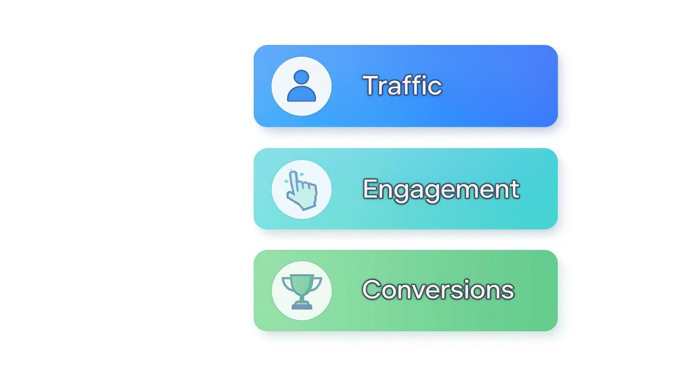
This flow really just maps out the user journey. You can't get valuable conversions without first getting successful traffic and engagement.
The Founder or CEO Dashboard
Founders and C-level execs need the 30,000-foot view of the business. They simply don’t have time to get bogged down in bounce rates on individual blog posts. Their dashboard needs to answer one core question: "Is the business growing, and is that growth profitable?"
This high-level view is all about core business health and long-term viability, not day-to-day fluctuations.
Key KPIs for a Founder Dashboard:
- Customer Acquisition Cost (CAC): How much do we spend to get a new paying customer?
- Customer Lifetime Value (LTV): What’s the total revenue an average customer brings in?
- Monthly Recurring Revenue (MRR): For subscription businesses, this is the predictable revenue stream.
- Lead-to-Customer Rate: What percentage of our leads actually become paying customers?
- Overall Conversion Rate: The big-picture metric—what percent of visitors complete a primary goal, like a purchase or sign-up?
The Marketer Dashboard
Marketers are on the front lines, driving audience growth and generating leads. Their dashboards are all about campaign performance, channel effectiveness, and, of course, return on investment. They need to know which channels are bringing in quality traffic and how their latest initiatives are stacking up.
This dashboard is the campaign command center, giving them the data needed to optimize ad spend and content strategy. To learn more about the metrics that power great campaigns, check out our in-depth guide for marketers using analytics.
A marketer's dashboard should tell a clear story about every dollar spent. It directly connects marketing activities to business outcomes, showing what’s working and what’s not.
Essential Metrics for Marketers:
- Traffic by Source/Medium: Where are visitors coming from? Organic search, social media, paid ads?
- Conversion Rate by Channel: Which channels don't just send traffic, but send traffic that converts?
- Cost Per Lead (CPL): How much does it cost to get a single lead from each campaign?
- UTM Campaign Performance: This is how you track specific marketing campaigns to measure their direct impact.
- Top Landing Pages by Conversions: Which pages are doing the heavy lifting when it comes to turning visitors into leads?
The Product Manager Dashboard
Product managers are obsessed with user behavior. Their focus is squarely on how people interact with the website or app. They want to know if users are finding new features, completing key tasks, and genuinely getting value out of the product.
You can think of this dashboard as a product health monitor. It helps them spot friction points in the user experience and validate whether a new feature release was a success.
Critical KPIs for Product Managers:
- User Retention Rate: What percentage of users keep coming back over time?
- Feature Adoption Rate: How many people are actually using that new feature we just launched?
- User Funnel Analysis: Where are people dropping off during critical moments, like the checkout process or onboarding?
- Top User Paths: What are the most common journeys people take through our site or app?
- Average Time to Complete Key Actions: How long does it take for a user to accomplish their main goal?
The Developer Dashboard
For developers and engineers, performance is everything. Their dashboard has very little to do with marketing ROI and everything to do with the technical health and stability of the website. After all, a slow, buggy site creates a terrible user experience that undermines everyone else's work.
This dashboard is an early warning system. It's designed to flag technical problems before they spiral out of control and affect a large number of users.
Key Metrics for Developers:
- Page Load Time (Core Web Vitals): How fast are pages actually loading for real people?
- Error Rate (404s and 500s): How often are users hitting broken pages or server errors?
- API Response Times: Are our backend services snappy and efficient?
- Uptime Monitoring: Is the website consistently online and available?
- Browser and Device Performance: Are there performance bottlenecks on specific browsers (like Safari on iOS) or certain devices?
By creating these role-specific website analytics dashboards, you turn data from a static report into an active tool. It empowers every single person on your team to make smarter, faster decisions based on what's really happening.
Designing Dashboards That Actually Get Used
A great website analytics dashboard isn't about cramming in every possible metric. Think of it less like a dense financial report and more like the cockpit of an airplane—it should give you the critical information you need to fly straight, right when you need it. The goal is to build something so intuitive that anyone can glance at it and immediately grasp what's happening, spot a problem, and know what to do next.
This isn't just a design preference; it's a business necessity. The web analytics market is on track to hit nearly $8 billion by 2025, fueled by an insatiable need for data to back up decisions. But raw data is useless. Actionable data is everything. You can get a deeper look into this trend by checking out the full market analysis on mordorintelligence.com.
First Things First: Create a Visual Hierarchy
When you open a dashboard, your eyes should automatically snap to the most important numbers. This is what we call visual hierarchy. It works just like a newspaper headline: the biggest, boldest text gets your attention first.
Put your heavy hitters—your main KPIs like revenue, user sign-ups, or conversion rates—right at the top. Make them big and bold. These are your "at-a-glance" numbers. The supporting charts and graphs that explain the why behind those numbers should sit just below, creating a natural path for the eye to follow from the big picture down to the details.
Use Color to Tell a Story, Not Just to Decorate
Color is a powerful tool, but it's often abused. A dashboard that looks like a bag of Skittles exploded is just visual noise. It's confusing and makes it impossible to focus. Instead, every color you use should have a specific job.
Here are a few simple rules I always follow:
- Stay Consistent: If you decide revenue is green, it needs to be green in every single chart. This creates a mental shortcut for users.
- Signal Good vs. Bad: Use intuitive, contrasting colors—like red for a drop and green for a spike—to instantly flag performance changes.
- Go Muted by Default: Use a calm, neutral color palette for the bulk of your charts. Then, save the bright, attention-grabbing colors for the truly critical alerts or highlights that need immediate action.
A well-designed dashboard uses color to guide the eye, not assault it. Every single hue should serve a purpose, whether it's flagging a problem, showing a comparison, or just keeping things on-brand.
Be Ruthless: Declutter and Stick to the Essentials
One of the biggest pitfalls is the "data dump" dashboard, where every metric imaginable is thrown onto one screen. This is a recipe for disaster. It overwhelms people and buries the actual insights you're trying to surface.
The secret is to be incredibly selective. Before you add any new widget, ask yourself this one simple question: "Can someone take a clear action based on this number?" If the answer is fuzzy, it doesn't belong on the main dashboard. Focus only on the KPIs that directly track your core business goals. For everything else, you can build separate, deep-dive reports.
The Bedrock of It All: Trustworthy Data
Let's be clear: none of these design tips matter if your data is wrong. A beautiful dashboard showing bad numbers is actively harmful—it gives people the confidence to make the wrong decisions. Data integrity is the absolute, non-negotiable foundation.
This means double-checking that your tracking is installed correctly, you’re filtering out internal traffic from your team, and your data sources are clean. When people trust the numbers, they act on them. And that trust is what transforms a dashboard from a simple reporting tool into a real engine for growth.
Navigating Data Privacy and Compliance
In the world of website analytics, data might be the currency, but trust is the entire economy. A beautiful, powerful dashboard means nothing if the data feeding it is collected unethically or illegally. We've got to talk about the complex web of privacy regulations—not as a legal chore, but as a core part of building a brand that people actually want to engage with.
Respecting user privacy has gone from a "nice-to-have" to a global standard. Landmark regulations like GDPR in Europe and CCPA in California have completely changed the game, giving users real control over their personal information. This has a direct impact on how your analytics tools can even operate, especially when it comes to old-school tracking cookies and identifying users.
At their heart, these laws demand transparency. You have to tell users exactly what data you're collecting and why, and you need their explicit consent before you start tracking them. Ignoring this can lead to massive fines—we're talking up to 4% of annual global turnover under GDPR—and, maybe worse, a complete collapse of customer trust.
The Shift to a Cookieless Future
For decades, third-party cookies were the engine of digital analytics and advertising. They followed users from site to site, piecing together detailed profiles of their online lives. But as privacy concerns have grown, major browsers like Safari, Firefox, and soon Chrome have started blocking these cookies by default. This isn't just a small change; it’s a seismic shift toward a "cookieless future."
What does that mean for us? It forces a pivot to first-party data. This is the information you collect directly from users on your own website, with their full permission. Not only is this data more accurate and transparent, but it helps you build a much stronger, trust-based relationship with your audience.
In this new era, your website analytics dashboard has to be built on a foundation of privacy-first data collection. The goal is to get meaningful insights without creeping on your users, turning what seems like a limitation into a real competitive advantage.
This transition isn’t just about dodging penalties. It's about future-proofing your entire analytics strategy. A dashboard fueled by consented, first-party data is far more resilient and gives you a much clearer picture of who your users actually are, not just some anonymous profile stitched together from across the web.
Building a Privacy-First Analytics Strategy
Adopting a privacy-first mindset really just means putting user consent at the very center of your data strategy. It's about picking tools and using techniques that respect people's choices while still giving you the insights you need to grow.
Here are a few practical steps you can take to get started:
- Choose Compliant Tools: Look for analytics platforms like Swetrix that were designed from the ground up to be GDPR-compliant and don't depend on cookies. These tools focus on showing you trends from aggregated, anonymous data without singling out individuals.
- Anonymize User Data: Make sure you're using features like IP address anonymization. This simple step prevents data from being traced back to a specific person, protecting their privacy while still letting you analyze things like geographic trends and traffic sources.
- Embrace Data Ownership: If you want total control over privacy and security, think about hosting your own analytics. A self-hosted web analytics solution puts you in the driver's seat, ensuring no third party can ever access or sell your data.
- Be Radically Transparent: Write a privacy policy that a human can actually read. Use plain language to explain what you track, what you do with the data, and how users can easily opt out if they want to.
When you weave these principles into how you operate, you end up with a website analytics dashboard that isn't just powerful and insightful—it's also ethical and trustworthy.
Bringing Your Analytics Dashboard to Life
All the theory and design principles are great, but the real magic happens when you turn those ideas into a living, breathing command center for your website. Implementation is where your analytics dashboard stops being a concept and becomes the central hub for your business intelligence. This isn't just about picking a tool; it's about weaving it into your daily workflows so that information flows seamlessly.
Let's walk through what this looks like in practice. We'll use a privacy-first platform like Swetrix as our example, because its setup process is designed to get you from zero to meaningful insights in just a few minutes. It all starts with a simple tracking code.
This little piece of JavaScript is the bridge between your website and your analytics platform. You just pop it into the header of your site, and it starts gathering anonymous data on traffic and user behavior right away. No need for a complex setup just to see the essential metrics start rolling in.
Initial Setup and Configuration
Once that tracking code is live, your dashboard will begin to light up with data. The first real job is to shape it to fit the KPIs and roles we talked about earlier.
- Define Your Core Reports: First things first, build out the views you'll check most often. A marketer might immediately set up a report filtering traffic by UTM parameters to track campaign performance, while a developer would likely pin the error tracking and performance widgets to the top.
- Set Up Custom Events: You need to see more than just page views. Tracking custom events for things like button clicks, form submissions, or video plays gives you a much richer picture of how people are actually engaging with your site.
- Filter Out Internal Traffic: This is a crucial step for data hygiene. Add IP filters to exclude traffic from your own team, your home office, or any contractors. This keeps your own activity from inflating metrics like session duration or skewing your bounce rate.
This initial configuration is what transforms a generic template into a tool that speaks your business's language.
Advanced Features for Deeper Insights
A great analytics platform goes way beyond the basics. Modern tools offer powerful features that let you automate workflows and customize how you access your data, which is what truly brings a dashboard to life.
For example, an Application Programming Interface (API) gives you direct, programmatic access to all your analytics data. This means you can pull website metrics straight into other business systems, create stunning custom charts in tools like Tableau, or pipe performance data into your internal company portals. The possibilities are pretty much endless.
Another game-changer is intelligent alerts. Instead of compulsively checking your dashboard every hour, you can set up automated notifications for the things that matter. You could get a Slack ping if a key landing page's bounce rate suddenly shoots up, or an email if your site’s traffic takes an unexpected nosedive.
Alerts transform your dashboard from a passive reporting tool into an active, automated monitoring system. It watches your back, freeing you up to focus on strategy instead of constant manual checks.
For businesses that need total control over their data, self-hosting is the ultimate solution. By hosting the entire analytics platform on your own servers, you can guarantee that no third party ever touches your user data. This is the gold standard for data ownership and privacy compliance, and it's a core option for platforms like Swetrix.
This diagram shows how it all works together—how data flows from user interactions, gets processed by your analytics platform, and ends up as actionable reports.
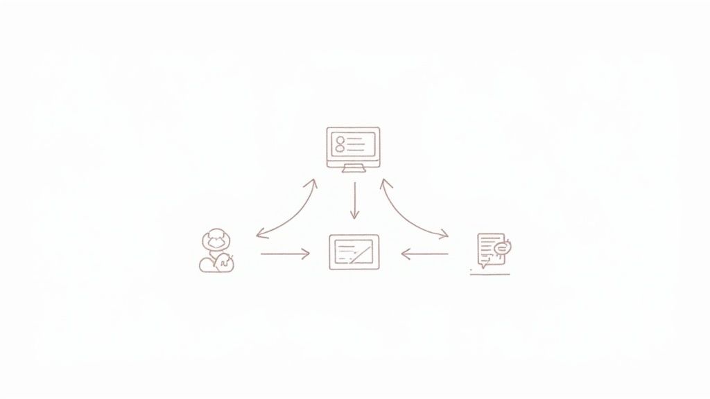
The goal isn't just to collect data, but to create a feedback loop of analysis and action that constantly improves the user experience.
Integrating for a Single Source of Truth
Finally, your website analytics dashboard shouldn't be an island. Its true power is unlocked when you connect it to the other tools you rely on every day. When you integrate your analytics with systems like your Customer Relationship Management (CRM) or email marketing software, you create a single, unified view of the entire customer journey.
This kind of integration is becoming absolutely essential. Market intelligence projects the global data analytics market will explode from USD 64.75 billion in 2025 to over USD 658 billion by 2034. A huge driver of this growth is the demand for comprehensive data solutions, with small and medium-sized enterprises already making up over 35% of the market. You can explore more research on data analytics market trends to see just how massive this shift is.
By connecting these systems, you can see not just that a marketing campaign drove traffic (your analytics data), but that it also generated qualified leads (your CRM data) who eventually became paying customers. This is how your dashboard evolves into the true command center for all your growth initiatives.
Ready to build a website analytics dashboard that respects user privacy and delivers clear, actionable insights? Swetrix offers a powerful, cookie-free analytics solution with everything you need to get started, from beautiful dashboards and real-time reporting to self-hosting options. Start your 14-day free trial today and see your data in a whole new light.