- Date
How to reduce website bounce rate: Quick, proven tips
 Andrii Romasiun
To tackle a high bounce rate, you've got to get to the heart of what's making people leave your site. It usually boils down to three things: a slow-loading page, content that misses the mark, or a design that just confuses people. The goal is to make sure your page delivers exactly what a visitor expects, creating a seamless experience the second they land.
Why Visitors Bounce and How It Hurts Your Site
Before we dive into the fixes, let's get on the same page about what a "bounce" really means. It’s not just a number on a dashboard; it’s a person making a split-second decision that your page isn’t the answer to their problem. When someone lands on your site and leaves without clicking anything else, they’re sending you a loud, clear signal: something is off.
This failure to engage usually stems from a handful of common problems. Think of each one as a crack in your website's foundation—undermining the user's journey before it even gets started.
The Promise-vs-Reality Disconnect
One of the biggest culprits I see is a mismatch between what a user thinks they’re getting and what your page actually delivers. This happens all the time. Your ad copy, search result snippet, or social media post makes a promise, but the landing page doesn't follow through immediately.
Imagine an ad shouting about a “50% Off Sale” that just dumps the user on your generic homepage. Now they have to hunt for the deal. Let’s be honest, most people won’t bother. They’ll just leave.
A high bounce rate often reveals a broken promise. Your headline and meta description write a check that your on-page content and user experience must cash instantly. If they don't, users will leave.
To help you quickly diagnose the issue, here are some of the most frequent reasons people hit the back button.
Common Reasons for High Bounce Rates
This quick-glance table helps you spot the most frequent issues causing visitors to leave your website prematurely.
| Issue Category | Specific Problem Example | Impact on User |
|---|---|---|
| Performance | Page takes more than 3 seconds to load on mobile. | Frustration and abandonment; they won't wait. |
| Content Mismatch | A "beginner's guide" article is full of technical jargon. | Confusion; the content doesn't match their expertise level. |
| Poor UX/Design | Pop-ups or autoplay videos cover the main content. | Annoyance and inability to access information. |
| Navigation | The menu is unclear, or there's no obvious next step. | Feeling lost; they don't know where to go next. |
| Technical Errors | The page shows a 404 error or has broken elements. | Immediate distrust and a broken experience. |
Spotting your issue in this table is the first step. Next, it’s crucial to understand the real-world consequences of letting it slide.
The Real Costs of a High Bounce Rate
A high bounce rate isn't just a vanity metric; it has tangible consequences that directly impact your business goals. It hits your bottom line and search engine visibility in a few critical ways.
- Damaged SEO Rankings: Search engines like Google see a high bounce rate as a sign that your content isn't relevant or helpful. Over time, this can push your pages down in search results, slashing your organic traffic.
- Wasted Ad Spend: This one stings. For any paid campaign, every person who bounces is money down the drain. You paid for that click, but a poor landing page experience means you get zero return on your investment.
- Lower Conversion Rates: It's simple, really. Visitors who bounce can't sign up for your newsletter, buy your product, or fill out a contact form. A high bounce rate is a direct roadblock to achieving your most important goals.
This flow shows just how fast that "no thanks" decision happens.
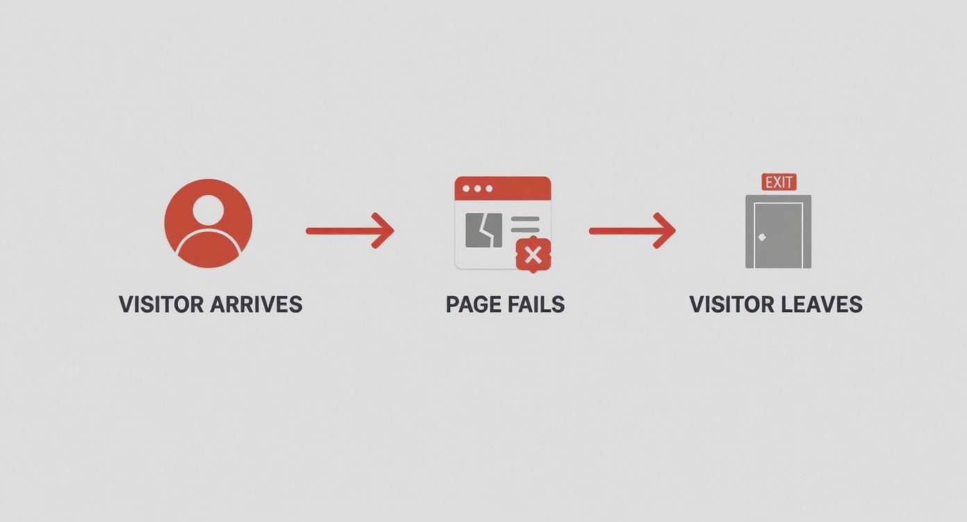
As you can see, the path from arrival to exit is incredibly short when a page fails to deliver, which is why providing immediate value is non-negotiable.
Winning the First Three Seconds with Page Speed
You get one shot—maybe three seconds, if you're lucky—to make a good first impression. When someone lands on your site and stares at a blank white screen, their patience doesn't just wear thin; it vanishes. Performance isn't just some technical box to check. It's the very foundation of a good user experience and one of the most powerful ways to slash your bounce rate.
Slow load times are a direct path to user frustration. We've all been trained to expect instant gratification online, and any delay feels like a roadblock. This isn't just anecdotal, either. The data is crystal clear: as page load time goes from one to ten seconds, the chance of a mobile user bouncing skyrockets by a staggering 123%.
Even a one-second delay matters. In fact, 53% of mobile users will ditch a site that takes more than three seconds to load.
A slow website is like a physical store with a locked door. It doesn't matter how great your products or content are inside if customers can't get in quickly and easily. They will simply turn around and go elsewhere.
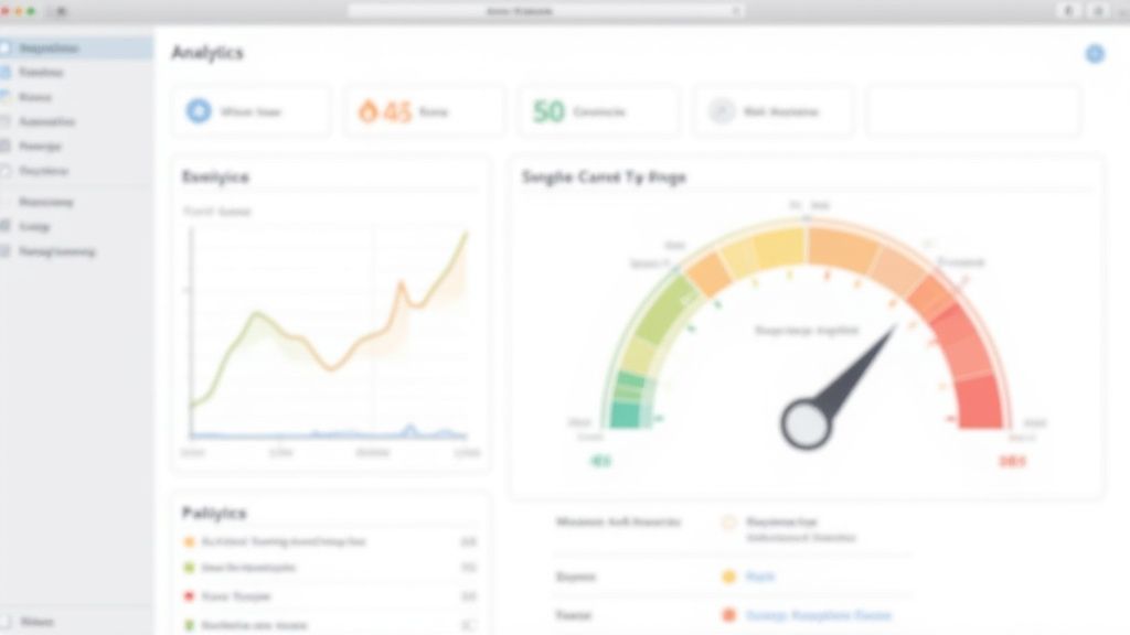
So, where do you begin? The first step is always diagnosis. A fantastic, free tool for this is Google PageSpeed Insights. It’ll analyze your page on both mobile and desktop, spitting out a detailed report with specific, actionable recommendations.
Here's a glimpse of what that report looks like:
The report scores your performance and highlights your Core Web Vitals, giving you an immediate sense of where you stand and what needs fixing.
Pinpointing Your Performance Bottlenecks
Once you have your report, it's time to turn those diagnostics into a concrete plan. Don't let the list of suggestions overwhelm you. Your job is to focus on the items that will deliver the biggest bang for your buck.
Most performance problems boil down to a few usual suspects:
- Unoptimized Images: This is the big one. Huge, high-resolution images are often the single heaviest thing on a page.
- Bloated Code: All those extra spaces, comments, and unnecessary characters in your CSS, JavaScript, and HTML files add up, making your page heavier than it needs to be.
- Slow Server Response Time: If your server takes too long to even start sending the page, everything else is delayed from the get-go.
- Render-Blocking Resources: Some scripts and stylesheets demand to be loaded before anything else can appear on the screen, creating a major bottleneck.
Tackling these common culprits is your fastest route to a zippier site and a healthier bounce rate.
Actionable Steps for a Lightning-Fast Site
With a clear diagnosis in hand, you can start implementing targeted fixes. Think of it as a tune-up for your website. Every small tweak adds up to a much faster experience for your visitors.
Here’s what to focus on:
- Compress and Resize Images: This is completely non-negotiable. Use tools like TinyPNG or Squoosh to shrink image file sizes without a noticeable drop in quality. Critically, make sure you're serving images at the right dimensions. Never force a browser to load a 2000px-wide image just to display it in a 500px container.
- Enable Browser Caching: Caching tells a visitor's browser to store parts of your site (like your logo, CSS files, and key images) locally. The next time they visit, the browser can load those assets from its own memory instead of downloading them all over again. It's a game-changer for repeat visits.
- Minify Your Code: Minification strips all the unnecessary characters from your code files. It’s an automated process, and most modern development tools have plugins that handle it for you, resulting in smaller files that download and run faster.
- Use a Content Delivery Network (CDN): A CDN is a network of servers distributed globally that stores copies of your site's assets. When a user in London visits your site, they get the content from a server nearby, not one in Los Angeles. This dramatically reduces latency and makes your site feel fast for everyone, everywhere.
These changes can sound technical, but many are one-time fixes that deliver continuous value. For a deeper dive, check out our guide on website performance optimization tips.
Real-World Impact on Bounce Rate
Let's look at a real-world scenario. An e-commerce shop selling handmade leather goods was seeing a 65% bounce rate on its product pages. After running a PageSpeed Insights report, they found the culprit: massive, uncompressed product photos were pushing load times to over eight seconds on mobile.
The team made two simple but powerful changes:
- They compressed every product image, slashing file sizes by over 70%.
- They set up lazy loading, which means images further down the page only load when a user actually scrolls to them.
The results were immediate. Page load time dropped to under three seconds. Within a single month, the bounce rate on those same product pages plummeted to 38%.
That’s not just a vanity metric. It’s a huge improvement that meant more people were sticking around to browse, add items to their cart, and ultimately buy. It proves that focusing on speed isn't just about pleasing Google; it’s a core business strategy for keeping potential customers on your site.
Nail User Intent to Deliver Real Value
A lightning-fast website is great, but speed is only half the battle. If your content doesn't deliver on the promise that brought someone there in the first place, they'll leave in a heartbeat. Nailing user intent is all about closing the gap between what a visitor expects to find and what you actually give them.
This whole process starts way before they even land on your page—it's forged in your ad copy, your search engine headlines, and your meta descriptions. Every one of those is a promise. Your landing page’s job is to make good on that promise, instantly.
The price for getting this wrong is steep. According to WordStream, one of the biggest reasons for a high bounce rate is simple irrelevance—a direct result of ignoring what the user actually wants. Their research shows that getting your content aligned with user intent can slash bounce rates by as much as 30%. It’s a crystal-clear link between relevance and keeping people engaged.
Get Inside the Search Query
To give your audience what they want, you have to figure out their goal. Behind every search query is an intent. Are they trying to learn something? Find a specific page? Or are they ready to pull out their credit card?
Take a query like "best running shoes for beginners." This person isn't just looking for a single product page. Their intent is informational; they're in research mode. They want expert guidance, real comparisons, and solid recommendations.
- Informational Intent: The user wants answers. (e.g., "what is bounce rate?")
- Navigational Intent: They're looking for a specific site. (e.g., "Swetrix login")
- Transactional Intent: They're ready to buy something. (e.g., "buy Nike Air Zoom Pegasus")
- Commercial Investigation: They're comparing options before buying. (e.g., "Swetrix vs Google Analytics")
If your landing page just shows a list of shoe models, you'll see a high bounce rate from that query. But a comprehensive guide comparing the top beginner models, breaking down key features, and offering real buying advice? That directly addresses their need and gives them a reason to stick around.
Write Headlines That Keep the Promise
Your headline is the first thing a visitor reads. It has to instantly confirm they've landed in the right place. Think of it as a direct echo of the ad or link they just clicked. If your ad promises an "Easy Guide to SEO," your landing page headline better not be "Advanced Link Building Strategies."
I once worked with a B2B software company struggling with a high bounce rate on a key landing page. Their ads targeted "small business accounting software," but the headline was a vague, brand-focused slogan. We swapped it out for "Accounting Software Built for Small Business Owners Like You."
The result? A 22% drop in bounce rate in under a month. That new headline was an instant handshake, reassuring visitors they’d found exactly what they were looking for.
Structure Your Content for Scanners, Not Readers
Once the headline hooks them, the structure of your content decides if they stay. Let's be honest: people don't read web pages word-for-word. They scan for answers. Your job is to make those answers impossible to miss.
Use clear, descriptive H2 and H3 subheadings to break your text into logical chunks. These act like signposts, guiding the user through your content and helping them find what they care about most. Short paragraphs, bullet points, and bold text are your best friends here—they make your content so much easier to digest.
For longer pieces, like in-depth guides, a table of contents at the top is a total game-changer. It gives people a quick overview and lets them jump straight to the section that solves their problem right now. It's a simple feature that gives them control and makes the whole experience better.
Lead with the Problem, Not the Preamble
Your introduction has one critical job: prove to the reader you understand their problem and you have the solution. Don't waste this precious space on a long, philosophical intro. Get straight to the point.
Let’s go back to that B2B example. We noticed the bounce rate was high on a popular article about customer journey mapping. The original intro started with the history of marketing funnels. We rewrote it to lead with:
"Struggling to figure out why potential customers drop off before buying? A customer journey map helps you see their experience from their eyes and pinpoint exactly where things are going wrong."
This problem-first approach connected with the reader's pain point immediately. It confirmed the article would offer a real solution, giving them a compelling reason to keep reading. That simple change, along with better subheadings, made a huge difference. You can see what I mean by checking out these customer journey mapping examples in our dedicated article.
When you meticulously align every piece of your page with user intent—from the search query to the final sentence—you turn your content from a static block of text into a dynamic resource that visitors actually want to use.
Designing an Engaging User Experience
https://www.youtube.com/embed/zXPZ0L2cOw4
A great user experience (UX) is what separates a visitor who just glances at your page from one who stays, explores, and actually engages. It's about turning a passive view into an active interaction. To really tackle your bounce rate, you have to design an experience that isn't just functional, but genuinely intuitive and even enjoyable.
It all starts with getting the basics right. If your site is confusing or just plain hard to use, no amount of brilliant content will convince someone to stick around. Think of it like a retail store with messy aisles and no signs—frustrated customers will just turn around and walk out.
Building an Intuitive and Readable Foundation
The foundation of a low bounce rate is a design that feels completely effortless. Your visitors should never have to stop and think about how to use your website; it should just feel natural.
First up, intuitive navigation. Your main menu needs to be simple, logical, and use clear, predictable words. Someone looking for your pricing shouldn't have to guess if it's hidden under "Solutions," "Products," or "Get Started." Keep the main menu clean and tuck related pages neatly underneath.
Next, you have to make sure your content is easy on the eyes. This is more than just good writing.
- Choose Clean Fonts: Go with something clean and legible like Open Sans, Lato, or Merriweather. Steer clear of overly decorative or script fonts that become a chore to read, especially for longer articles.
- Embrace White Space: Don't be afraid of empty space! Generous white space (or negative space) around text and images makes your content feel less crowded and much easier to scan. It helps guide the eye and actually improves comprehension.
- Ensure Mobile Responsiveness: This one is non-negotiable. Most of your traffic is likely coming from mobile devices. Your text has to be readable without any pinching and zooming, and buttons need to be big enough for someone to tap easily with their thumb.
A seamless user experience is invisible. When it's done right, the user doesn't even notice the design; they just notice how easy it is to find what they need. Friction, on the other hand, is always noticeable and is a surefire way to send people bouncing.
Nailing these fundamentals creates a sense of calm and control for your visitors, encouraging them to stick around instead of hitting the back button in frustration.
The Power of Interactive Content
Once you've got a solid UX foundation, you can start adding elements that invite people to participate. Static text is fine, but interactive content turns your page into a two-way conversation, which is infinitely more engaging.
Time and again, research shows that interactive features are a fantastic way to keep users on a page longer. For instance, data from one study showed that using elements like calculators, quizzes, or videos can seriously boost engagement. In fact, pages that include data visualizations or tutorials often see a 20% lower bounce rate than their text-heavy counterparts. You can dig deeper into this in Backlinko’s research on bounce rate.
These interactive tools work because they offer immediate, personalized value that a block of text just can't compete with.
Here are a few ideas to get you started:
- Calculators: If you're in finance, real estate, or even SaaS, an ROI or mortgage calculator gives users a concrete answer to a personal question.
- Quizzes: A fun, low-stakes quiz like "What's Your [Blank] Style?" can be a great way to engage visitors and guide them toward relevant content or products.
- Polls and Surveys: Simply asking for an opinion makes people feel heard and invested.
- Embedded Videos: A well-placed video can break down a complex topic way more effectively than text ever could, holding a visitor's attention for several minutes.
These features give the user a reason to do something on your page, not just passively read it.
A Real-World Scenario in Action
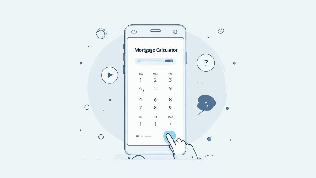
Let’s look at a real example. A financial services firm was struggling with a high bounce rate on their main landing page for home loans. The page was packed with good information about different loan types and rates, but it was all just text.
They saw a clear opportunity. The team decided to embed a simple, interactive mortgage calculator right at the top of the page. Now, visitors could pop in a home price, down payment, and interest rate to see their estimated monthly payment instantly.
The result was immediate and dramatic. The landing page's bounce rate dropped by 32% in just two months. Why the huge change? The calculator provided instant, personalized value. It answered the visitor's most critical question—"What can I actually afford?"—in a way static text never could. That one interactive element transformed the page from a digital brochure into a useful tool, giving people a compelling reason to stick around and learn more.
How to Measure Your Bounce Rate Accurately
Before you start tweaking buttons and rewriting headlines, you have to be absolutely sure your data is telling you the truth. Making changes to lower your bounce rate is just a shot in the dark if your analytics are off. I’ve seen it time and time again: a misconfigured setup gives you a completely skewed picture, leading you to waste time on "fixes" that don’t solve the real problem.
One of the biggest culprits? Single-Page Applications (SPAs). On these sites, a visitor can move between different views or sections without the browser ever doing a full page reload. A standard analytics script often misses these internal navigations entirely, incorrectly flagging a perfectly engaged, multi-view session as a single-page bounce.
This inflates your bounce rate, making your site's engagement look far worse than it actually is.
Moving Beyond Flawed Metrics
To get a real feel for user behavior, you need a smarter way to track—one that goes beyond simply counting page loads. This is where modern, privacy-first analytics tools really come into their own. Platforms like Swetrix are designed to give you a clearer picture without relying on outdated or intrusive methods.
They let you define what engagement truly means for your website. Instead of just asking, "Did they visit a second page?" you can start asking much better questions:
- Did they click a critical call-to-action button?
- Did they watch that embedded video we spent ages on?
- Did they scroll more than 75% of the way down the page?
- Did they actually use that interactive mortgage calculator?
These are all strong signals of genuine interest, even if they happen on a single page. Tracking these interactions gives you a far more nuanced and accurate read on how people are using your content.
By focusing on clear, meaningful actions, you can finally move away from a vague metric and get a real sense of user engagement.
Setting Up Meaningful Event Tracking
The secret to accurate measurement lies in custom event tracking. It's all about telling your analytics platform which specific user actions you consider valuable.
Let's walk through a quick example using Swetrix. Imagine you have a landing page with a primary "Request a Demo" button. A user who lands, reads your copy, and clicks that button is highly engaged—even if they never see another URL. To track this, you’d set up a custom event that fires every time that specific button is clicked.
By tracking meaningful interactions as events, you get to redefine what a "bounce" means for your site. A session is no longer a bounce if the user performs a key action, giving you a much smarter and more accurate engagement metric.
This simple shift completely transforms your understanding of user behavior. You can finally see not just which pages get traffic, but which pages actually persuade users to take the actions that matter to your business. If you want to dive deeper into organizing this data, our guide on building a powerful web analytics dashboard is a great next step.
A Practical Walkthrough with Swetrix
Don't worry, setting this up is more straightforward than it sounds. Most modern analytics tools have simple methods for event tracking. It usually just involves adding a small snippet or attribute to the interactive elements on your site.
For instance, to track that demo button click in Swetrix, you might add a simple attribute directly to the button's HTML:
sw-onclick="Demo Button Click"
With that one line of code, Swetrix will now record every click on that button as a "Demo Button Click" event. From there, you can see this data in your dashboard, analyze the funnels that lead to that click, and even filter sessions by users who completed the action.
This is how you get a true measure of engagement. It’s how you validate whether your efforts to reduce your bounce rate are actually working.
Answering Your Toughest Bounce Rate Questions
As you start digging into your site's performance, you’ll naturally run into some tricky questions. Getting the details right is what separates guessing from making real, impactful improvements.
Let's clear up some of the most common sticking points people face when they start trying to lower their website’s bounce rate.
Can My Bounce Rate Be Too Low?
It’s a strange thought, but yes. If you’re seeing a site-wide bounce rate under 10%, your first instinct shouldn't be to celebrate. It’s almost always a sign of a technical glitch.
The usual culprit? Your analytics code is firing twice on a single page load. This double-counting makes it look like every visitor immediately interacts with the page (the second, duplicate page view), so a single-page session is never recorded as a bounce. If your numbers seem way too good to be true, they probably are. Start by auditing your analytics setup for duplicate tracking scripts.
Is a High Bounce Rate Always a Bad Thing?
Absolutely not. Context is everything. For some pages, a high bounce rate is perfectly normal—it might even mean the page is doing its job perfectly.
Think about it:
- Contact Pages: Someone lands, grabs your phone number, and leaves. Mission accomplished.
- Confirmation Pages: A user just bought something or signed up. They see the "Thank You" page and close the tab. Their task is done.
- Blog Posts: A visitor searches for a specific answer, finds it in your article, and leaves satisfied.
A "bounce" on a page that provides a quick answer isn't a failure. If the user found what they needed and left, your content succeeded. The goal isn't just to lower a number; it's to make sure every page fulfills its purpose for the user.
How Does Bounce Rate Affect SEO?
This is a big one. While Google has stated that bounce rate isn't a direct ranking signal, the user behavior behind it definitely is. Search engines are getting incredibly good at measuring user satisfaction.
If someone clicks on your result and immediately hits the back button to return to the search page (a behavior known as "pogo-sticking"), it tells Google your page wasn't a good match for their query. If this happens consistently, it can hurt your rankings over time.
So, while you're not optimizing for the metric itself, you are optimizing for the things that lead to a lower bounce rate: a fantastic user experience and highly relevant content. And those are massive for SEO.
Which Pages Should I Focus on First?
Don't try to fix everything at once. To get the biggest bang for your buck, you need to be strategic. Prioritize pages that have both a high bounce rate and are critical to your business goals.
Here’s where I’d start looking:
- High-Traffic Landing Pages: These are your front doors. Even a small improvement on a page getting thousands of visitors can have a massive ripple effect.
- Conversion-Critical Pages: This means your product pages, service pages, or any page with a lead form. A high bounce rate here is like having a hole in your pocket—you're losing money.
- Key Funnel Drop-Off Points: Where are users abandoning their journey? A high bounce rate on a checkout page, for instance, is a five-alarm fire that needs immediate attention.
By focusing your energy on these high-impact areas, you're not just tweaking numbers; you're making changes that directly improve your bottom line.
Ready to get accurate, actionable insights into your bounce rate and user behavior? Swetrix provides a clear, privacy-first analytics platform that helps you understand what's really happening on your site without creepy tracking. Start your 14-day free trial today and see the difference.