- Date
Your Web Analytics Dashboard Made Simple
 Andrii Romasiun
Staring at a web analytics dashboard can feel like trying to fly a jumbo jet without any training. You're faced with a confusing wall of charts, numbers, and jargon that doesn't seem to make much sense. But it doesn't have to be that complicated.
What if your dashboard was more like the one in your car? A simple, intuitive tool that tells you exactly what you need to know, right when you need to know it, so you can get where you're going.
From Data Overload to Strategic Clarity

Think of this guide as your roadmap. We’re going to help you transform that complex screen into a powerful storyteller for your website. We'll show you how to move past the initial "what am I even looking at?" phase and start using your dashboard to make decisions that actually drive growth.
Instead of drowning in data, you'll learn how to pull out the real, actionable opportunities hidden within the numbers. The goal isn't just to look at data; it's to understand the story it's telling about your audience and their behavior. That shift in perspective is what turns raw information into real progress.
The Soaring Demand for Web Analytics
The growing reliance on these tools is clear when you look at the market. The global web analytics market was valued at around USD 6.67 billion in 2024 and is expected to hit a staggering USD 24.79 billion by 2033.
This explosion is happening for a simple reason: businesses need to know if their digital marketing is working and how to get the best return on their investment. You can see more market analysis on imarcgroup.com.
This guide will help you understand:
- The metrics that truly matter: We'll help you cut through the noise and focus on the signals that align with your business goals.
- How to design a dashboard for action: Learn to arrange your data so that the most important takeaways jump right out at you.
- Using data to make confident decisions: We'll show you how to turn insights into informed strategies that measurably improve your website.
A great web analytics dashboard doesn't just show you what happened. It helps you understand why it happened and gives you clues about what to do next. It turns a pile of numbers into a clear business story.
By the time you're done here, you'll have the confidence to read key metrics and use your dashboard as a strategic tool. Building a solid foundation in data interpretation is the first step, and you can read our guide on turning analytics into insight to go even deeper.
The Core Metrics That Actually Matter
A web analytics dashboard can throw a tidal wave of data at you. It’s easy to drown in hundreds of different numbers, charts, and graphs, most of which don't actually help you make better decisions. The real trick is learning to ignore the noise and focus on the vital signs—the metrics that tell you the real story of how your website is performing.
Instead of trying to track every little thing, it's far more effective to group your metrics into categories that answer simple, direct questions. Who is visiting my site? Where are they coming from? What are they doing once they get here? And, most importantly, are they doing what I want them to do? Thinking this way transforms a jumble of data into a clear narrative.
This infographic breaks it down perfectly, showing how the core metric categories build on one another.
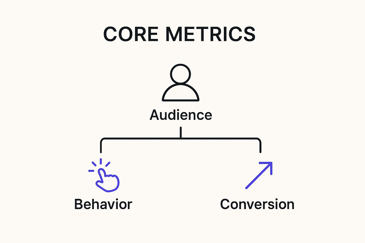
You can see the logical flow here: you first need to understand your audience, then analyze their actions, which ultimately helps you measure whether you're achieving your goals.
Audience Metrics: Who Are They?
Before you can figure out what people are doing, you need to know who they are. Audience metrics paint a high-level portrait of the people arriving at your digital doorstep.
- New vs. Returning Users: This is your first clue about growth and loyalty. Are you constantly attracting fresh faces, or are you building a dedicated following? A healthy site has a good mix of both. You need new users to grow, and you need returning users to prove you're valuable.
- Device Type: Are people browsing on a desktop during their lunch break or scrolling on their phones while on the go? Knowing this is crucial. It directly informs your design choices and helps you prioritize a seamless experience on the devices your audience actually uses.
- Geolocation: Understanding where your visitors are physically located is incredibly powerful. It can guide everything from your marketing campaigns and ad targeting to the language and cultural references you use in your content.
These data points provide essential context. For instance, if you see a huge surge in mobile users from a specific country, you know exactly where to focus your efforts to improve their experience and win them over.
Behavior Metrics: What Did They Do?
Okay, so people have arrived. Now what? Behavior metrics track their journey, revealing how interesting, engaging, and easy-to-use your site really is.
Think of these as the "story" metrics. They don't just count people; they describe the path each visitor takes, highlighting the pages that grab their attention and the spots where they lose interest and drop off.
Here are the key behavioral clues to watch:
- Bounce Rate: This is the percentage of visitors who land on a page and leave without clicking anything else. Think of it as digital window shopping. A high bounce rate often means your landing page isn't compelling enough to pull people deeper into your site.
- Pages per Session: On average, how many pages does a user visit before they leave? A higher number is usually a good sign, suggesting that visitors are engaged and finding more content they're interested in.
- Average Session Duration: This tracks the average amount of time people spend on your site during a single visit. For a deeper dive into what this number really means for your business, you can explore our complete session duration guide.
Conversion Metrics: Did They Succeed?
This is where the rubber meets the road. Conversion metrics tell you if your visitors are completing the specific actions you want them to take. This is how you connect your website's performance directly to tangible business results.
A conversion is any valuable action a user takes—it could be signing up for your newsletter, downloading a whitepaper, or, of course, making a purchase. The Conversion Rate is the percentage of visitors who complete that goal. For many, this is the single most important number on the dashboard because it measures outcomes, not just traffic.
To make this clearer, let's organize these metrics based on the business questions they help you solve.
Key Metrics and Their Business Impact
The table below summarizes these essential metrics, showing what each one measures and the critical business question it helps you answer.
| Metric Category | Example Metric | What It Measures | Key Business Question Answered |
|---|---|---|---|
| Audience | New vs. Returning Users | The ratio of first-time visitors to those who have visited before. | Are we acquiring new customers and retaining old ones? |
| Audience | Device Type | The percentage of users on desktop, mobile, or tablet devices. | Where should we focus our design and UX efforts? |
| Behavior | Bounce Rate | The percentage of single-page sessions where the user left without interacting. | Is our landing page content engaging and relevant? |
| Behavior | Average Session Duration | The average length of time a user spends on the site in a single session. | Is our content holding visitors' attention? |
| Conversion | Conversion Rate | The percentage of users who complete a desired goal (e.g., purchase, signup). | Is our website effectively achieving its business goals? |
By focusing on metrics that answer direct questions, you can quickly assess performance and identify exactly where you need to make improvements.
Designing a Dashboard for Action, Not Just Reporting
A web analytics dashboard packed with data is worse than useless—it’s a distraction. The real magic happens when you transform that data dump into a strategic tool that actually inspires you to do something. It's all in the design. The goal is to build a visual story that tells you exactly how your website is performing and what to do next.
Think of it this way: you wouldn't use a hammer to turn a screw. In the same vein, a line chart is perfect for showing a trend over time, like your user growth from month to month. A bar chart, on the other hand, excels at comparing separate categories, like figuring out which social media channel sends you the most traffic. Matching the right visualization to the right metric is the first, most crucial step toward clarity.
Create a Logical Information Hierarchy
The best dashboards all follow one simple, powerful rule: put the most important stuff first. Your most critical KPIs should live right at the top, giving you a five-second health check of your entire website at a single glance.
From there, the rest of the layout needs to make sense. Group related metrics together so they tell a cohesive story. For instance, putting your traffic sources right next to your top landing pages helps you connect the dots between where people are coming from and what they see first.
Your dashboard's layout should read like a good news story, with the headline at the top and the supporting details unfolding below. If someone can't get the gist in under a minute, the design simply isn't working hard enough.
To get this structure right, you have to organize your data to answer your biggest business questions in a logical order. For a more detailed look at structuring data for traffic analysis, you can check out our guide to building an effective traffic dashboard.
Use Visual Cues Intentionally
Color and formatting aren't just for making things look pretty; they're your most powerful communication tools. When you use them with a clear purpose, they can instantly draw attention to what really matters.
- Consistent Color Coding: Stick to a simple system. Maybe green signals a positive trend (like more conversions), while red flags a negative one (like a climbing bounce rate). This consistency makes scanning the dashboard for quick insights a breeze.
- Minimalist Design: Get rid of the clutter. Every chart, border, and line of text should have a reason to be there. White space is your best friend—it gives your data room to breathe and makes it much easier to process.
- Clear Labels and Titles: Every single chart needs a crystal-clear title. Ditch the jargon and make it obvious what someone is looking at without them having to play detective.
This focus on clear, actionable design is becoming more important every day. The web analytics market is on track to hit USD 7.98 billion by 2025, and the fastest-growing part of that is customer journey mapping. This trend tells us one thing: businesses are desperate to understand complex user behavior, and a well-designed dashboard is the only way to do it. Discover more insights on web analytics market growth from Mordor Intelligence.
How AI Is Making Analytics Smarter
Traditional analytics dashboards are fantastic at giving you a clear picture of what happened yesterday. They show your traffic, bounce rates, and conversions with solid accuracy. But what if your dashboard could predict what's coming tomorrow and give you a heads-up on how to prepare? That’s exactly where artificial intelligence (AI) is stepping in and changing everything.
AI and machine learning are fundamentally upgrading the modern web analytics dashboard. It’s no longer just a passive rearview mirror; it's becoming an active, intelligent partner. Instead of simply reporting numbers, these smarter tools can analyze data on the fly, find patterns you'd never spot on your own, and offer insights that used to require a team of data scientists.
From Reporting to Predicting
The biggest leap forward is the move from reactive to proactive analysis. An AI-powered dashboard doesn't just tell you sales dropped last Tuesday; it digs in to figure out why.
Think about what this looks like in practice:
- Anomaly Detection: Imagine your dashboard suddenly flags an unusual traffic spike from a specific country. It alerts you immediately, so you can figure out if it's a wildly successful ad campaign or a bot attack before it throws off all your metrics.
- Predictive Analytics: The system sifts through the behavior of thousands of past visitors to spot conversion patterns. It can then predict which of your current visitors are most likely to buy, letting you target them with a perfectly timed offer or chat support.
- Automated Insights: Forget manually comparing a dozen different reports. The AI connects the dots for you, surfacing gems like, "Heads up: Visitors from social media using a mobile device have a 30% higher conversion rate on your new landing page."
A smart web analytics dashboard closes the gap between data and action. It stops saying, "Here are your numbers," and starts asking, "Have you considered doing this?"
This shift is happening fast. As AI and machine learning become more integrated into analytics platforms, the ability to process data in real-time and generate complex predictions is becoming the new standard. This is all driven by the need to create more personalized customer experiences, a trend you can read more about in this web analytics market report.
Making Data Science Accessible
Maybe the best part of all this is that it puts powerful insights into everyone's hands. AI takes care of the heavy lifting—the complex statistical modeling—and presents the results in plain English.
You no longer need a degree in data science to figure out why your bounce rate spiked or which blog posts are actually connecting with your audience. The dashboard itself becomes your analyst, suggesting optimizations and pointing out opportunities you might have otherwise missed.
Common Dashboard Mistakes and How to Avoid Them
Even the best web analytics dashboard can lead you down the wrong path if you're not careful. A few common missteps can easily turn what should be a strategic asset into a source of complete confusion. Knowing what these pitfalls are is the first step to making sure your insights are solid and your decisions are smart.
The most common trap is chasing vanity metrics. These are the numbers that feel good to report but don't actually mean anything for the business—think total pageviews or social media likes. Sure, having 100,000 pageviews sounds amazing, but if your e-commerce store only made 10 sales from them, you don't have a success story; you just have a lot of traffic going nowhere.
The fix? Anchor your dashboard to the KPIs that truly matter to your bottom line. Focus on metrics like conversion rates, customer lifetime value, or cost per acquisition. These numbers tell the real story of your business's health.
Ignoring Audience Segmentation
Another huge mistake is treating all your visitors as one big, uniform group. Your overall bounce rate might be sitting at 45%, but that single number is hiding the real story. It could be masking a fantastic 15% bounce rate from your organic search visitors and a disastrous 75% from a specific ad campaign.
If you aren't segmenting, you're blind to both your biggest wins and your most urgent problems.
Averages can be deceptive. The real insights in your web analytics dashboard come from comparing different segments, such as traffic sources, device types, or user locations, to see the complete picture.
Always, always break down your data. Filter your reports to see how different groups behave. This is how you find the actionable stuff, like realizing your mobile experience is frustrating users or that one marketing channel is basically just burning money.
Overreacting to Short-Term Fluctuations
Finally, resist the urge to make massive strategy changes based on a single day's data. A sudden traffic drop might just be a holiday, a small technical glitch, or a random fluke. It doesn't automatically mean your entire content strategy has failed overnight. Good analysis is about spotting trends, not reacting to blips.
The solution is simple: zoom out. Before you jump to any conclusions, expand your date range to compare performance week-over-week or month-over-month. This helps you separate the meaningless noise from a genuine pattern, ensuring your big decisions are based on stable trends, not daily volatility.
Putting It All Together with Swetrix
Knowing the theory behind a great web analytics dashboard is one thing, but seeing it work in the real world is where it all comes together. A good tool doesn't just show you numbers; it tells you a story about your website in a way you can instantly understand. Swetrix was built on this very principle, aiming for powerful insights while keeping things simple and respecting user privacy.
Instead of burying you in a mountain of menus and jargon-filled metrics, the Swetrix dashboard puts the most important information front and center. It’s designed to answer your biggest questions right away: Where are people coming from? Which pages are getting all the attention? Are my marketing campaigns actually working? This gets straight to the point, focusing on insights you can act on, not just data you can report on.
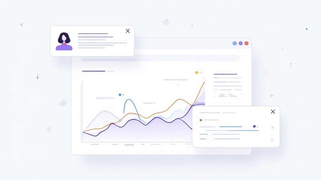
A Focus on Clarity and Usability
Let's be honest, many analytics platforms feel like they were built for data scientists. That complexity is a major barrier for marketers, founders, and content creators who just need clear answers. Swetrix was designed to cut through that noise. The interface is clean and intuitive, grouping metrics together logically so you can see the relationships between different data points.
This screenshot of the main Swetrix dashboard shows exactly what I mean. It’s a bird's-eye view of your site's health.
Without digging through a single report, you immediately see trends in unique visitors and bounce rate. You also get visual charts for your top pages, traffic sources, and where in the world your audience is. Everything you need for a quick pulse check is right there.
Privacy First Without Sacrificing Insight
In an era where data privacy isn't just a buzzword but a customer expectation, Swetrix gives you a huge advantage. It's a cookieless platform. That means you can get the analytics you need without the creepy tracking that turns off users and creates headaches with regulations like GDPR. This ethical approach doesn’t water down your data; it just means you’re getting smart insights while respecting your visitors.
Swetrix proves that you don't have to choose between getting powerful user insights and protecting user privacy. A well-designed platform can deliver both, giving you the confidence to make data-informed decisions ethically.
With Swetrix, you still get all the essential metrics and features you'd expect:
- Real-Time Data: Watch what’s happening on your site this very minute.
- User Journeys: Trace the actual paths visitors take, from the page they land on to the moment they leave.
- UTM Campaign Tracking: Get a clear, accurate picture of how your marketing efforts are paying off.
- Performance Monitoring: Look beyond traffic and pageviews to see how your site's loading speed is affecting the user experience.
By combining a clean design, the right metrics, and a privacy-first mindset, Swetrix makes data clarity something anyone can achieve. It's the perfect example of what a modern web analytics dashboard should be: a tool that helps you truly understand your audience and grow your business with confidence and integrity.
Still Have Questions? Let's Clear Things Up
After digging into the metrics, design, and strategy behind a great web analytics dashboard, a few practical questions almost always pop up. Let's tackle some of the most common ones I hear.
What Is the Most Important Metric?
This is the million-dollar question, but the honest answer is: there isn't one. The "most important" metric is whatever ties directly back to your business goals.
If you're running an e-commerce store, your world probably revolves around the conversion rate. But if you're building a content-heavy blog, you'll likely care more about session duration or how many pages a visitor reads. It all comes down to what you're trying to achieve.
The trick is to define your Key Performance Indicators (KPIs) first, then build your dashboard to spotlight those numbers. That way, the data you see every day is the data that actually moves the needle for your business.
How Often Should I Check My Dashboard?
This really depends on your role and how fast things change in your business. If you're in the middle of a big product launch or actively managing a marketing campaign, checking in daily makes a lot of sense. For higher-level strategic planning, though, looking at the data weekly or monthly gives you a much clearer picture of the real trends.
The key is to find a consistent rhythm and not get spooked by tiny, day-to-day blips. Set a schedule for reviewing trends over time instead of making knee-jerk decisions based on one day's numbers.
This discipline helps you act on meaningful patterns, not just random noise.
Can I Have Multiple Dashboards for My Website?
Not only can you, but you absolutely should. As your business grows, creating different dashboards for different teams or goals is one of the smartest things you can do.
Think about it this way:
- Your marketing team needs a dashboard that's all about campaign results, where traffic is coming from, and lead generation.
- Meanwhile, your product team needs a totally different view—one focused on how people are using new features, navigating user funnels, and sticking around over time.
Giving each team a tailored view ensures the data they see is immediately relevant to their work. It turns the dashboard from a one-size-fits-all report into a focused, powerful tool for everyone.
Ready to turn your data into clear, actionable insights without sacrificing user privacy? Swetrix offers a clean, intuitive, and cookieless analytics platform built to help you make smarter decisions. Start your 14-day free trial today and see what you've been missing.