- Date
How To Measure Cumulative Layout Shift Effectively
 Andrii Romasiun
A user reaches for the "Add to Cart" button on your mobile site, but right before their finger taps the glass, an advertising banner finishes loading at the top of the screen. The entire page content pushes downward, moving the button out of the way, which causes the user to tap an empty space or accidentally click the ad and leave your site.
That unexpected movement is Cumulative Layout Shift (CLS). You must track this metric to stop accidental clicks from destroying your conversion rates. Default lab tools often miss these shifts because they simulate a clean, initial load, so measuring true visual stability requires tracking how your layout behaves in the wild as real humans scroll, tap, and interact. We built Swetrix to capture that field data directly from your visitors without relying on invasive cookies or heavy consent banners that cause layout shifts.
Defining Cumulative Layout Shift
Cumulative Layout Shift quantifies visible layout instability by tracking elements that change their starting position from one rendered frame to the next without direct user input. The metric ignores new elements appearing on screen as long as they do not push existing content around.
How The Calculation Window Works
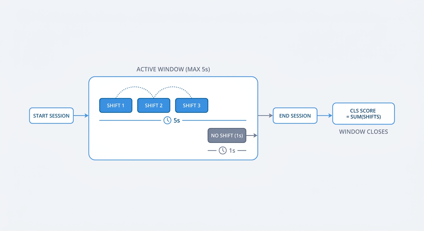
The browser calculates scores by grouping rapid successive visual shifts into specific blocks called "session windows." The maximum length of a single session window is exactly five seconds, though a window closes prematurely if the page registers one full second with zero shifting.
The browser adds up the severity of every shift within a window based on how much distance the element traveled and how much of the viewport it impacted, and the highest scoring window across the entire page lifecycle determines the final CLS grade. Single Page Applications (SPAs) require extra attention because users stay on the same route longer and trigger new components via JavaScript, causing these sites to accumulate multiple session windows rapidly.
Any layout change triggered by a direct user action earns a 500-millisecond grace period. If a user clicks an accordion menu and the content expands downward instantly, the browser categorizes the movement as expected and applies no penalty, but if the server delays the expansion for 600 milliseconds, the grace period expires and the movement damages your score.
The Business Impact Of CLS
Visual stability dictates user trust and revenue. A WPO Stats case study demonstrated that optimizing CLS to near zero alongside a faster Largest Contentful Paint increased conversion rates by 3% and page views per session by 9% across standard e-commerce environments. Fixing layout shifts stops accidental interactions that inflate bounce rates and skew marketing attribution data.
To pass Google's Core Web Vitals assessment, a page must maintain a score of 0.1 or below at the 75th percentile of all recorded user sessions. Scores ranging from 0.11 to 0.25 fall into the "Needs Improvement" category, while anything above 0.25 flags the page as "Poor" and threatens its standing in search engine results.
How To Measure Cumulative Layout Shift Accurately
Tracking visual stability requires a combination of synthetic tests and real user environments, because relying on a single data source leaves massive performance blind spots. You should establish a baseline in the lab before validating those metrics with live audience data.
Lab Data VS Field Data Differences
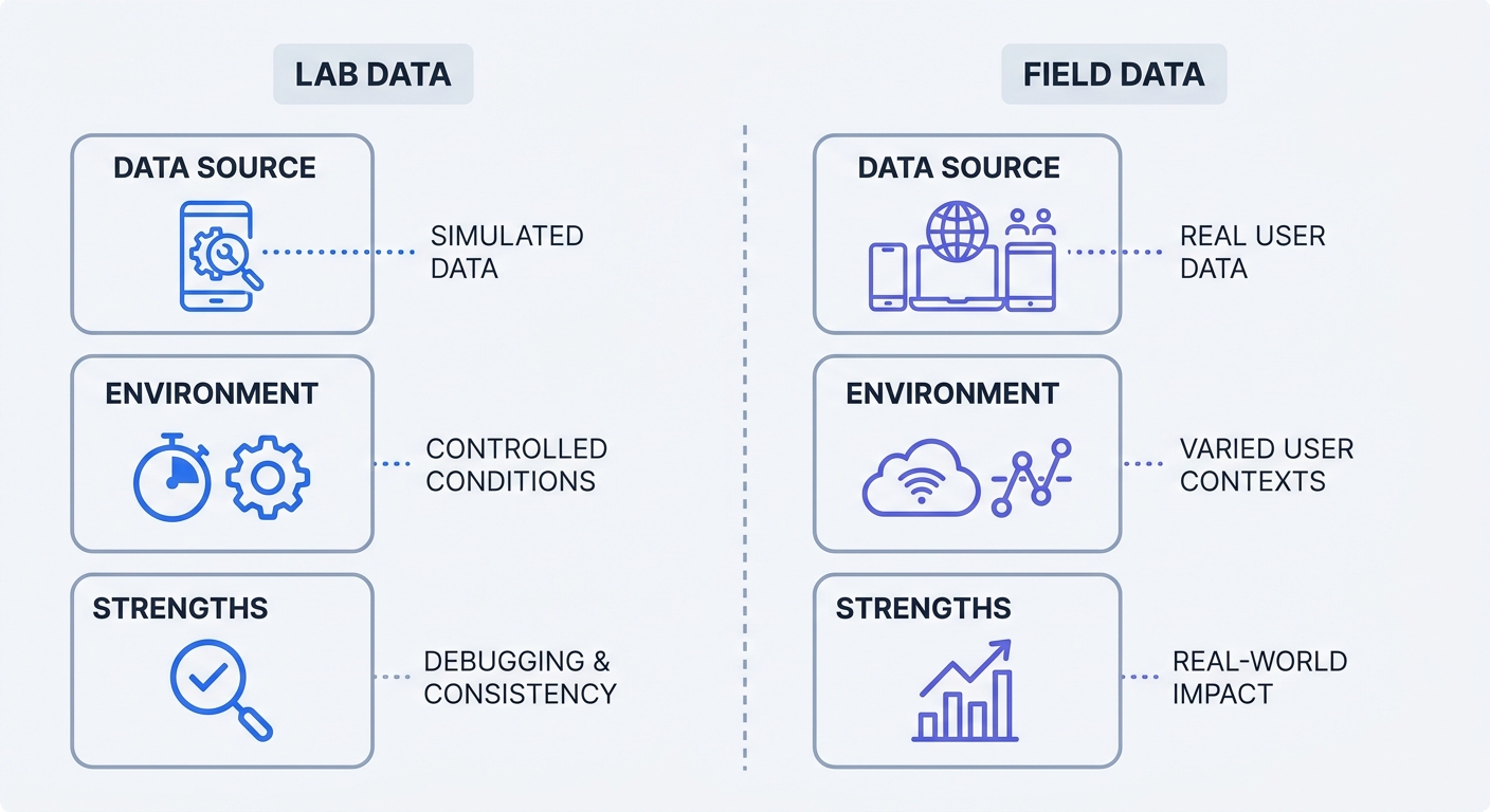
You will frequently encounter misleading metrics when auditing web performance using lab tools like Lighthouse and PageSpeed Insights. These utilities run inside a controlled, synthetic environment where they simulate a mobile device on a static connection, record the initial render, and stop.
Lab tests fail to scroll down the page, interact with tabs, resize the browser window, or wait for third-party ad networks to inject dynamic creatives. You can pass a Lighthouse run with a perfect 0.0 CLS on your local machine and completely fail in production because the lab never triggers the elements causing the instability.
Google Chrome UX Report And PageSpeed Insights
To see what real humans experience, consult the Chrome UX Report (CrUX) inside Google Search Console, which aggregates field data from opted-in Chrome users across a 28-day rolling window.
Open PageSpeed Insights, enter your URL, and check the top section labeled "Discover what your real users are experiencing" to view your CrUX field data. If your field data registers as "Poor" while your lab data shows a passing grade, unrendered late-loading elements are shifting the layout as users interact with the page over time.
Swetrix For Privacy-Centric Real User Monitoring
CrUX data updates too slowly to guide active development, and relying on a 28-day rolling average leaves you blind to how yesterday's code deployment affected stability today. You must implement Real User Monitoring (RUM) to bridge this gap.
By integrating the open-source web-vitals library with Swetrix, you capture exact CLS scores from every live visitor. The platform uses a lightweight script to monitor Core Web Vitals in the browser and sends that data to your dashboard in real time. Because Swetrix operates without cross-site tracking cookies, it never collects Personally Identifiable Information (PII), allowing you to secure performance visibility without violating GDPR or CCPA standards.
Identifying The Main Culprits Of Layout Instability
Before writing CSS to fix a shift, you must pinpoint the exact DOM node responsible for the movement by tracking performance traces in your browser's developer tools.
GDPR Cookie Banners Above The Fold
Privacy compliance tools frequently destroy layout scores. When you deploy a heavy third-party cookie consent banner, it injects itself at the top of the viewport after the main DOM finishes loading. The browser renders the page, the JavaScript executes, and the banner forces your entire header and main content downward.
This late injection triggers an immediate layout penalty, but switching to a privacy-friendly analytics platform like Swetrix means you do not need tracking cookies. Removing those cookies allows you to drop the obtrusive consent pop-up, eliminating a major source of visual instability.
Dynamic Ads And Unsized Media
Late-loading embeds cause severe layout changes because generative AI summary modules, personalized UI widgets, and third-party advertising iframes rarely declare their physical dimensions upfront.
The browser parses the HTML and continues rendering text because it has no spatial data for the incoming media. Once the server delivers the asset, the browser recalculates the layout geometry and pushes everything below the asset down the screen to make room.
Web Fonts And The FOUT Effect
Custom typography introduces subtle layout shifts. When a custom web font takes too long to fetch over the network, the browser temporarily displays a generic system fallback font.
Once the network delivers the custom font, the text snaps into its new style, creating an event called the Flash of Unstyled Text (FOUT). Because different fonts have unique character widths and line heights, swapping them resizes words and shifts surrounding paragraphs, meaning a single font change in your navigation bar can push the page body down by several pixels.
Proven Techniques To Fix Cumulative Layout Shift
Stop guessing which elements move and open Chrome DevTools, navigate to the Animations tab, and enable "Layout Shift Regions." This feature highlights shifting DOM nodes in blue as you reload and scroll the page, allowing you to locate the movement and apply specific structural fixes.
Statically Sizing Images And Video Containers
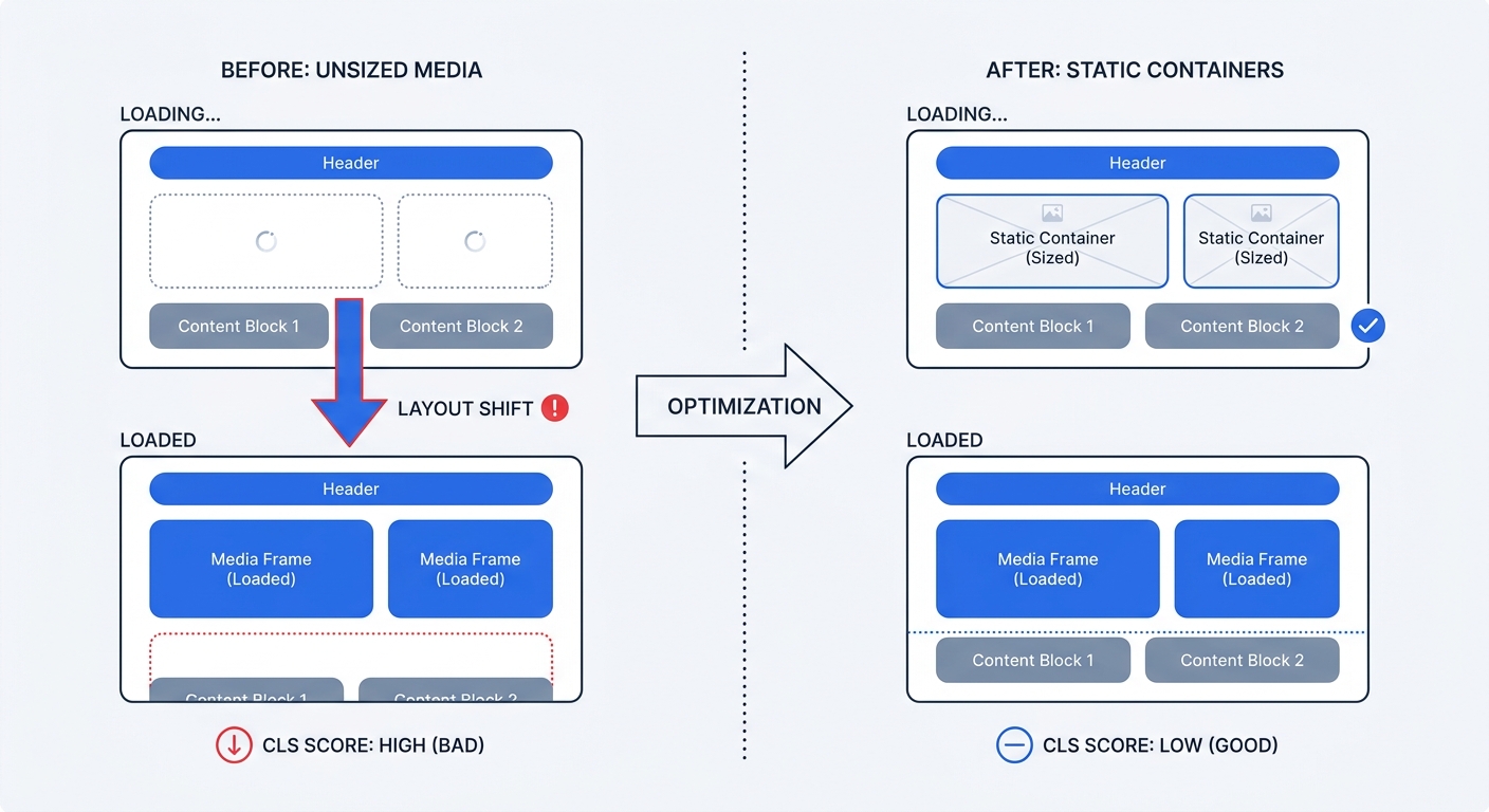
Give the browser explicit spatial instructions before visual assets arrive by declaring the width and height attributes directly on your HTML media tags.
<img src="hero.jpg" width="800" height="400" alt="Dashboard"><video src="demo.mp4" width="1920" height="1080"></video><iframe src="embed.html" width="500" height="300"></iframe>
Modern browsers use these attributes to compute the aspect ratio and reserve an empty bounding box matching that geometry while the asset downloads. Content below the box renders in its final position immediately, eliminating the layout shift.
Managing Third-Party Injections Properly
While you cannot always predict the exact height of a programmatic ad slot, you can define a structural baseline by applying CSS min-height to the container wrapping the dynamic injection.
If you expect a standard 250-pixel tall banner, assign min-height: 250px to its parent <div class="ad-slot"> so the browser reserves that vertical space during the initial render. If the ad network fails to return a creative or a user runs an ad blocker, leave the empty space intact, as collapsing an empty ad container forces a layout shift just as severely as expanding one. You should never insert dynamic promotional banners above existing content unless they respond directly to a user's tap.
Preloading Critical Fonts Safely
Control how the browser handles custom typography swaps by adding font-display: optional or font-display: swap to your CSS @font-face declarations. This rule instructs the browser to use the fallback font immediately, ensuring text remains visible during network delays.
To prevent the resulting FOUT from shifting paragraphs, use the CSS size-adjust descriptor to scale the fallback font's glyphs to match the exact physical dimensions of your final web font. Adjusting these metrics forces the fallback to consume the same amount of spatial room as the custom typography, rendering the eventual font swap structurally stable.
Monitoring Core Web Vitals Continuously
Performance optimization requires ongoing attention because you deploy new tag managers, embed heavy videos, and push updated typography styles daily.
Tracking Mobile VS Desktop Variances
Devices experience layout shifts differently. HTTP Archive data shows that 81% of mobile pages across the general web pass the 0.1 CLS threshold, but looking at all three Core Web Vitals combined reveals a massive performance gap across industries. Only 48% of mobile pages pass the complete assessment, compared to 56% of desktop pages, though this pass rate ranges from 35% to 76% depending on the specific sector.
Network speeds fluctuate on cellular connections, and narrow mobile viewports stack content vertically, meaning a small 20-pixel shift on a 4K monitor might go unnoticed while the exact same shift on a phone screen pushes interactive elements out of view. Segment your real user monitoring data by device type to isolate mobile-specific layout collapses that desktop lab tests ignore.
Building A Long-Term Optimization Workflow
Connect your RUM data to your weekly engineering routines by setting up custom event tracking in Swetrix to monitor pages with high traffic volume and frequent dynamic updates.
When you schedule a product launch containing multiple third-party embeds, watch the specific landing page dashboard during the first 24 hours. Catching a layout shift early prevents a rolling 28-day penalty in Google Search Console, giving you time to fix the CSS container and verify the visual stability locally using DevTools before real user data processes the next day.
Stop flying blind with outdated lab tests and heavy tracking scripts that ruin your layout scores. Swetrix offers a privacy-focused, cookie-free web analytics platform with built-in Core Web Vitals monitoring, providing real-time field data without requiring invasive consent banners. Plans start at $19/mo for 100,000 events, allowing you to start your 14-day free trial today and see exactly what your real users experience.