- Date
How to improve website conversion rates: Proven Tips
 Andrii Romasiun
If you want to boost your website's conversion rates, you need to get inside your visitors' heads and figure out what's stopping them from taking that next step. It’s not about obsessing over every little metric; it's about finding the friction points in their journey and smoothing them out. This is where privacy-first analytics tools become invaluable, letting you understand user experience without compromising trust.
Moving Beyond Metrics to Understand Your Visitors
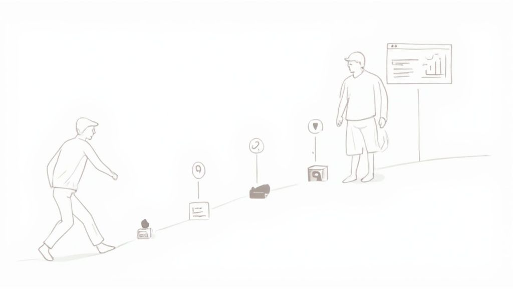
Boosting conversions is less about chasing numbers and more about genuinely understanding what your visitors need. So many businesses fall into the trap of endlessly tweaking button colors or A/B testing headlines, hoping for a quick win. While those details can make a difference, they're often just scratching the surface. Real, lasting improvements come from understanding the "why" behind what people do on your site.
Forget the generic advice for a moment and focus on the actual experience. Are visitors getting lost? Is your checkout process a headache? Is that brilliant feature you built impossible to find? Answering these questions is the real secret to learning how to improve website conversion rates.
Why Privacy-First Analytics Is Key
Let's be honest, traditional analytics tools can be invasive, often relying on cookies and tracking methods that make users uncomfortable. This is where privacy-first platforms like Swetrix change the game, offering powerful insights without crossing ethical lines. This isn't just about doing the right thing; it's good business. When visitors feel their privacy is respected, they're far more likely to stick around.
A tool that prioritizes privacy helps you gather the crucial data needed to make smart decisions.
- Identify High-Exit Pages: Find the exact pages where people are giving up and leaving. This is your starting point for any investigation.
- Track User Journeys: See the common paths visitors take through your site. This reveals what content is actually pushing them closer to a conversion. If you're new to this concept, looking at some customer journey mapping examples is a great way to get started.
- Monitor Core Events: Figure out which calls-to-action are getting clicks and which are being ignored, all without collecting personally identifiable information.
By focusing on behavioral patterns instead of personal data, you get a clearer, unbiased picture of your site's performance. This allows you to fix real usability issues that are actively hurting your conversions.
Ultimately, this approach helps you build a more intuitive and user-friendly website. The result? A smoother experience that builds trust, encourages people to come back, and naturally leads to more conversions.
How Page Load Speed Directly Impacts Your Conversions
We’ve all been there: you click a link, wait, and then bounce because the page just won't load. That tiny moment of frustration is more than just an annoyance—it's a conversion killer. Every second of delay chips away at your visitor's patience and trust, sending them straight to your competition.
It doesn't matter how brilliant your product is or how stunning your design is. If the page doesn't load quickly, most people will never even see it. This is why respecting your visitor's time is the first rule of conversion optimization.
The numbers are staggering. Research consistently shows that a site loading in one second can have conversion rates three times higher than one that takes five seconds. When you stretch that out to a ten-second load time, the one-second site converts five times better. Speed isn't just a feature; it's a direct driver of revenue.
The data below, drawn from industry studies, paints a clear picture of just how much a faster site can boost your bottom line.
Impact of Page Load Speed on Conversion Rate Lift
| Page Load Time | Potential Conversion Rate Improvement |
|---|---|
| 5 Seconds | Baseline |
| 3 Seconds | +33% |
| 2 Seconds | +100% |
| 1 Second | +200% |
As you can see, the jump from even a "pretty good" 3-second load time to a fantastic 1-second load time can double your conversions. The difference is too significant to ignore.
Pinpointing Performance Bottlenecks
So, where do you start? Before you can fix what's slow, you need to know what's slow and why. Guesswork won't cut it. This is where a tool like Swetrix becomes invaluable. It gives you the real-world data to see exactly which pages are lagging for actual users.
Is it your homepage that's dragging its feet? Or maybe a specific product page loaded with high-resolution images is the real problem. Swetrix helps you zero in on these bottlenecks so you can focus your efforts where they'll make the biggest difference.
Instead of a vague feeling that "my site seems slow," you get concrete insights like, "our checkout page on mobile devices in Europe is costing us sales." That's the kind of specific, actionable data that leads to real improvements.
Actionable Steps for a Faster Website
Once you've identified the problem areas, you can start making targeted fixes. Even shaving off a single second can create a noticeable lift in conversions. Here are a few practical places to begin:
- Optimize Your Images: Large, uncompressed images are the usual suspects. Use modern formats like WebP that provide excellent quality with much smaller file sizes. Also, be sure to implement lazy loading, which prevents images from loading until a user actually scrolls down to them.
- Leverage Browser Caching: Caching allows you to store static parts of your site—like your logo, CSS files, and key images—on a visitor's device. When they come back, their browser can load those files locally instead of re-downloading them, making return visits feel almost instant.
- Get the Right Hosting: Your hosting is the foundation of your site's performance. A cheap, shared hosting plan might have been fine when you started, but if your traffic has grown, the server might be struggling. Upgrading your plan or moving to a better provider can give you an immediate speed boost.
Improving site speed is an ongoing process, not a one-and-done task. For a deeper dive into more advanced techniques, check out our guide on website performance optimization tips.
Weave in Social Proof and User-Generated Content
While you can fine-tune the technical stuff all day, what really moves the needle on conversions is the human element. We're all a bit skeptical of marketing promises, right? But we tend to trust what other people—our peers—have to say about a product or service. This is the power of social proof.
Bringing authentic customer voices onto your website is one of the smartest things you can do to build instant credibility. When a potential customer sees someone just like them raving about your product, it melts away their hesitation and validates their interest.
This is where user-generated content (UGC) comes in. I'm talking about reviews, testimonials, case studies, and customer photos. This isn't just about slapping a few star ratings on a page; it’s about making your customers' success stories a core part of your website's experience.
Weaving Customer Voices Into Your Site
The trick is to make social proof feel like a natural part of the conversation, not a random add-on. You need to show the right kind of proof at the exact moment a visitor is starting to have doubts.
Think about the key decision-making spots on your site:
- Product Pages: Place detailed reviews and customer-submitted photos right next to your product descriptions. This is your chance to answer specific questions and show your product being used in the real world.
- Landing Pages: Lead with a powerful testimonial from a customer who perfectly represents your ideal client. It helps new visitors instantly picture themselves getting the same great results.
- Checkout Process: Sometimes all it takes is a final bit of reassurance. A simple quote or a banner saying "Join 5,000+ happy customers" can be the final nudge someone needs to click "buy."
Don't underestimate how well this works. Research consistently shows that when visitors interact with UGC, their chance of converting can literally double—we're talking a potential conversion rate lift of up to 102%. Even just the act of scrolling through reviews can bump conversions by almost 4 percentage points. If you want to dig into the numbers, there's some great data on how UGC impacts eCommerce conversions on redstagfulfillment.com.
Your happiest customers are your best salespeople. Giving them a platform to share their experiences builds a level of trust that no marketing copy can replicate. It shows you’re confident in your product and transparent with your audience.
How to Encourage and Collect Authentic UGC
Of course, you can't showcase UGC if you don't have any to begin with. The good news is, most happy customers are more than willing to share their feedback. You just have to make it incredibly simple for them.
A great place to start is with an automated post-purchase email. A few days after an order is delivered, send a friendly, personal-sounding email asking for a review. Keep the message short, sweet, and provide a direct link to the review form.
Want to sweeten the deal? Offering a small incentive, like a discount on their next purchase, can work wonders for your response rates. This simple system creates a steady flow of fresh, authentic content that will keep working to boost your website conversion rates long into the future.
Analyzing Your Funnel With Privacy-First Analytics
Think of your website not as a collection of pages, but as a journey you want every visitor to complete. The problem is, many get lost or give up along the way. Figuring out how to improve your website's conversion rates starts with mapping out that journey, and a conversion funnel is the perfect tool for the job.
A funnel simply visualizes the path someone takes from a starting point—like a landing page—to a final goal, whether that's making a purchase, signing up, or filling out a form. Your job is to make that path as smooth and painless as possible.
Identifying Where Users Drop Off
The real magic of a funnel is its ability to pinpoint the exact moments people leave. Without this, you're flying blind. Is it a confusing form field on the signup page? Or are unexpected shipping costs at checkout causing cart abandonment?
When you set up funnel tracking, you stop guessing and start knowing. Privacy-first analytics tools like Swetrix let you define the key steps of your ideal customer journey. From there, you can see the percentage of users that successfully make it from one stage to the next.
This immediately shows you where the biggest leaks are. A 3% overall conversion rate might feel discouraging, but what if you discover that 50% of users who start checkout abandon their cart on the payment page? Suddenly, you have a clear, high-impact problem to solve. Fixing that one leaky step can dramatically boost your overall success.
This visual process shows how collecting reviews, displaying them prominently, and then guiding users to convert creates a powerful cycle of trust.
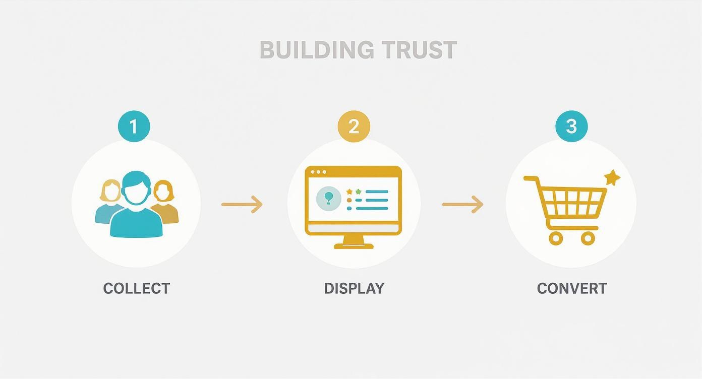
As the flow shows, building trust isn't a one-off action; it's a repeatable process that directly fuels higher conversions.
Setting Up Funnels Without Compromising Privacy
Traditional analytics often rely on cookies and invasive tracking methods that users are increasingly wary of. The good news is, you don't need them. Platforms like Swetrix empower you to analyze user behavior in a completely ethical and compliant way. You can build out your funnels by tracking key events and page views without collecting any personal data.
For an e-commerce site, a typical funnel might be broken down into these four key actions:
- Visited Product Page: The user is showing interest.
- Clicked 'Add to Cart': They've taken a concrete step forward.
- Reached Checkout Page: This signals strong purchase intent.
- Completed Purchase: The ultimate conversion goal.
A clean, privacy-first dashboard can give you all the information you need at a glance, showing you exactly how your site is performing without ever compromising the trust of your visitors.
By focusing on anonymized, aggregated data, you get a clear, unbiased picture of user behavior. This helps you identify and fix the real usability issues that are actively hurting your bottom line.
Whether you're using a managed service or prefer to have full control over your data, this type of analysis is within reach. If you're technically inclined and interested in managing your own infrastructure, our guide to self-hosted web analytics offers a detailed walkthrough.
At the end of the day, funnel analysis isn't about watching every single click. It's about understanding the collective journey and systematically removing the roadblocks that stand between your visitors and "mission accomplished."
Crafting High-Converting Calls to Action
https://www.youtube.com/embed/c2G-9vyDB5k
Think of your Call to Action (CTA) as the final handshake. Every other element on your page builds trust and guides the visitor, but the CTA is where they make the final decision. A weak or uninspired button can bring a user's journey to a dead stop, undermining everything you've built up to that point.
A truly great CTA doesn't just sit there waiting to be clicked; it inspires action. It should be the most visually striking and persuasive element on the page, grabbing the user's attention and making it crystal clear what happens next. This is your last, best chance to seal the deal.
Make Your CTAs Impossible to Ignore
The best CTAs are a potent mix of clear language and smart design. Vague, generic phrases like "Submit" or "Click Here" are tired relics from a bygone era of the web. Modern users demand clarity and value. Your button copy should be a direct command that promises a tangible outcome.
For example, simply changing "Download" to "Get Your Free Ebook" makes a world of difference. This tiny tweak shifts the focus from what the user has to do to the value they're about to get. It's a fundamental step in learning how to improve website conversion rates.
A few core principles can make an immediate impact:
- Use Action-Oriented Verbs: Kick off your CTA with a strong command word. Think "Start," "Get," "Join," or "Create."
- Create Visual Contrast: Your CTA button has to pop. Use a color that stands out from your page's palette, ensuring it doesn't just blend into the background.
- Consider Strategic Placement: Put your CTA where a user’s eyes will naturally land after reading your value proposition—usually above the fold or right at the end of a key section.
A well-placed CTA feels like a natural conclusion to the information a user has just consumed. It's the logical next step, not a jarring interruption.
Test Your Way to Better Conversions
You can follow every best practice in the book, but you'll never really know what connects with your audience until you test it. This is where event tracking with a tool like Swetrix becomes your secret weapon.
By setting up custom events, you can track clicks on different CTA variations. This lets you run simple A/B tests to see what actually moves the needle. Does "Start My Free Trial" outperform "Sign Up for Free"? Does a bright green button get more action than a subdued blue one?
Data, not guesswork, should be driving these critical decisions. By tracking these small but vital interactions, you ensure your most important buttons are working as hard as possible to turn casual visitors into loyal customers.
Turn "Maybe Later" into "Yes, Now" with Email
Not every visitor is going to pull the trigger on their first trip to your site. Honestly, most won't, and that's completely normal. Thinking of this as a "lost sale" is a rookie mistake. The real win is earning a second chance to talk to them, and there’s no better way to do that than through email.
When someone gives you their email address, they're opening a direct line of communication. It's not about blasting them with sales pitches; it's about offering something genuinely valuable—like a killer ebook or a sweet first-purchase discount—in exchange for their permission to stay in touch. This simple trade can turn a one-time visitor into a long-term relationship.
Let Automation Do the Heavy Lifting
Once you've got that email, the magic can really start. This is where you can set up automated email sequences that kick in based on what a user actually does on your website. It’s all about sending the right message at the perfect time.
Think about these scenarios:
- The Cart Abandoner: Someone loads up their cart and then ghosts. An hour later, a friendly reminder lands in their inbox, maybe with a small incentive to seal the deal.
- The Repeat Browser: You see someone checking out the same product page for the third time. That’s your cue to send them a detailed case study or a feature guide that answers their unasked questions about that specific item.
- The New Subscriber: They just signed up for your newsletter. Welcome them with a short series of emails that tells your brand's story and highlights what customers love most.
This isn't about being pushy; it's about being helpful. You're showing them you're paying attention to what they're interested in and are ready to guide them to the right solution. That’s how you build real trust, one email at a time.
And the numbers don't lie. Email marketing consistently crushes other channels, boasting an average conversion rate of 2.6%. Why? Because you're no longer shouting into the void. You're talking to people who have already raised their hands and said, "I'm interested." You can dive deeper into these powerful email conversion rate statistics from Ruler Analytics.
By segmenting your audience and sending messages that actually resonate, you can transform hesitant visitors into loyal customers. This kind of smart, strategic follow-up is a cornerstone of knowing how to improve website conversion rates for good.
A Few Lingering Questions Answered
Even with a solid plan, a few questions always seem to pop up. Let's tackle some of the most common ones I hear from clients, so you can move forward with total clarity.
So, What’s a “Good” Conversion Rate, Really?
This is probably the number one question I get, and the honest answer is… it depends. There’s no magic number.
A "good" rate for an enterprise SaaS company selling six-figure contracts might be a tiny 0.5%, and they’d be thrilled. Meanwhile, an e-commerce store selling fun, affordable t-shirts could be shooting for 3% or even higher.
Instead of getting hung up on a universal number, do two things:
- Benchmark against your direct competitors if you can find reliable data.
- More importantly, focus on outdoing yourself. Aim for consistent, incremental growth over your own historical performance. That's the real win.
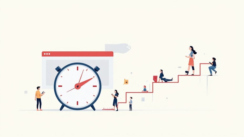
How Long Until I Actually See Any Results?
Patience is a virtue here, but some changes do deliver faster wins than others.
If you fix a major technical bug or drastically improve your page speed, you might see a lift almost immediately. But for the bigger, more strategic plays—like building a library of compelling case studies or refining your email nurture sequence—you need to give them time to breathe. Let them run for at least a few weeks to collect enough meaningful data before you decide if they're working.
The goal isn't a one-off spike in conversions; it's about building a sustainable growth engine. Focus on making steady, data-backed improvements, and the results will compound over time. That’s the secret of how to improve website conversion rates for the long haul.
Should I Prioritize Mobile or Desktop?
Both platforms matter, but if you have to pick one to focus on first, it has to be mobile. No question about it.
For most sites, mobile traffic eclipsed desktop years ago. Yet, conversion rates on mobile still often lag way behind. That gap isn't a problem; it's a massive opportunity waiting for you.
By prioritizing a truly seamless mobile experience—from lightning-fast load times to thumb-friendly buttons—you’ll be tackling the biggest point of friction for the majority of your visitors. The returns on that effort are almost always worth it.
Ready to stop guessing what works and start seeing real improvement? Swetrix delivers the privacy-first insights you need to understand your visitors and make decisions that actually move the needle. Start your 14-day free trial today.