- Date
Your Ultimate Guide to the Data Analytics Dashboard
 Andrii Romasiun
Think of a data analytics dashboard as your business’s mission control. It’s a single screen where all your most critical metrics and performance indicators are displayed in real-time, turning oceans of complex data into clear, visual insights. It’s designed to give you an immediate, at-a-glance understanding of how your business is doing, so you can spot trends and make smart decisions without getting lost in spreadsheets.
Understanding Your Business Cockpit
Imagine you’re a pilot. You don't have time to flip through separate manuals for engine status, fuel levels, and weather reports during a flight. Instead, you have a cockpit with all that crucial information displayed right in front of you—altitude, speed, system warnings. A data analytics dashboard does the exact same thing, but for your business. It pulls in data from all over the place, like your website traffic, sales numbers, and customer support channels, and arranges it all in one easy-to-understand visual hub.
This is its superpower: instant clarity. You no longer have to wait days for a weekly report to find out what's going on. You can see it as it happens. A good dashboard doesn't just throw numbers at you; it tells a compelling story about the health and momentum of your business.
From Raw Data to Actionable Insight
A dashboard really proves its value by bridging the gap between raw, messy data and a confident, informed decision. Without one, you're looking at a puzzle with a thousand scattered pieces. A dashboard is what puts that puzzle together for you.
This translation from chaos to clarity usually happens in three steps:
- Data Aggregation: First, it connects to all your different data sources—your website analytics, CRM, payment systems, you name it—and gathers all the relevant information into one central location.
- Data Visualization: Next, it transforms that raw data into charts, graphs, and other visuals. This makes it incredibly easy to spot patterns, outliers, and trends you’d never notice in a spreadsheet.
- Interactive Exploration: Finally, it lets you play with the data. You can filter, segment, and drill down to answer specific questions, like "Which marketing channel brought in the most new customers last quarter?"
A great dashboard empowers everyone in your company to stop asking "What happened?" and start asking "Why did it happen?" and, most importantly, "What should we do next?" It puts data into everyone's hands, making every team member a bit of an analyst.
This move from passively reading reports to actively exploring data is a game-changer. You’re not just looking at a static picture; you’re interacting with a live tool built for discovery. This is a foundational concept in the world of **web analytics**, where the goal is to truly understand user behavior.
Why Every Business Needs a Dashboard
When you're competing, speed and accuracy are everything. A data analytics dashboard delivers both. It automates the painful process of manual data collection and presents the findings in a format that anyone can understand instantly. Whether you're a founder tracking user growth or a marketer measuring campaign results, a dashboard gives you a serious advantage.
Dashboards are central to tracking your key performance indicators (KPIs) against your business goals. They help you pinpoint opportunities for growth and, just as crucially, catch problems before they spiral out of control. For example, a sudden nosedive in user engagement or a spike in website errors is something you’ll see immediately, not a week later.
Before we dive deeper, let’s quickly recap the main roles a dashboard plays.
Table: Key Functions of a Data Analytics Dashboard
| Function | Business Impact |
|---|---|
| Centralized Monitoring | Provides a single source of truth, eliminating data silos. |
| Real-Time Insights | Enables quick responses to market changes and operational issues. |
| Performance Tracking | Measures progress against KPIs and business goals effectively. |
| Data-Driven Decisions | Replaces gut feelings and assumptions with hard evidence. |
| Improved Communication | Aligns teams around common goals and shared metrics. |
Ultimately, a dashboard helps you trade guesswork for confidence. It ensures your big decisions are backed by real data, not just intuition. This is even more vital for businesses that respect customer privacy, as tools like Swetrix can provide these powerful insights without ever collecting personal data.
The Three Core Types of Analytics Dashboards
Not all dashboards are created equal. Think of it like a carpenter's toolbox—you wouldn't use a sledgehammer to drive a finishing nail. The right tool depends on the job. Similarly, the right data analytics dashboard depends entirely on what you're trying to accomplish, who's looking at it, and how fast you need answers.
Dashboards generally fall into three main buckets: operational, strategic, and analytical. Each one is built for a specific audience and a different kind of decision. Getting this right is the first step to building a data visualization strategy that actually delivers value. Let’s break down what makes each one tick.
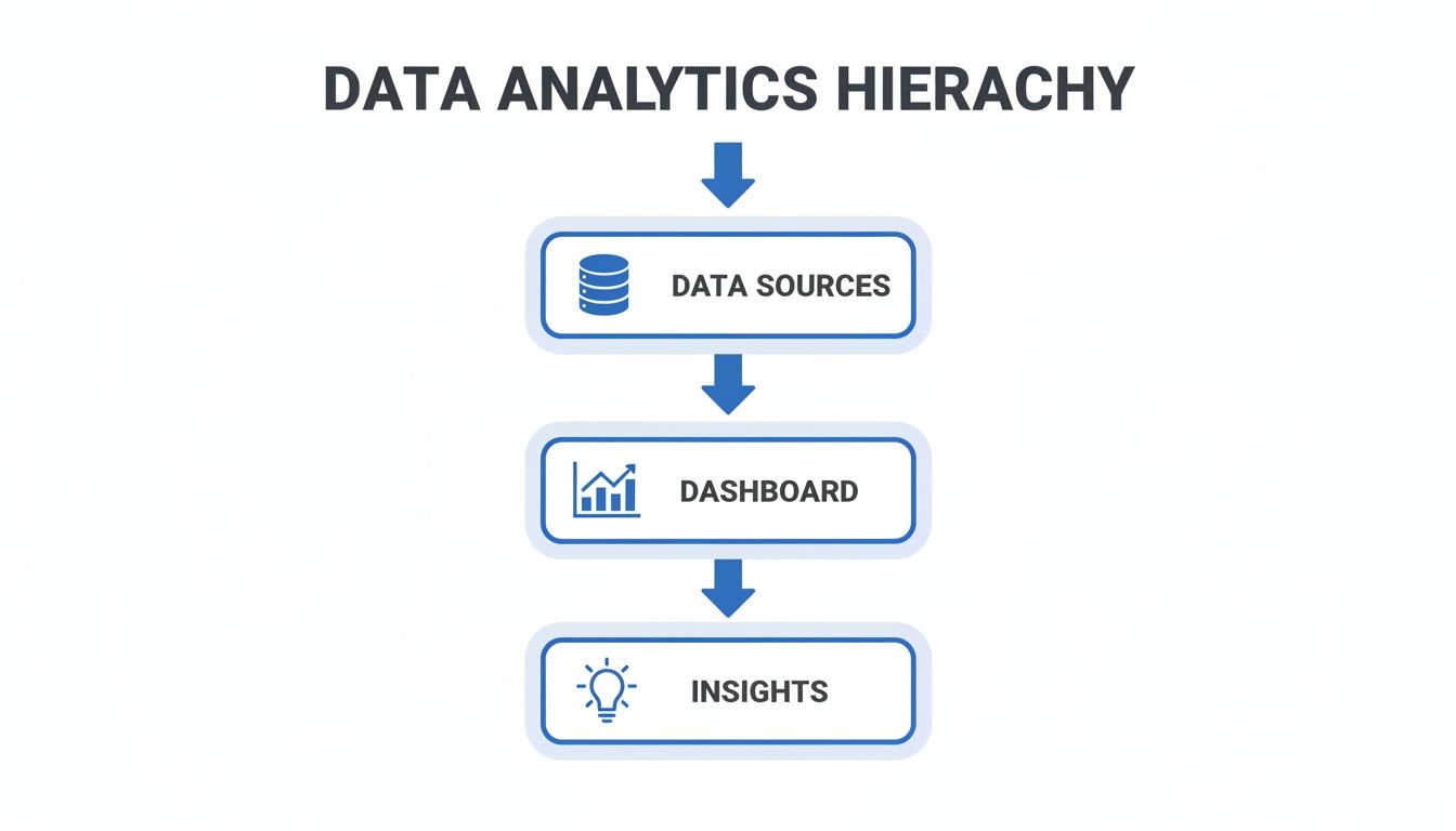
This flow shows how a dashboard acts as that crucial bridge, turning a sea of raw data into the clear insights that actually move a business forward.
Operational Dashboards
Picture the command center for your day-to-day work—that's an operational dashboard. Its entire purpose is to monitor real-time data to keep the wheels of the business turning smoothly. This is what your IT team stares at to watch server uptime or what your support crew uses to track incoming tickets.
The defining traits of an operational dashboard are:
- Real-Time Data: It’s all about what's happening right now, with data refreshing constantly.
- High Detail: It focuses on granular, specific metrics tied to immediate tasks and processes.
- Action-Oriented: It’s built to help users spot and fix problems the moment they arise.
A perfect example is a social media manager’s dashboard. It might show live mentions, engagement on the latest post, and follower counts ticking up or down in real time. If a post starts to go viral or negative comments suddenly spike, this dashboard is their early warning system, letting them react instantly.
Strategic Dashboards
If operational dashboards are for the front lines, strategic dashboards belong in the boardroom. They offer a high-level, 30,000-foot view of the company's health and its progress toward long-term goals. They care less about what’s happening this second and more about performance trends over weeks, months, or even quarters.
Strategic dashboards zero in on Key Performance Indicators (KPIs) that reflect the company’s biggest objectives. They’re designed for busy executives who need to grasp the big picture quickly without getting lost in the weeds.
A strategic dashboard answers one key question: "Are we on track to meet our long-term goals?" It summarizes performance across the organization, highlighting trends over individual data points.
For instance, a CEO's dashboard would likely display metrics like month-over-month revenue growth, customer acquisition cost (CAC), and overall market share. It’s a tool for spotting major trends and making high-level course corrections for the entire company.
Analytical Dashboards
Finally, we have the analytical dashboard—the data detective's toolkit. Unlike the other two, this one is built for deep exploration and discovery. It’s the go-to for data analysts, marketers, and product managers who need to dig into massive datasets to figure out why things are happening.
These dashboards are highly interactive, loaded with filters, drill-down features, and ways to segment the data. They let you slice and dice information, compare time periods, and uncover hidden patterns that aren't obvious on the surface.
This is the dashboard a growth marketer uses to dissect a campaign's performance, filtering by traffic source, device, or user demographics to see which segments converted best. Its purpose isn't just to monitor or track; it’s to generate fresh insights that inform future strategy. This deep-dive capability is driving huge demand. The data analytics market, which powers these tools, was valued at USD 108.79 billion in 2026 and is projected to hit USD 438.47 billion by 2031. This explosive growth shows just how much businesses are relying on dashboards to turn raw data into smart decisions. You can learn more by checking out the full research about the data analytics market growth.
Anatomy of an Effective Data Dashboard
A truly great data analytics dashboard is so much more than a jumble of pretty charts. Think of it as a well-told story. Every element has a purpose, guiding you from the high-level plot summary right down to the nitty-gritty details. It’s built for clarity and action, not just to look nice.
When you look under the hood, you’ll find a set of core components that work together to turn raw, messy data into a powerful decision-making tool.
Let's break down the essential parts that separate a confusing dashboard from one that delivers instant understanding.
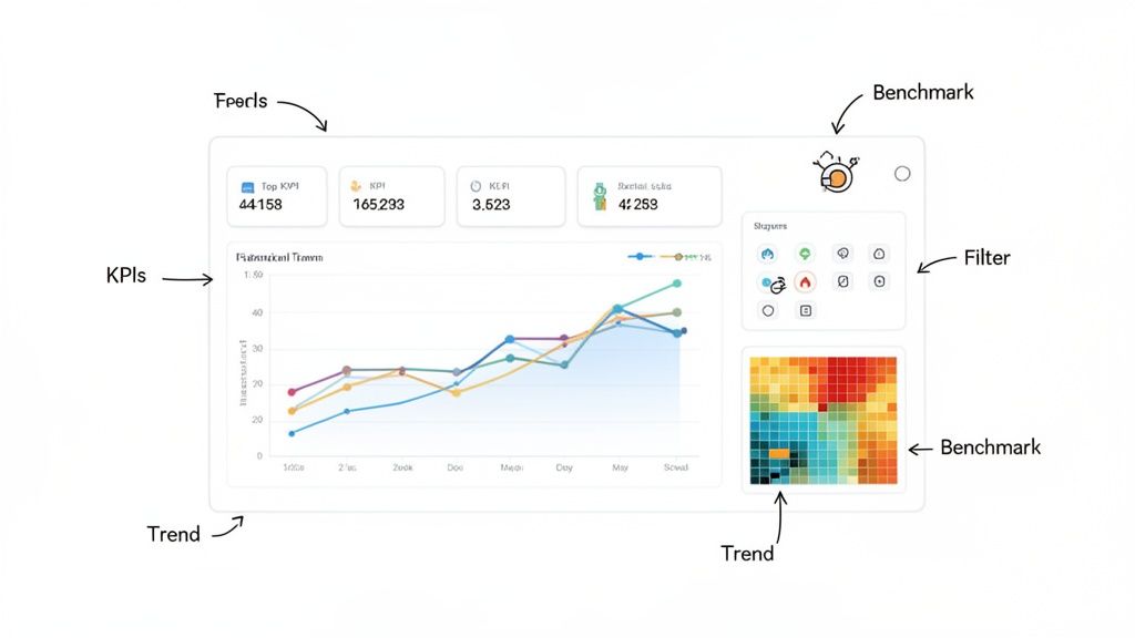
The Foundation: Key Performance Indicators
The absolute heart of any dashboard is its Key Performance Indicators (KPIs). These are the hard numbers that tell you if you're winning or losing, directly reflecting your most important business goals. Without well-defined KPIs, your dashboard is just a collection of random data points with no plot.
Choosing the right KPIs is everything. For an e-commerce store, the top-line KPIs might be Daily Sales, Conversion Rate, and Average Order Value. For a SaaS product, it’s probably things like Monthly Recurring Revenue (MRR) and Customer Churn Rate. These metrics belong front and center, usually right at the top of the dashboard, giving you an immediate health check of the business at a glance.
Telling the Story with Data Visualizations
Data visualizations are the language of your dashboard. They’re what translate complex spreadsheets into intuitive graphs, making trends and patterns pop out instantly. A good dashboard doesn't just use one type of chart; it uses a variety of them strategically, picking the right tool for the right job.
Here are some of the most common and effective visuals you'll run into:
- Line Charts: Perfect for showing how something changes over time, like website sessions over the last 30 days.
- Bar Charts: The go-to for comparing different groups, like sales figures per product or traffic from different marketing channels.
- Pie Charts: Best used to show parts of a whole, like the percentage breakdown of visitor device types (mobile vs. desktop vs. tablet).
- Heatmaps: Fantastic for visualizing intensity. Think of it as showing the "hot spots" on a webpage where users click the most.
- Geographical Maps: Absolutely essential for location-based data, like tracking sales by country or user signups by state.
Every single visual needs to be clearly labeled and easy to read. Avoid the temptation to add extra fluff—clutter just gets in the way of the message.
The goal of visualization is not just to present data but to reveal it. An effective chart should require minimal effort from the viewer to understand its key takeaway.
This principle is what makes insights jump off the page, letting you grasp the situation in seconds, not minutes.
Empowering Users with Interactive Elements
A static dashboard offers just one point of view, but an interactive one invites you to explore. This is where filters, drill-downs, and segmentation controls become so important. These features transform anyone watching from a passive observer into an active analyst, letting them ask and answer their own questions on the fly.
For instance, a marketing manager could use a date range filter to compare campaign performance this quarter versus last quarter. Then, they might apply a source filter to see which channels—organic search, social media, or paid ads—drove the most conversions. This level of interaction is what makes a modern data analytics dashboard a dynamic tool for discovery, not just a static report.
The Critical Role of Context
Finally, data without context is just a bunch of numbers. Is 10,000 website visitors a day good? It depends. Is that up from 1,000 last month, or down from 50,000? An effective dashboard provides this crucial context.
This is usually done through a few simple tricks:
- Comparisons: Showing current performance against a previous period (like this month vs. last month) or the same period last year.
- Targets and Benchmarks: Displaying your actual performance right next to your goals to immediately show if you're on track.
- Trend Indicators: Using simple arrows or colors (green for good, red for bad) to show which way a metric is heading.
By weaving all these elements together, a dashboard tells a rich, contextual story that leads to smarter, faster business decisions.
Dashboard Design Principles for Better Insights
What good is a powerful data analytics dashboard if it just sits there gathering dust? The difference between a tool that actually drives decisions and one that gets ignored almost always comes down to design. And I don't mean artistic flair—I'm talking about the psychology of communication.
The real goal is to create a visual experience so intuitive that the story behind the data clicks almost instantly. Think of it like a car's speedometer. You glance at it and immediately get the information you need with almost zero mental effort. That's what we're aiming for. Every chart, color, and number needs to pull its weight.
Create a Clear Visual Hierarchy
When someone opens your dashboard, their eyes should immediately know where to go. That's visual hierarchy in action. Without it, you’re just presenting a wall of charts that feels overwhelming, leaving users confused and frustrated before they even start.
So, how do you build this hierarchy? A great rule of thumb is to place your most critical KPIs in the top-left corner—it’s where our eyes naturally go first. Make these top-tier metrics stand out with larger fonts or bolder visuals to signal their importance. As the user's eye moves down and to the right, the information can get more granular.
This structure naturally guides them through a story:
- The Big Picture: What’s the overall health of the business? (e.g., total revenue, active users).
- The Trends: How are we doing over time or against our goals? (e.g., line charts showing monthly growth).
- The Details: What’s driving these results? (e.g., bar charts breaking down traffic sources or sales by region).
Embrace the Power of Simplicity
One of the most common mistakes I see is trying to cram everything onto a single screen. This just creates visual clutter that drowns out the very insights you're trying to highlight. When it comes to dashboards, "less is more" is almost always the right call.
Every single element on your dashboard should have to earn its spot. Before adding a new chart, ask yourself a simple question: "Does this help someone make a better decision?" If the answer is no, it doesn't belong. Simplicity also extends to choosing the right kind of chart for the job. Don't use a complicated scatter plot when a simple bar chart tells the story more clearly.
The ultimate goal of a data analytics dashboard is to reduce the time it takes to get from data to insight. Simplicity and clarity are your most powerful tools for achieving this.
This focus on simplicity is a huge reason for the rise of self-service analytics. Dashboards are at the center of the business intelligence evolution, with predictive analytics becoming a major player. This shift empowers non-technical folks to build their own dashboards for specific goals, which is a perfect fit for indie makers who need straightforward, privacy-friendly tools. You can discover more insights about the data analytics market on Grand View Research.
Use Color Strategically, Not Decoratively
Color is an incredibly useful tool for communication, but it can quickly become a distraction if you're not careful. Please, avoid the "rainbow effect" where every chart is a chaotic mix of bright, competing colors. The key is to develop a consistent and meaningful color palette.
Here are a few practical tips to get it right:
- Use color to emphasize: Stick with a neutral palette (like grays and blues) for your standard charts. Then, save a bright, attention-grabbing color (like green or red) to highlight what truly matters—like hitting a target or flagging a sudden drop in performance.
- Be consistent: If blue represents "organic traffic" in one chart, it needs to represent organic traffic across the entire dashboard. This consistency builds instant recognition.
- Think about accessibility: Always check that your color choices have enough contrast to be readable for everyone, including those with color blindness.
By sticking to these principles, you can design a data analytics dashboard that’s not just nice to look at, but is a genuinely functional tool. It’ll turn complex data into a clear story that your team will actually want to use. To see these ideas in action, check out our guide on building an effective web analytics dashboard.
Building Your Dashboard with a Privacy-First Approach
It's no longer enough to just get insights from your data; how you collect that data has become just as critical. Building a powerful data analytics dashboard is now as much an ethical challenge as it is a technical one. The rules have changed, and any business that still ignores user privacy is playing a dangerous game.
For years, traditional analytics tools were built on a model of invasive tracking, using third-party cookies to follow people across the web. Frankly, that model is broken. It opens you up to massive legal risks under regulations like GDPR and CCPA, which carry hefty fines. More importantly, it erodes the trust you have with your customers.
The only way forward is to build privacy into the foundation of your analytics. This doesn't mean giving up on valuable insights. It’s about being smarter and more respectful in how you understand your audience, all while future-proofing your business against the next wave of regulations.
![]()
The Rise of Cookieless Analytics
This is where privacy-first analytics platforms like Swetrix come in. They operate on a completely different philosophy, designed from the ground up to give you actionable insights without ever collecting personally identifiable information (PII). The magic behind this is cookieless tracking.
Instead of dropping a persistent cookie on someone's browser, these systems use anonymized identifiers that only last for a single session. This lets you track essential metrics like user flows, bounce rates, and conversion events without ever knowing who the individual user is. You get the data you need to grow, and your users get the privacy they deserve.
Make no mistake, this isn't just a niche trend; it's a global shift. Today, over 140 countries enforce privacy laws that affect 82% of the world’s population. This reality makes cookieless solutions a must-have for building modern, GDPR-compliant dashboards.
Key Features of a Privacy-First Dashboard
When you build a dashboard with privacy at its core, you're not just checking a compliance box. You’re arming your team with data that is both ethical and surprisingly effective. The focus shifts from tracking individuals to understanding collective behavior, which is often where the real insights are hiding.
A truly privacy-focused data analytics dashboard is built on a few key principles:
- Anonymous Data Collection: All data is aggregated and anonymized from the start. This makes it impossible to trace website activity back to a specific person.
- No Cross-Site Tracking: User activity is only tracked on your website, never across other sites they visit. This is a fundamental way to respect user boundaries and build trust.
- Full Data Ownership: With open-source and self-hostable tools, you can keep your analytics data entirely within your own infrastructure. No third parties, no data sharing.
By prioritizing privacy, you're not just complying with regulations; you're making a powerful statement about your brand's values. You're showing customers that you respect them, which is one of the strongest foundations for long-term loyalty.
This approach actually gives you a competitive edge. While your competitors are stuck wrestling with cookie consent banners and data compliance headaches, you can focus on what really matters: improving your product and user experience with clean, ethically sourced data. If you want maximum control, exploring self-hosted web analytics solutions is the logical next step.
Making the Switch to Ethical Analytics
Moving to a privacy-first analytics tool is a lot easier than you might think. Platforms like Swetrix are designed to be simple, lightweight replacements for older, more invasive systems. It often takes just a few minutes to get set up and start collecting valuable, anonymous insights.
Once it's running, your data analytics dashboard will fill up with the same essential metrics you've always relied on—top pages, traffic sources, user engagement. The only difference? You'll have the confidence of knowing you're building your business on a foundation of trust and compliance, ready for whatever the future holds.
Answering Your Top Dashboard Questions
As you start working more with data analytics dashboards, a few questions always seem to come up. Whether you're a founder trying to get a pulse on growth, a marketer digging into campaign performance, or a developer wiring up a new system, getting these fundamentals right is crucial.
Let's clear up some of the most common points of confusion so you can feel confident putting these powerful tools to work.
What’s the Real Difference Between a Dashboard and a Report?
This is easily the most frequent question, and the answer boils down to one simple idea: are you looking at a live feed or a historical snapshot?
Think of a data analytics dashboard as the cockpit of an airplane. It’s a live, interactive display showing you exactly what’s happening right now—your altitude, speed, and heading. It’s designed for quick glances that help you make immediate decisions to keep things flying smoothly.
A report, on the other hand, is more like the post-flight analysis. It’s a static, detailed summary of the entire journey after it’s over. Reports are built for digging deep into historical data to understand what happened over a specific period, helping you plan better for the next trip. One is for real-time steering; the other is for long-term strategy.
How Do I Pick the Right KPIs for My Dashboard?
Choosing the right Key Performance Indicators (KPIs) is everything. Get this wrong, and your dashboard becomes useless noise. The secret? Start with your goals, not your data.
Before you even think about metrics, ask yourself this one critical question: "What single outcome truly defines success for this team or project?" Once you have that answer, work backward to find the metrics that measure it.
- If your goal is to... increase user retention.
- Then you should track... Churn Rate, Daily Active Users (DAU), and Customer Lifetime Value (LTV).
- If your goal is to... boost online sales.
- Then you should track... Conversion Rate, Average Order Value (AOV), and Cart Abandonment Rate.
- If your goal is to... improve website engagement.
- Then you should track... Average Session Duration, Pages per Session, and Bounce Rate.
The trick is to brutally avoid "vanity metrics"—those flashy numbers that look great on a slide but don't actually tell you if the business is healthy (like total signups without looking at how many people actually use the product). A great dashboard is disciplined, focusing on a handful of KPIs that directly reflect progress toward your most important goals.
A dashboard cluttered with dozens of metrics is a dashboard that tells you nothing. Focus on the vital few KPIs that reflect the true health of your business, and push everything else to a secondary report.
This focus is what turns a dashboard from a data dump into a genuine decision-making tool.
Can I Actually Build a Dashboard Without Being a Developer?
Yes, absolutely. The days of needing a team of data scientists and engineers to build a dashboard are long gone. Today's self-service analytics platforms were built from the ground up for people who aren't developers.
Tools like **Swetrix** have intuitive, drag-and-drop interfaces that let marketers, founders, and product managers create sophisticated custom dashboards without touching a line of code. These platforms handle all the heavy lifting in the background—connecting data sources, processing it, and creating the charts—so you can focus on asking and answering your business questions.
This shift has been a game-changer. It makes data analysis accessible to everyone in the company, moving it from a siloed IT function to a core part of how every team makes decisions.
How Often Should I Be Checking My Dashboard?
There's no single right answer here—it completely depends on what the dashboard is for. Checking a strategic dashboard every five minutes is just as pointless as checking an operational one once a month.
Here’s a simple guide:
- Operational Dashboards: These are meant for constant monitoring. Think of a real-time server status or customer support ticket queue. You need to know the moment something breaks, so you're either watching it live or checking it multiple times a day.
- Strategic Dashboards: These are best reviewed weekly or monthly. They track long-term, big-picture goals, so daily blips aren't that meaningful. You're looking for trends over time to see if your strategy is on track.
- Analytical Dashboards: You use these on an as-needed basis. An analytical dashboard is a tool for investigation. You pull it up when you have a specific, tough question to answer, like, "Why did our conversion rate tank last quarter?"
Matching how often you look with what you're looking at is key to getting value without drowning in data.
How Does a Privacy-First Dashboard Help My Business?
Switching to a privacy-first approach for your analytics gives you two massive advantages that go way beyond just being compliant: trust and sustainability.
First, when you use a cookieless solution that respects user privacy, you're sending a clear message to your customers: we value you and your data. That builds authentic trust, which is an incredibly powerful way to set your brand apart.
Second, it makes your business legally resilient. With regulations like GDPR and CCPA getting stricter, a privacy-first data analytics dashboard protects you from the risk of huge fines. It gives you all the actionable insights you need to grow—traffic sources, user flows, conversion events—without ever collecting sensitive personal information. This means your analytics strategy isn't just effective, but ethical and built to last.
Ready to build a powerful dashboard without compromising user privacy? Swetrix provides all the tools you need to turn your website data into actionable insights, ethically. Get started with a free 14-day trial and see what a privacy-first approach can do for your business.