- Date
A Founder's Guide to Web Page Metrics That Actually Matter
 Andrii Romasiun
Let’s get real for a second—most website analytics dashboards are just a sea of noise. It's so easy for founders to get completely fixated on chasing huge traffic numbers, but that's a surefire way to burn through time and money with nothing to show for it. The real secret is to stop counting clicks and start understanding the actions that tell you if your business is actually healthy and if customers are truly interested.
Why Most Web Page Metrics Are Just Vanity
Imagine your website is a physical store. Would you measure its success by counting every person who walks past the front window? Or would you focus on who actually steps inside, browses the aisles, and pulls out their wallet to make a purchase? A lot of the most popular web page metrics are just like counting those window-shoppers—the numbers might look impressive, but they don't pay the bills.
This becomes even more critical when you zoom out and look at the competition. We're talking about a digital space with over 1.2 billion websites, though only about 200 million are even active. When you learn that the average website conversion rate is a razor-thin 1.3%, it becomes painfully clear that just getting eyeballs on your site is nowhere near enough.
Moving Beyond Empty Numbers
To build a business that lasts, you have to learn how to separate the signal from the noise. That really boils down to knowing the difference between vanity metrics and actionable metrics.
- Vanity Metrics: These are the feel-good numbers like total pageviews or social media likes. They might give you a temporary ego boost, but they offer almost zero insight into what your users are actually doing or how your business is performing.
- Actionable Metrics: These are the data points directly tied to your business goals. Think conversion rates, user flows, and customer lifetime value. They tell you exactly what’s working and what’s broken.
The fundamental challenge every founder faces is figuring out how to turn clicks into customers. Shifting your focus to actionable web page metrics gives you a clear roadmap, guiding you to make smarter decisions that drive real growth, not just traffic.
This guide is all about reframing your perspective on what is web analytics and helping you tune into the signals that truly matter. We're going to dive into the metrics that reveal genuine user engagement and business health, all while setting you up for a smarter, privacy-first way to grow your project.
The 10 Core Web Page Metrics That Actually Drive Decisions
If you want to move beyond just chasing big, empty numbers, you need a solid dashboard—a core set of web page metrics that tell the real story of how people interact with your site. Each metric is a different dial, giving you a specific reading on your website's health. Once you see how they connect, you can stop guessing and start making decisions backed by real data.
Think of it this way: raw data is just noise. The magic happens when you start linking these metrics to answer the big business questions. Are people finding what they need? Is our site fast and intuitive? And the most important one of all: are visitors taking the actions that actually grow the business?
Let’s dig into the 10 metrics that truly matter. I've broken them down into a simple table to show what each one measures and, more importantly, the business question it helps you answer.
Core Web Page Metrics and Their Business Impact
| Metric | What It Measures | Business Question It Answers |
|---|---|---|
| Pageviews | The total number of times a page is loaded or viewed. | "Which of our pages are the most popular or getting the most attention?" |
| Unique Visitors | The number of distinct individuals visiting your site in a set period. | "How large is our actual audience reach?" |
| Sessions | A group of interactions by a single user within a given timeframe. | "How often are people returning to our site and how engaged are they per visit?" |
| Bounce Rate | The percentage of visitors who leave after viewing only one page. | "Is this page meeting the expectations of the people we're sending to it?" |
| Time on Page | The average duration a user spends actively viewing a specific page. | "Is our content engaging enough to hold people's attention?" |
| User Flows | The visual path visitors take as they navigate from page to page. | "Where are people getting stuck or dropping off in key conversion funnels?" |
| Conversions | The number of times a visitor completes a specific goal (e.g., purchase, sign-up). | "Is our website successfully turning visitors into customers or leads?" |
| Page Load Time | The time it takes for a page to fully display in a browser. | "Is our site fast enough to provide a good user experience and support SEO?" |
| Errors | Technical issues like 404s or script failures encountered by users. | "Are technical glitches hurting our user experience and credibility?" |
| UTM Attribution | The source of traffic, tracked via specific URL parameters. | "Which of our marketing channels and campaigns are delivering the best results?" |
This table gives you a quick reference, but understanding the nuance behind each metric is where you'll find the real insights. Let's explore them in more detail.
Foundational Audience Metrics
First things first, you need to understand who is coming to your site and what they're looking at. These metrics are the bedrock of any good analysis.
Pageviews: This is the most basic metric, simply counting every time a page gets loaded. On its own, a big number can be misleading, but it's incredibly useful for comparing content to see which pages are your blockbusters.
Unique Visitors: This is where you get a clearer picture of your audience size. It tracks the number of distinct people who came to your site over a period, answering the question, "How many real people did we reach this month?"
Sessions: A session is basically one user's visit. A single unique visitor can have multiple sessions if they come back on different days. This helps you understand visit frequency and how often people feel the need to return.
The key is to avoid getting stuck on vanity metrics like pageviews alone. You have to connect them to actions that matter for your business.
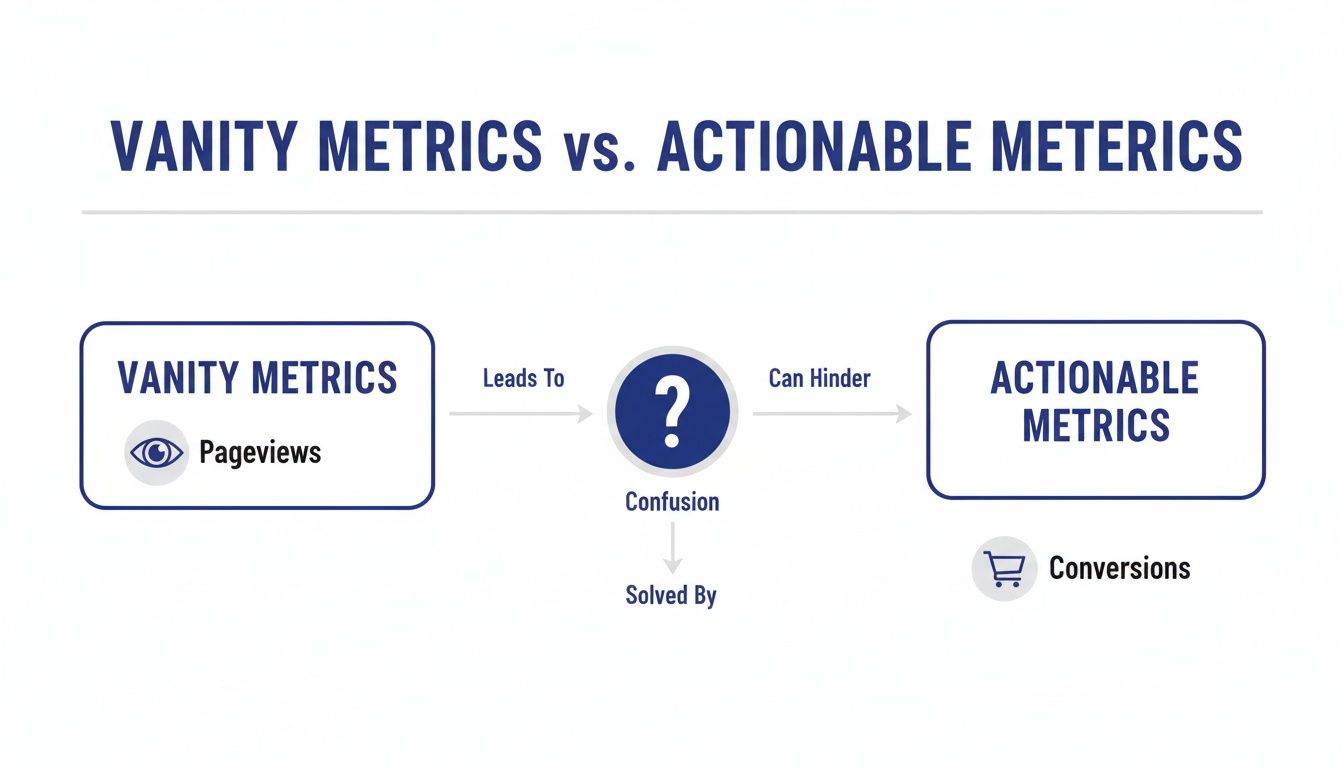
As you can see, fixating on a number like pageviews can lead you down the wrong path. The real clarity comes from focusing on actionable metrics like conversions that directly impact your goals.
Measuring User Behavior and On-Site Experience
Okay, so you know people are showing up. Now what? The next step is to figure out what they’re actually doing. These metrics reveal how people interact with your pages and whether they’re having a good time or getting frustrated.
Bounce Rate: This is the percentage of people who land on a page and leave without clicking anywhere else. A high bounce rate is often a red flag, suggesting a mismatch between what your ad or link promised and what the page delivered.
Time on Page: This measures how long, on average, people spend on a specific page. Context is everything here. A long time on a blog post is great—it means people are reading. But a long time on a checkout page? That might signal confusion or a technical problem.
User Flows: Think of this as a treasure map of your website. It visually shows the paths people take from page to page. It’s an incredibly powerful tool for finding where visitors get lost, confused, or drop out of important processes like signing up or making a purchase.
Performance and Business-Critical Metrics
Finally, we get to the numbers that directly connect to your bottom line. These metrics tell you how well your site is doing its job, both from a technical standpoint and in achieving your business objectives.
Conversions: This is the big one. A conversion is when a user completes a goal you've set, whether it's buying a product, filling out a form, or signing up for a newsletter. This is arguably the ultimate measure of your website's success.
Page Load Time: Speed matters. A lot. Slow pages frustrate visitors and can even hurt your search engine rankings. Shaving off a few seconds of load time can be the difference between making a sale and losing a customer for good.
Errors: Nothing kills credibility faster than a broken website. Tracking technical problems like 404 "Page Not Found" errors or broken scripts is crucial for maintaining a professional, trustworthy site that actually works.
UTM Attribution: If you're spending money on marketing, you need to know what's working. UTM parameters are little tags you add to your links that tell your analytics exactly where your traffic is coming from. This metric is essential for proving the ROI of your marketing campaigns and making smarter budget decisions.
Measuring Website Performance in a Privacy-First World
Trust is the new currency online. In a world where everyone is (rightfully) skeptical about how their data is being used, the way you measure your web page metrics is more than just a technical choice—it's a statement about your brand. The old playbook of using invasive cookies to track people across the internet isn't just dying out; it's actively eroding the trust you've worked so hard to build.
This puts us at a crossroads. How can we get the data we need to improve our websites without alienating our visitors? The solution is to embrace a new generation of analytics tools built on a foundation of privacy. It’s a shift from tracking individuals to understanding anonymous, aggregate behavior.
The Rise of Ethical Analytics
The core idea is refreshingly simple. Instead of trying to build a dossier on every single person who visits your site, privacy-first analytics focuses on what people are doing as a whole. This gives you all the crucial insights you need to make smart decisions, all while treating your visitors with respect.
Here's how this modern approach works:
- Anonymized Data Collection: This method collects usage data without grabbing any personally identifiable information (PII). Things like IP addresses are masked, and unique identifiers are hashed, making it impossible to single out any one person.
- Event-Based Tracking: Forget just counting page loads. This technique focuses on the specific actions, or "events," people take—like clicking a "buy" button, watching a demo video, or filling out a contact form. You get rich, contextual information about what's actually working on your site.
- No Cross-Site Tracking: Ethical analytics tools keep their focus squarely on your website. They don't follow users around the web after they leave, which is one of the biggest privacy pitfalls of traditional platforms.
By focusing on what users do on your site, not who they are, you get clearer, more actionable insights. This method helps you improve your website's functionality and user experience based on real behavior, fostering a relationship built on transparency and respect.
Putting Privacy into Practice
So, what does this actually look like? A privacy-first tool like Swetrix lets you measure all the core web page metrics we’ve talked about—from bounce rates to user flows—without ever needing to set a cookie. It's a fundamental shift in philosophy that allows you to understand performance ethically. You can learn more about how to get powerful insights with cookie-less tracking techniques in our detailed guide.
This isn't just about staying compliant with regulations like GDPR; it's a real competitive advantage. When visitors feel that you respect their privacy, they're far more likely to stick around, trust your brand, and eventually become loyal customers. At the end of the day, a successful website is one that creates a safe and valuable experience for everyone.
How to Interpret Your Data and Find the Story
Raw data on its own is just a pile of numbers. The real magic happens when you learn to read between the lines and piece together the human story your web page metrics are trying to tell you. Think of each metric as a clue. When you put them together, you can diagnose problems, spot hidden opportunities, and start making decisions with real confidence.
Everything hinges on context. A long Time on Page, for instance, is a fantastic sign for a detailed blog post—it tells you people are hooked. But see that same metric on a checkout page? That's a huge red flag. It probably means users are confused, stuck, or hitting some kind of technical snag that’s costing you a sale.
To really get it, you have to connect the numbers to what's happening in the real world. Let's look at how different teams can use the exact same metrics to uncover completely different insights and drive their own specific goals.
A Marketer's Perspective on Campaign Health
Picture a marketing team that just launched a big ad campaign. They’re seeing a ton of new traffic flood the site, which feels great, but the conversion rate hasn't budged. This is where they turn into data detectives, using web page metrics to figure out what’s going on.
- High Bounce Rate: If visitors land on the page and leave almost immediately, you've likely got a mismatch. Is the ad promising something the landing page doesn't deliver? A Bounce Rate north of 60% on a targeted campaign page is a clear signal to investigate, and fast.
- Low Time on Page: When people aren't sticking around, your content probably isn't grabbing them. This tells the team they need to rethink their messaging, sharpen the value proposition, or even redesign the page to hold attention.
- UTM Attribution: By digging into the traffic sources, the team might discover that all this low-quality traffic is coming from one specific ad or platform. That’s a goldmine of information—they can kill the underperformer and shift their budget to the channels that are actually bringing in engaged users.
Metrics are your feedback loop from the market. A high bounce rate isn't a failure; it's a clear signal from your audience that you need to adjust your message to better meet their expectations.
This is especially true in a world dominated by mobile. Bounce rates often hover around 52.9% on phones versus 44.1% on desktops, a gap that proves you can't ignore the mobile experience. For major sites, this isn't a small slice of traffic; history.com, for example, gets 58.36% of its US traffic from mobile. This trend makes it critical to interpret your data through a mobile-first lens. To go deeper on these trends, you can review more website statistics and their impact on rebootonline.com.
A Product Team's Hunt for UX Friction
Now, let's switch hats and think like a product manager. Their job is to build a seamless, intuitive experience that helps people get things done. For them, web page metrics are a tool for finding and eliminating all the hidden roadblocks in the user journey.
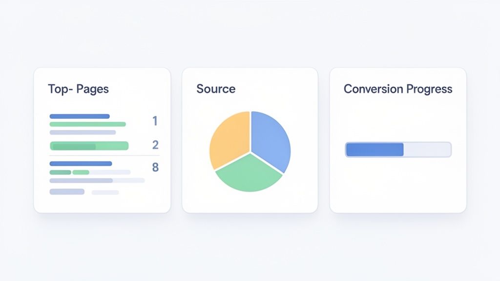
A dashboard like this one offers a quick, at-a-glance view of user engagement.
This kind of snapshot lets a product team see instantly which pages are keeping users engaged and which ones are pushing them away.
By analyzing User Flows, a product team can map out the exact paths people take through the site. If they spot a massive drop-off between the "Add to Cart" and "Begin Checkout" pages, they know exactly where to focus their energy. Is the button hard to see? Does the page take forever to load? The data transforms a vague hunch into a specific, actionable problem to solve.
Building Your First Actionable Analytics Dashboard
Alright, let's move from theory to action. Understanding individual web page metrics is one thing, but the real magic happens when you bring them together in a single, focused dashboard. A great dashboard isn’t about cramming every chart you can find onto one screen. It's about creating a clear, at-a-glance view that answers your most important business questions in seconds.
With a tool like Swetrix, you can build a clean, powerful command center without the overwhelming complexity you find in older platforms. The goal is to set up a handful of key widgets that monitor business health, track marketing effectiveness, and show your progress. This turns data analysis from a chore into a quick, routine check-in.
Designing Your Core Dashboard
Let's start by building a simple dashboard focused on three critical areas: audience engagement, traffic acquisition, and conversion tracking. This kind of setup gives you a complete picture of your website's performance, telling you who is visiting, how they found you, and what they do once they're there.
Your initial dashboard should have widgets that answer these core questions:
- What content resonates most with our audience? Add a "Top Pages" widget. This will instantly show you which articles, landing pages, or product features are getting the most attention and tell you what your audience truly values.
- Which marketing channels are actually working? A "Traffic Sources" widget, broken down by referrers or UTM campaigns, is essential. It cuts through the noise and tells you if your efforts on social media, search, or email are paying off.
- Are we achieving our business goals? You'll need a "Goals" or "Conversions" widget. This tracks the actions that matter—demo requests, newsletter sign-ups, or purchases—directly connecting website activity to real business results.
An effective dashboard is a story, not a spreadsheet. It should guide your attention to the web page metrics that signal an opportunity or flag a problem, empowering you to act quickly and with confidence.
From Data Points to Strategic Insights
Once your dashboard is live, you can start connecting the dots. For instance, you might see a new blog post suddenly shoot to the top of your pages list. A quick glance at your Traffic Sources widget reveals that a referral from a well-known industry blog is driving all that traffic. That's a clear, actionable insight: building more relationships with similar blogs could be a fantastic growth strategy.
Or maybe you notice that your overall traffic is up, but conversions are flat. Your dashboard gives you the perfect starting point to dig in. Which source is sending all this low-converting traffic? Is there a high bounce rate on the specific landing page they're hitting? Your dashboard turns vague hunches into specific questions you can answer with data.
This cycle of building, observing, and refining is what it's all about. For more ideas and detailed setups, you can check out our guide on creating an effective web analytics dashboard. Ultimately, the perfect dashboard is one that evolves with your business, constantly giving you the clarity you need to make your next move the right one.
Unlocking Growth with A/B Testing and Funnel Analysis
Once you have a solid grasp of your core web page metrics, it's time to move from simply observing to actively optimizing. This is where you shift from playing defense to playing offense, using data to intentionally shape user behavior and drive real growth.
Two of the most powerful plays in your book will be A/B testing and funnel analysis. Together, they let you test your gut feelings and identify the exact friction points that are killing your conversions.
Test Your Ideas with A/B Testing
A/B testing is a beautifully simple concept: pit two versions of a webpage against each other to see which one performs better. Think of it as a controlled experiment for your website. Version "A" (the control) goes to one group of visitors, while version "B" (the variation) goes to another.
By measuring which version gets more of the results you want—be it sign-ups, clicks, or sales—you can make decisions based on hard evidence, not just what you think will work.
You can test just about anything, but the secret to good testing is starting with small, focused changes:
- Headlines: Does a bold, benefit-driven headline beat a thought-provoking question?
- Call-to-Action (CTA) Button: Does "Get Started Free" outperform "Sign Up Now"?
- Images: Does a clean product shot convert better than an aspirational lifestyle photo?
The golden rule is to change only one thing at a time. That’s how you know for sure that the change you made was responsible for the lift (or drop) in performance.
Pinpoint Leaks with Funnel Analysis
While A/B testing is fantastic for optimizing specific elements, funnel analysis gives you the 30,000-foot view of your most important user journeys. A funnel is just a series of steps you expect a user to take to reach a goal, like moving through a checkout flow or completing an onboarding sequence.
Analyzing these funnels reveals exactly where people are giving up and leaving. For example, you might find that 90% of users who add an item to their cart proceed to checkout, but only 40% actually complete the purchase. That’s a massive leak on the payment page—and a huge opportunity for improvement.
Funnel analysis turns your website into a transparent pipeline. It highlights the leaks that are costing you conversions, allowing you to focus your efforts on the specific steps that need fixing.
This kind of precision is crucial, especially when you think about where your visitors come from. Search engines are a massive driver of traffic; Google alone accounts for 63.41% of all site referrals. But putting all your eggs in one basket is a risky strategy. You can discover more insights about website traffic statistics on vwo.com.
By combining funnel analysis with your UTM tracking, you can see which marketing channels are sending visitors who actually complete your goals. This allows you to double down on what works and diversify your efforts wisely. Understanding both where users come from and where they get stuck is a powerful formula for sustainable growth.
Got Questions About Web Page Metrics? We’ve Got Answers.
Even after you get the hang of web page metrics, a few questions always seem to surface. Let's tackle some of the most common ones I hear, so you can move forward with confidence.
What Is the Most Important Web Page Metric?
This is the million-dollar question, and the answer is always: it depends entirely on your goals. There's no single magic number that rules them all.
For an e-commerce store, Conversions (sales) are obviously the top dog. But for a blog, you might care more about Time on Page and the growing number of Unique Visitors. The goal isn't just traffic; it's engaged readership.
Think of it this way: the most important metric is simply the one that proves you're achieving what you set out to do. Always start with your objective and work backward to find the numbers that matter.
Key Takeaway: The "best" metric is all about context. Don't just track metrics for the sake of tracking them. Tie them directly to a business goal.
How Often Should I Actually Check My Analytics?
It's tempting to refresh your analytics dashboard every five minutes, but that's a recipe for making reactive, emotional decisions based on normal, everyday blips. For most businesses, a weekly check-in is the sweet spot. It's frequent enough to catch trends but not so often that you get lost in the noise.
Here’s a good rhythm to consider:
- Weekly: This is perfect for checking on campaign performance and getting a general pulse on your site's health.
- Monthly: Use this for bigger-picture strategic planning and spotting those broader shifts in user behavior.
- Real-Time: Save this for the big moments, like a massive product launch or if a post suddenly goes viral.
Why Do My Analytics Tools Show Different Numbers?
You're not going crazy. It's incredibly common for two different analytics platforms to report slightly different data for the same website.
This can happen for a bunch of reasons. They might define a "session" differently, have unique ways of filtering out bot traffic, or vary in how they handle user privacy settings and ad blockers.
Instead of trying to make the numbers match perfectly, pick one tool you trust and focus on the trends it shows you. Consistency within a single platform is far more valuable than trying to compare apples to oranges.
Ready to stop guessing and start truly understanding your users? Swetrix gives you clear, privacy-first analytics so you can make smarter decisions. Get started for free and see your data in a whole new light.