- Date
Effective Strategies for landing page A/B testing
 Andrii Romasiun
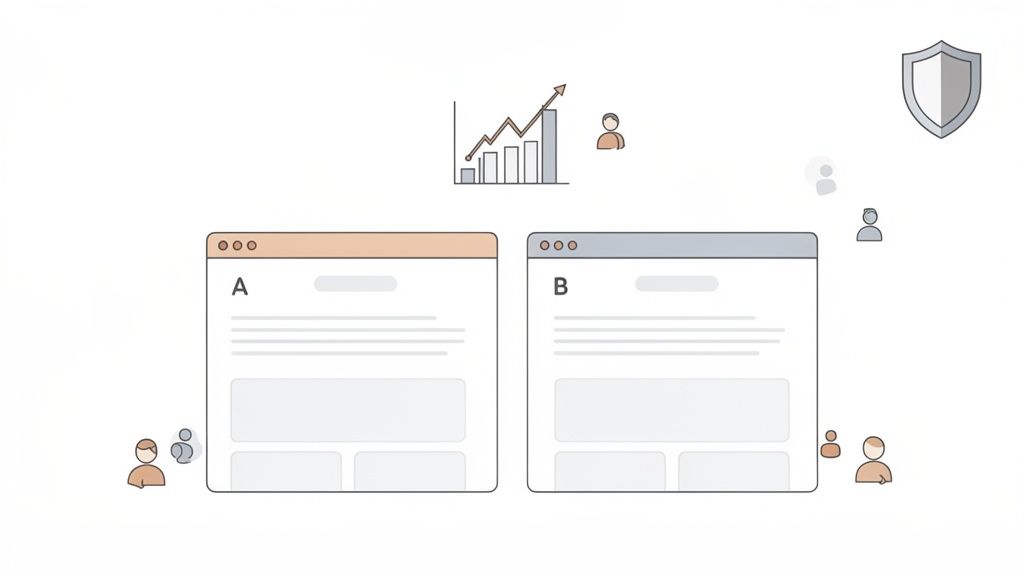
At its core, A/B testing a landing page is pretty simple: you pit two versions of a page against each other to see which one performs better. You show the original version (A) to one group of visitors and a tweaked version (B) to another. The goal is to collect real data on which design, copy, or layout actually gets more people to convert.
It's the most reliable way I know to make improvements that are backed by data, not just a hunch.
Why Systematic Testing Is Your Biggest Growth Lever
Let's look past the textbook definition for a minute. True, systematic landing page A/B testing isn't just another box to check on your marketing to-do list—it's one of the most powerful levers you have for sustainable growth.
It's about creating a disciplined process that turns guesswork into a repeatable, reliable conversion engine. This is how you shift the conversation from "we think this will work" to "we know this works." You're not just throwing random changes at the wall; you're forming educated hypotheses, measuring the results with precision, and learning something valuable from every single experiment, win or lose.
The numbers don't lie. We see that businesses that consistently test and optimize their pages achieve conversion rates up to 300% higher than those who don't bother. Think about that. While the average landing page scrapes by with a 2.35% conversion rate, the top-tier pages are hitting 11.45% or more. That’s a nearly 5x difference in performance, which is why A/B testing is a cornerstone of effective conversion rate optimization best practices.
From Guesswork to Data-Driven Decisions
The real magic of A/B testing is that it settles arguments. It takes subjective debates and gut feelings out of the equation and replaces them with cold, hard data. Instead of copying what your competitors are doing or going with the highest-paid person's opinion, you get direct feedback from the only people who matter: your audience.
This iterative approach creates an incredible feedback loop for continuous improvement.
- Validate Your Assumptions: Got a great idea for a new headline, call-to-action (CTA), or hero image? Test it. Find out what actually resonates with your users.
- Mitigate Your Risk: Planning a big, expensive redesign? Don't just launch it and pray. Test the new concept on a small slice of your audience first to make sure it doesn't tank your conversion rate.
- Unlock Incremental Gains: Not every test will be a home run. But small, consistent wins from testing add up. Over time, those tiny lifts compound into massive increases in leads, sales, and revenue.
When you build a culture of experimentation, you’re not just improving a single page; you’re building a deep, data-backed understanding of your customer’s behavior. That knowledge becomes a competitive advantage that’s incredibly difficult for anyone else to replicate.
Throughout this guide, we'll walk through exactly how to put this workflow into practice. We’ll show you how to use privacy-first analytics tools like Swetrix to run powerful experiments that optimize the user experience without ever compromising on data ethics. It's about making confident decisions that both respect your users and drive your business forward.
Building a Bulletproof Testing Framework
A great A/B testing program doesn't start with tweaking button colors. It begins with a solid, strategic framework that guides every single experiment. If you just jump into testing without this foundation, it’s like sailing without a map—you’re moving, but you have no idea if you're actually getting closer to your destination. This framework is what makes your tests purposeful, measurable, and capable of delivering real business insights.
It all starts with a bit of detective work to find the right optimization opportunities. This means blending two kinds of data: the what and the why. Quantitative data tells you what is happening, while qualitative data helps you understand why it's happening.
Uncovering Opportunities with Data
To find powerful testing ideas, you need to put on your detective hat. Start by digging into your analytics. Look for pages that get a lot of traffic but have terrible performance—a landing page with tons of visitors but a dismal conversion rate is a prime candidate for an A/B test. Zero in on specific drop-off points in your funnels. Where are people giving up?
Once you have the numbers, layer on the human element with qualitative insights. I find that tools offering user session recordings are absolutely invaluable here. Watching how real people interact with your page reveals friction points you’d never spot in a spreadsheet. You might see them rage-clicking on something that isn't a button or scrolling endlessly, completely lost. This is pure gold for figuring out what to test first.
Crafting a Strong, Testable Hypothesis
After you've identified a problem, you need to form a hypothesis. A vague idea like "Changing the CTA will get more clicks" is useless. It’s not grounded in any observation and gives you nothing to learn from, whether you win or lose. A strong hypothesis, on the other hand, is a structured statement based on evidence that sets the entire test up for success.
I always stick to a simple but powerful formula:
Because we observed [data/insight], we believe that [change] for [audience] will result in [impact].
This structure forces you to connect the dots. It links the why (your data) with the what (the change you're making) and the so what (the outcome you expect).
Let’s walk through a real-world example.
- Observation: We watched session recordings and saw that a shocking 70% of mobile users never scrolled past the hero section to see the testimonials.
- Hypothesis: "Because we observed that most mobile users don't see our social proof, we believe that moving the top three customer testimonials into a slider within the hero section for mobile visitors will result in a 15% increase in demo requests."
See the difference? This hypothesis is specific, measurable, and directly tackles a real user behavior problem we uncovered.
A solid hypothesis always has a few key ingredients. Breaking it down helps make sure you haven't missed anything important.
Key Elements of a Strong A/B Test Hypothesis
| Component | Description | Example |
|---|---|---|
| The Observation | A piece of qualitative or quantitative data that identifies a problem. | "Analytics show a 90% bounce rate on our pricing page for traffic from social media." |
| The Change | The specific modification you will make to the variant (B) version. | "Adding a concise, three-point summary of our value proposition above the pricing table." |
| The Impact | The specific, measurable outcome you expect to see from the change. | "A 20% reduction in bounce rate and a 5% increase in 'Start Trial' clicks." |
Framing your tests this way ensures that even a "failed" experiment is a win because you've learned something concrete about your audience.
Defining Your KPIs and Ensuring Significance
Your hypothesis should make it pretty obvious what your Key Performance Indicators (KPIs) are. The primary KPI directly measures the "impact" you defined earlier. In our example, that’s the number of demo requests. But don't stop there—it's crucial to track secondary metrics, too. You might find a change boosts sign-ups but accidentally tanks another important action, like newsletter subscriptions.
Before you even think about launching, you have to calculate your required sample size and test duration. This is a non-negotiable step for any serious landing page a b testing. Skipping it means you risk ending the test too early and making a big decision based on random noise instead of a real shift in user preference.
There are plenty of free online calculators for this. Use one to figure out how many visitors you need per variation to achieve statistical significance, which is typically a 95% confidence level. This simple step is your insurance against being fooled by promising early results and ensures your conclusions are genuinely bulletproof.
Setting Up Your Experiment with Precision
You've got a solid hypothesis. Now it's time to roll up your sleeves and move from planning to execution. This stage is critical—even a small technical hiccup can invalidate your results, sending good traffic and valuable time down the drain.
The first big decision you'll make is how to show your different page versions to visitors. There are two main ways to do this: client-side or server-side. Your choice really hinges on how complex your proposed change is.
Client-Side vs. Server-Side Testing
Most of the time, you'll probably be using client-side testing. It works by using JavaScript to make changes directly in the user's web browser after the original page loads. It’s perfect for quick, straightforward tweaks—things like changing a headline, swapping out an image, or testing a different CTA button color.
Server-side testing, as the name implies, happens on your server before the page is even sent to the browser. This method is the heavy-hitter, reserved for more significant changes. Think testing a totally different page layout, a new checkout process, or anything that involves your site's backend logic. It’s more complex to set up but completely avoids the "flicker" effect where a user might glimpse the original page before the new version appears.
My Takeaway: For the vast majority of landing page tests you'll run (headlines, copy, images, CTAs), client-side is your best friend. It’s fast to implement and built for rapid learning. Save the server-side approach for when you're testing deep, structural changes to the user experience.
The process isn't just about flipping a switch; it's a methodical flow that starts with good research and ends with reliable data.
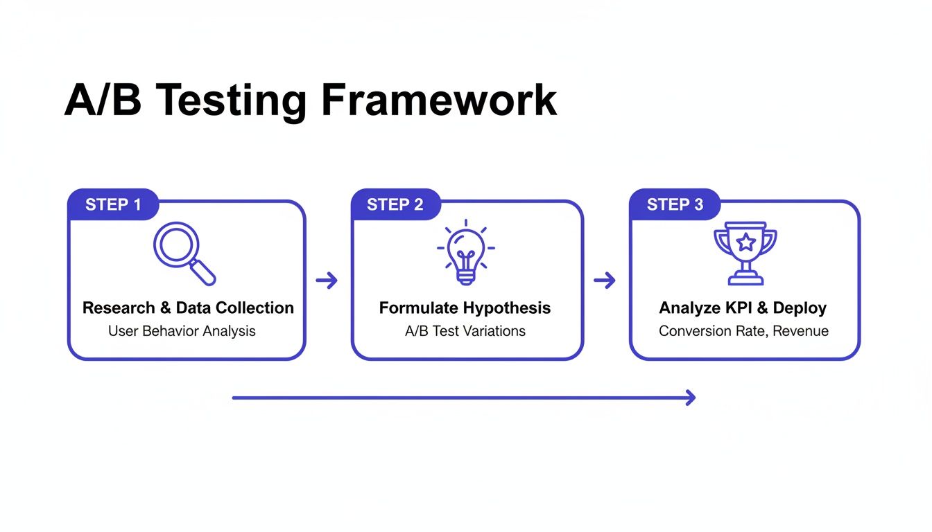
As you can see, a successful experiment is built on a structured foundation, connecting your initial questions to the final metrics.
Defining Your Goal and Using Feature Flags
Once you’ve picked your method, you need to define what "winning" looks like. This means setting a clear conversion goal. In a privacy-first tool like Swetrix, you'll typically do this by creating a custom event.
Let's say your goal is to boost demo sign-ups. You'd configure a custom event, maybe called "DemoSignUp," to fire every time a user successfully submits that form. This event is now the key performance indicator (KPI) your experiment will be judged on.
To manage who sees what, you'll use feature flags. Think of them as traffic cops for your website. They let you control the rollout, starting with a simple 50/50 split of traffic between your original page (the control) and your new version (the variant). Behind the scenes, the system must randomly assign users to each group to keep the test fair and unbiased. Properly tracking these campaigns is also crucial; you can learn more about how to set them up for clear analysis in our guide to using UTM parameters.
Don't Skip the QA Phase
Before you go live, you absolutely have to put your test through its paces with some thorough quality assurance (QA). A broken variant won't just give you bad data; it can hurt your brand.
Here's my personal QA checklist:
- Cross-Browser Check: Does the new version look right on Chrome, Firefox, Safari, and Edge? Don't assume it will.
- Device Check: How does it look on a phone? A tablet? Different desktop sizes? A great-looking desktop change can easily break a mobile layout.
- Goal Tracking Check: Use your browser's developer tools to make sure your custom event fires correctly when the goal is completed. Test this on both the original and the new version.
- URL Parameter Check: Make sure UTMs or other URL parameters don't break the experiment.
Once you’re confident that everything works flawlessly, you’re ready. Launch the experiment, but keep a close eye on the initial data to ensure it’s all being tracked correctly. Now, you just need to be patient and let the results come in.
Once your experiment has run its course and collected enough data, it's time for the most critical phase: turning raw numbers into a smart business decision. This is where the real work begins.
It’s all too easy to glance at the dashboard, see one version with a higher conversion rate, and immediately declare a winner. But that's a classic rookie mistake. The true insights—the ones that drive real growth—are almost always hidden a layer deeper.
Your analytics tool will probably flash a big number at you, like your new headline (Version B) got a 12% higher conversion rate than the original. That feels great, but it’s just one piece of the puzzle. Before you do anything, you have to look at that number in the context of statistical significance.
Understanding Statistical Significance and Confidence
Statistical significance is what tells you if your result is real or just random noise. It's often shown as a confidence level, like 95% confidence. Think of it this way: a 95% confidence level means there's only a 5% chance that the difference you're seeing is a complete fluke. That's the industry standard for a reason.
If your tool says you have a winner but the confidence is only 70%, you can't trust it. Making a decision based on that is no better than flipping a coin. You absolutely have to wait until your test hits that 95% threshold before you even think about making a call.
You'll also see a confidence interval, which gives you the likely range of the true conversion lift. For example, a 12% lift might come with a confidence interval of [+8%, +16%]. This is fantastic news—it means you can be very confident the real improvement is somewhere between 8% and 16%.
But what if the interval is something like [-2%, +26%]? That's a different story. Because the range dips into negative territory, it means the variant could actually be hurting your conversions. The result is far too uncertain to act on.
Look Beyond the Main KPI by Segmenting Your Data
The most powerful analysis happens when you start slicing up your data. An experiment might look like a total wash on the surface, but when you segment the results by different audience groups, you can uncover some incredible insights.
This is where you move from simple testing to deep customer understanding. Start asking better questions of your data:
- Device Type: Did the new design perform brilliantly on desktop but fall flat on mobile?
- Traffic Source: How did visitors from paid ads react compared to those from organic search?
- New vs. Returning Visitors: Did the change resonate more with first-time visitors or your loyal, returning users?
Landing page performance can be wildly different across segments. For instance, you might get five times more traffic from mobile, but find that desktop users convert at an 8% higher rate. This shows why you can't just chase traffic; you need to optimize for the right traffic. Segmenting your A/B test results is how you can tailor the experience for everyone without compromising privacy.
Don't declare a winner based on the aggregate result alone. A test that's flat overall could be a huge win with one segment and a total loss with another. Segmenting is how you turn a simple test into a deep customer insight.
Making the Final Call: What to Do Next
After you’ve crunched the numbers, checked for statistical significance, and dug into your audience segments, you’ll be left with one of three clear paths forward. Whatever you decide, make sure to document it so the whole team can learn from the experiment.
If you want to get better at interpreting user data, our guide on how to analyze website traffic is a great place to start.
Declare a Clear Winner: If one version was significantly better on your main goal without hurting any of your secondary metrics, the path is clear. Roll out the winning variation to 100% of your audience, document what you learned, and celebrate the win.
Iterate on the Concept: Maybe your new version showed promise but didn't quite reach statistical significance. Or perhaps it was a huge hit with one segment but a miss with another. Don't throw it out! This is your chance to refine the idea, create an even bolder version based on what you learned, and run a follow-up test.
Archive the Hypothesis: Sometimes, a test is inconclusive or the new version just plain loses. This isn't a failure—it’s a learning opportunity. It means your initial hypothesis was wrong, and that’s incredibly valuable information. Archive the test, write down why you think it didn't work, and move on to the next idea in your backlog.
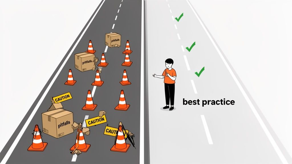
Common Testing Mistakes and How to Avoid Them
Learning from mistakes is part of the game, but it's much cheaper and faster to learn from the mistakes others have already made. I’ve seen even the sharpest teams fall into common traps that tank their landing page a/b testing efforts, leading to bad data and even worse decisions. Sidestepping these pitfalls is really what separates a mature testing program from one that just spins its wheels.
One of the biggest blunders? Testing too many things at once. It’s incredibly tempting to build a new variant with a different headline, a splashy new hero image, and a punchier CTA. You might see a huge lift, sure, but you'll have zero clue which change actually moved the needle. This is more of a multivariate test, and while it has its place for advanced teams, it often just creates confusion.
For most situations, you’re far better off isolating one significant variable per test. This is how you get clean, actionable insights and truly start to understand what makes your users tick.
Ending the Test Prematurely
Patience is a superpower in A/B testing, but it's one a lot of people are missing. It’s easy to get excited when a new variant rockets to a 20% lead in the first 48 hours, but that early data is often just statistical noise. It’s not a reliable trend.
Calling a test early because one version looks like it's winning is the fastest way to get a false positive. I've personally seen teams roll out a "winner" based on a tiny sample size, only to watch their site-wide conversion rate dip a month later.
Always let your test run until it reaches the pre-calculated sample size and achieves at least 95% statistical significance. This is non-negotiable. Trust the math, not the early momentum.
This discipline is your best defense against making a bad call that costs you real money down the road.
Ignoring the "Why" Behind the "What"
Another classic mistake is getting completely lost in the quantitative data—the numbers—while ignoring the human story behind them. Your analytics tell you what happened, but they almost never tell you why. A test might show Version B bombed, but you won't know if it's because the new headline was confusing, the image felt off-brand, or the button color was just plain ugly.
To get the full picture, you need to pair your A/B tests with qualitative feedback.
- Session Recordings: Watch how real people navigate the control and the variant. You might spot them hesitating, getting frustrated, or rage-clicking on your new design, which tells you a lot more than a simple conversion rate.
- User Surveys: Pop up a simple, one-question survey after a user converts (or abandons their cart). Ask them what almost stopped them from signing up.
- Feedback Widgets: Let users leave comments. You'll get raw, unfiltered feedback that often points directly to the problem.
Blending these two types of data gives you a much richer understanding. It helps you build smarter hypotheses for future tests and ensures you’re not just chasing clicks but actually creating a better experience.
Misinterpreting Inconclusive Results
Not every test will crown a clear winner. And that's okay. A huge error is to see an inconclusive result as a total failure. In reality, that "failed" test just gave you a valuable piece of information: the change you made wasn't big enough to matter to your users.
That's a powerful lesson. It means your hypothesis was probably off the mark or you were tweaking an element that nobody cares about. Instead of just trashing the results, document them. Knowing what doesn't work is just as important as knowing what does, because it stops your team from wasting time on similar dead-end ideas in the future. Take it as a signal to either test a much bolder change or shift your focus to a completely different part of the user journey.
Your Top Landing Page Testing Questions, Answered
Even the most seasoned pros run into questions when they're in the weeds of an experiment. Let's tackle some of the most common ones I hear. Getting these right is the difference between a successful testing program and a series of frustrating, dead-end efforts.
Think of this as your go-to cheat sheet for when you're stuck. My goal is to get you past the roadblocks and back to what really matters: learning from your users and improving your page.
How Long Should I Run a Landing Page A/B Test?
Forget about a magic number of days. The real answer is: you run it until you have enough data to make a confident decision. This is all about reaching a large enough sample size to achieve statistical significance. A high-traffic homepage might get there in three days, while a niche product page could take three weeks.
As a practical rule of thumb, always aim to run a test for at least one full business cycle. That usually means one to two weeks. This simple step helps average out any weirdness in user behavior, like the difference between a lazy Sunday browser and a focused Monday morning buyer.
The single most important rule here? Never, ever stop a test early just because one version is pulling ahead. This is a rookie mistake that almost always leads to a false positive. Figure out the sample size you need before you launch, and then have the patience to see it through.
What Should I Test First on My Landing Page?
It’s tempting to start by fiddling with button colors, but that's rarely where the big wins are. If you want to see a real impact from your first few tests, you have to go for the jugular. Focus on the elements that have the biggest potential to influence a visitor's decision.
Here’s where I’d put my money first:
- Your Headline and Value Prop: This is your 3-second pitch. Is it clear? Does it resonate with your audience's biggest problem? Test completely different angles that speak directly to their needs.
- The Call-to-Action (CTA) Copy: The words on the button matter way more than the shade of green. Try a benefit-focused CTA like "Get Your Free Marketing Plan" against something more direct like "Start My Trial."
- The Hero Shot: Your main image or video is pure emotion. Test visuals that tell a better story or help the visitor picture themselves succeeding with your product.
- Social Proof Placement: You have testimonials and logos, but are they working for you? Try moving your strongest social proof right below the hero section and see if it builds trust earlier in the journey.
- Form Fields: If you’re generating leads, every field you ask for adds friction. Try a radical test: remove every single field that isn't absolutely essential. You might be surprised by the lift in conversions.
Your own analytics are your best guide. Find the part of the page where people are bailing and form a hypothesis to fix that specific leak.
What if My A/B Test Result Is Inconclusive?
First off, an inconclusive result isn't a failure. It’s a finding. It tells you that the change you made wasn't significant enough to make your users behave any differently. That's incredibly valuable information.
Before you do anything else, just double-check: did you actually reach the sample size you needed? If so, the result is legitimate. It probably means your hypothesis was a bit off or the change was too subtle for anyone to really notice.
This is where you learn and adapt. An inconclusive test gives you two clear options: go back to the drawing board and design a much bolder, more radical variation, or pivot to a completely different element on the page.
The key is to document it. Knowing what doesn't work is just as important as knowing what does. It keeps your team from wasting time on low-impact ideas down the road and makes your entire testing strategy smarter.
Ready to turn these insights into action? Swetrix provides all the tools you need to run powerful, privacy-first A/B tests. Start making data-driven decisions that respect your users and grow your business. Get started with your free 14-day trial and launch your first experiment today.