- Date
How to Build a Marketing Dashboard That Drives Results
 Andrii Romasiun
A marketing team at a B2B SaaS company spent three months building what they called their "masterpiece dashboard." Twenty-seven metrics. Fifteen visualizations. Automated data pulls from eight platforms. The CMO opened it once, scrolled for thirty seconds, and went back to Excel. The dashboard collected dust while the team manually compiled reports every Monday morning.
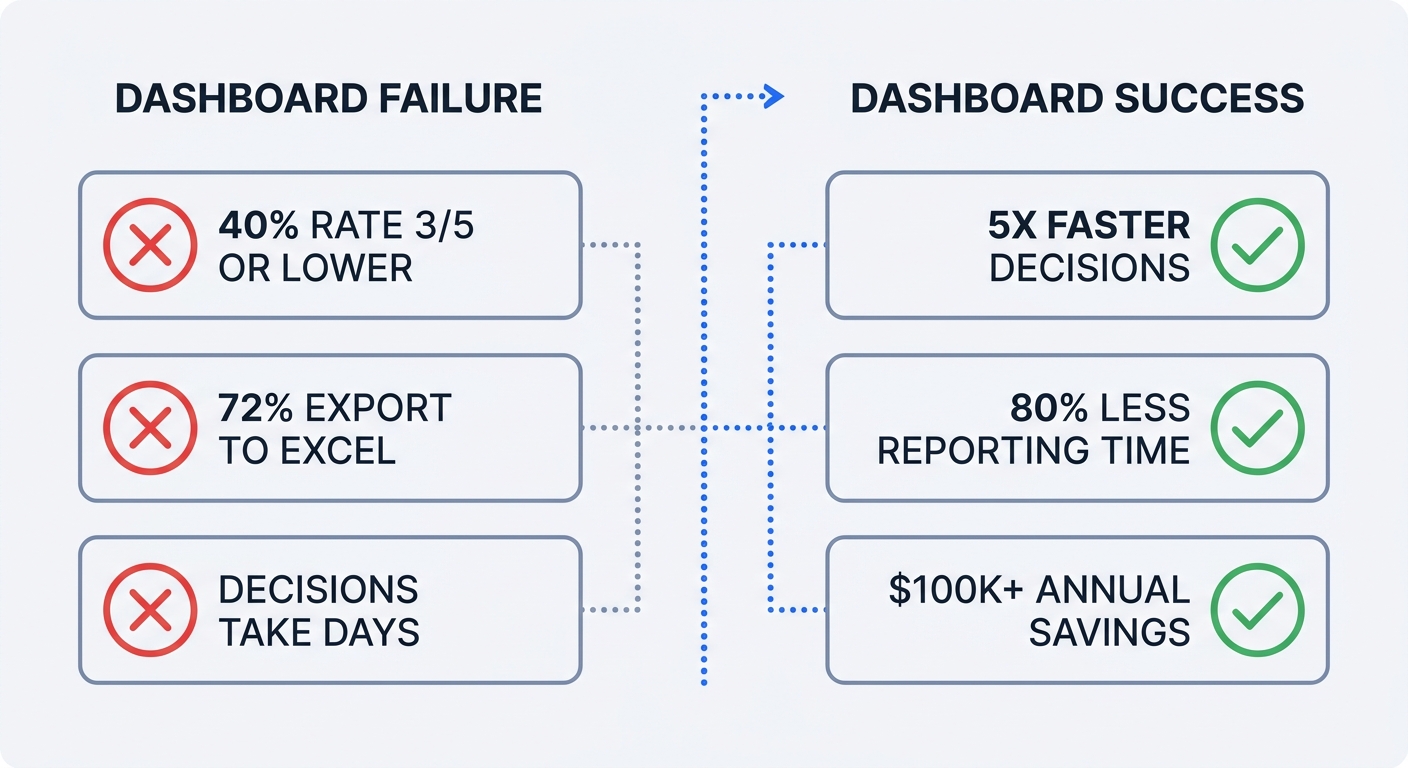
This pattern repeats across organizations. Research from Dataslayer shows that 40% of users rate their dashboards 3 out of 5 or lower, and 72% still export data to Excel when dashboards fail to deliver answers. Most dashboards are built as reports, not decision-making tools.
Companies that get dashboards right see dramatic results. Effective dashboards enable decisions five times faster than competitors and cut reporting time by 80%. One SEO agency saved over $100,000 annually by replacing manual reporting with automated dashboards. The difference between success and failure comes down to building for action, not information display.
Why Your Marketing Dashboard Matters (And Why Most Fail)
The Cost of Dashboard Failure
Poor data quality costs organizations an average of $12.9 million per year through erroneous decisions, inefficiencies, and compliance risks. When dashboards show outdated data, 67% of users lose confidence in their analytics. Teams abandon the tool and revert to manual processes that consume 10-20 hours weekly.
The problem starts with scope creep. A dashboard with 20 KPIs tries to answer every possible question and ends up answering none of them well. Users can't identify which metric matters most. Cognitive overload sets in. The dashboard becomes a data dump rather than a decision aid.
Refresh frequency creates another failure point. Marketing teams need different update speeds for different decisions. Budget pacing requires hourly data. Campaign performance reviews work with daily updates. Executive summaries function on monthly cycles. A dashboard that refreshes everything weekly satisfies none of these needs.
What Makes a Dashboard Work
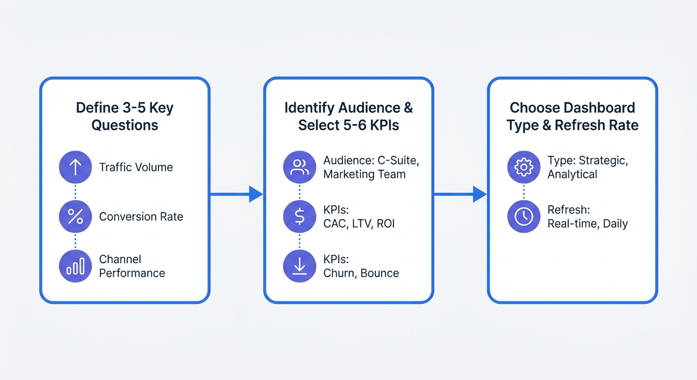
Successful dashboards start with questions, not data. Before opening any tool, define three to five specific questions the dashboard must answer. "Which channels drive qualified leads?" is a question. "Show me all our marketing data" is not.
A B2B SaaS company built separate dashboards for three audiences: their CMO saw monthly MRR impact from marketing, the paid media manager tracked daily budget pacing and cost per lead, and the content team monitored organic traffic and engagement metrics. Adoption jumped from 23% to 87% within two weeks because each dashboard answered specific questions for its user.
Limit each dashboard to 6-10 core KPIs. More metrics dilute attention and slow decision-making.
Audit your current dashboard against three criteria:
- Does it answer specific questions that drive decisions?
- Can users act on the data without additional analysis?
- Is someone opening it daily and making changes based on what they see?
If you answered no to any of these, the dashboard needs rebuilding from strategy up.
Step 1: Define Your Dashboard Strategy Before Building Anything
Start With Questions, Not Data
Open a blank document. Write down the three most important decisions you make weekly based on marketing data. Not the data you look at—the actual decisions. "Should I increase budget on this campaign?" "Which content topics drive conversions?" "Where are qualified leads coming from?"
Each question becomes a dashboard section. If you can't connect a metric to a decision, cut it. Vanity metrics like total impressions or follower counts might feel good to track, but they don't change what you do tomorrow.
A paid media manager needs to answer: "Am I pacing to hit monthly budget targets?" The dashboard shows daily spend versus target, with a projection line extending to month-end. When actual spend drops below the line, the manager increases bids or expands targeting.
Choose Your Audience and KPIs
Executives need different data than channel managers. Build an executive view that shows revenue per marketing dollar, customer acquisition cost, and pipeline contribution. Update it monthly.
Channel managers optimize daily. Their dashboard tracks cost per acquisition, conversion rate by source, and budget pacing. Refresh this data hourly during active campaigns so managers can adjust bids before burning budget on underperforming ads.
Content teams measure organic reach and engagement. Track organic traffic, time on page, scroll depth, and conversion rate by content type. Daily updates suffice—content optimization happens over weeks, not hours.
Create a one-page brief for each dashboard:
- Audience: Who opens this daily?
- Key decisions: What three actions will they take based on this data?
- Core KPIs: Which five to six metrics drive those decisions?
- Refresh rate: How current must the data be for the decision to remain valid?
Select the Right Dashboard Type
Three dashboard types serve different purposes:
Executive summary dashboards roll up marketing's business impact. Show marketing ROI, customer lifetime value, market share trends, and sales growth attributed to marketing. Update monthly. Executives don't need real-time data—they need accurate trend lines and clear ROI demonstration.
Performance optimization dashboards help channel managers improve campaigns. Display cost per lead, conversion rate by channel, budget pacing, and quality metrics like lead-to-opportunity ratio. Update daily or hourly. Managers need current data to adjust bids, pause underperforming ads, or shift budget between channels.
Campaign monitoring dashboards track active initiatives. Show impressions, clicks, conversions, and cost metrics for each running campaign. Update hourly or in real-time during high-stakes launches. When a campaign overspends by 3 PM, the team needs to know before the daily budget exhausts.
Match refresh frequency to decision speed. Acting on yesterday's data for budget pacing means missing the optimization window. Monthly data works for strategic planning because those decisions play out over quarters.
Step 2: Choose Your Tools and Data Sources
Three Approaches to Building Dashboards
Manual spreadsheets work for early-stage startups. Export data from each platform weekly, paste it into a master sheet, and calculate KPIs with formulas. This approach costs nothing beyond time but breaks down when you need daily updates or manage more than three data sources. Teams spend 10-20 hours weekly on manual exports and data cleaning.
Business intelligence platforms like Tableau or Power BI handle enterprise-scale reporting. Schneider Electric used Tableau for marketing attribution analysis and improved campaign efficiency by 20%. These platforms require dedicated data teams to build and maintain dashboards. Setup takes weeks. The payoff comes from handling complex, non-standard reporting requirements across large organizations.
Purpose-built marketing dashboard platforms emphasize speed and ease of use. Pre-built templates connect to common marketing channels—Google Ads, Meta, LinkedIn, email platforms—with minimal configuration. Dashboards are presentation-ready without design work. This approach fits teams that need results in days, not months, and lack dedicated data engineers.
Privacy-First Analytics: The Smart Foundation
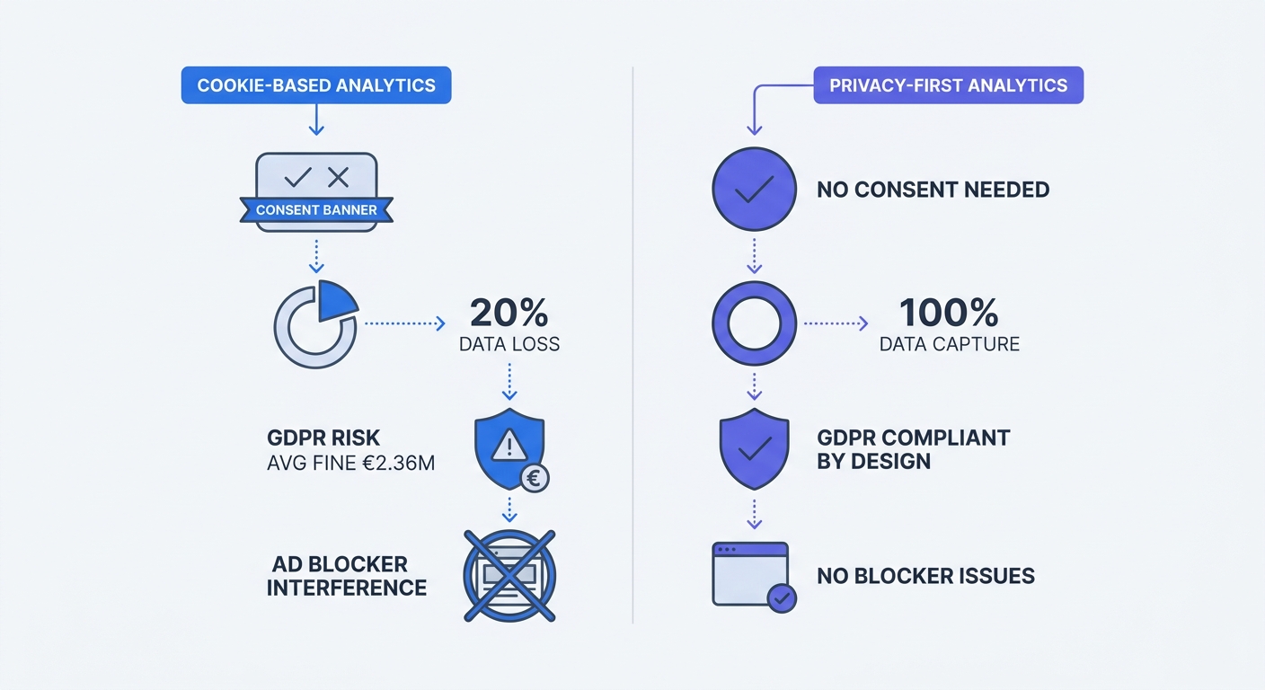
Cookie-based analytics can lose significant data when users reject consent banners. Studies show that around 20%-30% of visitors reject the consent banner, creating a substantial gap in marketing data.
Privacy-first analytics captures 100% of traffic without consent requirements. Tools like Swetrix don't collect personal data, IP addresses, or use cookies. Several EU data protection authorities have confirmed that properly configured cookieless analytics tools can be exempt from consent requirements because they don't process personal information.
GDPR enforcement intensified—regulators issued 2,245 fines totaling €5.65 billion by March 2025, with an average penalty of €2.36 million. Companies using cookie-based analytics face ongoing compliance risk. Privacy-first tools eliminate this exposure by design.
Browser restrictions compound the problem. Safari limits first-party cookies to seven days under certain conditions. Ad blockers interfere with traditional analytics scripts. Cookie-free solutions bypass both issues—they track page views and user flows without identifiers that browsers restrict.
Server-side tracking improves data quality further. Events fire from your server, not the user's browser, so ad blockers and browser restrictions don't interfere.
Start your dashboard on a privacy-compliant analytics foundation. You'll capture complete data, avoid consent banner complexity, and eliminate GDPR risk from day one. Check out Swetrix's Google Analytics alternative for a privacy-first approach that doesn't sacrifice functionality.
Connecting Multiple Data Sources
Marketing teams pull data from advertising platforms (Google Ads, Meta Ads, LinkedIn Ads), analytics tools, CRM systems, and email platforms. Data sits in silos across most organizations.
Map your current data sources:
- List every platform where marketing data lives
- Identify which metrics come from each source
- Note how often each platform updates its data
- Document any gaps—metrics you need but can't access
Most dashboard platforms offer pre-built connectors for major marketing tools. Verify that your chosen platform supports your specific stack before committing. Custom integrations add weeks to implementation timelines.
API rate limits affect refresh frequency. Some platforms restrict how often you can pull data. If you need hourly updates but the API allows only four calls daily, you'll need to adjust expectations or find a different data source.
Step 3: Design Your Dashboard for Action
Visual Hierarchy and Layout Principles
Place your three to five most important metrics at the top-left as large numbers with up/down indicators. People read in a Z-pattern—top-left captures attention first. Show current performance versus target. A paid media manager opening the dashboard should see "Daily spend: $847 / $1,000 target" before anything else.
Limit to 8-10 visualizations maximum. Too many elements create cognitive overload and make it harder to spot important trends at a glance. If you need more than ten charts to tell the story, you're trying to answer too many questions in one dashboard.
Use size and color to highlight what matters. Critical metrics get larger cards and brighter colors. Secondary metrics appear smaller and use muted tones. When everything is bold, nothing stands out.
Group related metrics together. Put all paid media KPIs in one section, organic metrics in another, and conversion data in a third. Users should find related information without scrolling between distant parts of the dashboard.
Choose the Right Visualizations
Match visualization type to data structure:
Line charts show trends over time. Use them for daily traffic, weekly conversions, or monthly revenue. The slope reveals whether performance is improving or declining.
Bar charts compare discrete categories. Display conversion rate by channel, cost per lead by campaign, or traffic by device type. Bars make relative performance obvious at a glance.
Scorecards present single, important KPIs. Show total monthly revenue, current customer acquisition cost, or marketing ROI as a large number with a comparison to last period.
Tables work when users need to see exact values or drill into specific campaigns. Limit tables to 10-15 rows—longer lists belong in detailed reports, not dashboards.
Avoid pie charts. They're hard to read when you have more than three segments, and bar charts communicate the same information more clearly.
Focus on actionable KPIs rather than vanity metrics. Cost per acquisition, revenue per marketing dollar, and conversion rate drive decisions. Impressions and follower counts feel good but rarely change what you do tomorrow. If a metric doesn't connect to a specific action, cut it.
Make It Interactive and Automated
Add filters for date range, channel, campaign, and geography. Users should answer their own questions without requesting custom reports. A content manager filtering by blog posts versus landing pages can identify which content type converts better and adjust the content calendar.
Automate data refresh based on decision speed. Paid campaigns need hourly updates so managers can adjust bids before burning budget. Performance reviews work with daily data. Executive summaries function on monthly cycles. Set refresh schedules that match how quickly users need to act.
Automation reduces reporting effort by 80%, freeing the team to optimize campaigns instead of compiling spreadsheets.
Build alerts for critical thresholds. When daily ad spend exceeds budget by 20%, send a notification. When conversion rate drops below historical average, flag it. Alerts catch problems before they compound.
Step 4: Build, Test, and Iterate
Implementation Timeline
This week: Interview five stakeholders about their decision-making process. Ask what questions they need answered, how often they need updates, and what actions they take based on marketing data. Document their responses.
This month: Design mockups for your most critical dashboard. Use a tool like Figma or even PowerPoint to sketch the layout. Show mockups to actual users and ask: Does this answer your key questions? Can you act on this data? What's missing? Adjust based on feedback before building anything.
This quarter: Implement your first production dashboard and establish a regular review cadence. Start with one dashboard for one audience rather than trying to build everything at once. A working dashboard for your paid media manager beats a perfect plan that takes six months to execute.
Validate With Stakeholders
Show mockups to users before full implementation. Walk through a typical scenario: "You open this dashboard Monday morning. What decision would you make based on what you see?" If they can't answer, the dashboard needs revision.
Ask specific questions during validation:
- Which metric would you look at first?
- What action would you take if this number was red?
- Is anything missing that you need to make decisions?
- How often would you open this?
Adjust based on feedback. If three users say they need to see cost per lead by device type, add that breakdown. If no one mentions a metric you included, consider cutting it.
Measure Dashboard Adoption
Track login frequency, time spent, and actions taken after viewing. Strong adoption means users open the dashboard daily and make changes to campaigns, budgets, or content plans based on what they see.
If adoption is low, diagnose why:
Wrong KPIs: The metrics don't connect to decisions users make. Interview users again and rebuild around their real questions.
Too complex: Users can't find the information they need quickly. Simplify the layout and cut secondary metrics.
Data quality issues: Numbers don't match other sources or update too slowly. Fix data pipeline problems before adding new features.
Not addressing real decisions: The dashboard shows interesting information but doesn't help users do their jobs better. Return to step one and define the specific decisions this dashboard should support.
Strong dashboards free teams to focus on optimization instead of data compilation. Measure time saved and decisions accelerated, not logins.
Future-Proofing Your Dashboard
Privacy Regulations and Cookie Deprecation
Safari blocks third-party cookies and limits first-party cookies to seven days under certain conditions. Firefox and Brave implement similar restrictions. Browser-based tracking becomes less reliable every quarter.
Companies using first-party data strategies achieve up to 40% higher customer lifetime value compared to those dependent on third-party cookies. Building dashboards on privacy-first analytics now protects against future data loss and regulatory risk.
GDPR fines continue escalating. Individual penalties can reach €20 million or 4% of global annual revenue, whichever is higher. Privacy-compliant analytics eliminates this exposure while capturing more complete data than cookie-based alternatives.
AI and Predictive Analytics
AI improves lead scoring accuracy by 38% and increases sales forecast accuracy. These tools surface insights without requiring manual dashboard interpretation.
Start small with AI integration. Add one predictive element—forecasted monthly conversions based on current pacing, or predicted customer lifetime value for new leads. Test whether the prediction improves decisions before expanding AI features.
Maintaining Data Quality
When dashboards show outdated data, 67% of users lose confidence in their analytics. Data quality requires ongoing validation.
Establish monthly data quality checks:
- Compare dashboard totals against source platform reports
- Verify that all data sources are updating on schedule
- Check for anomalies—sudden spikes or drops that don't match known events
- Test that filters and segments return expected results
Document data lineage. When a metric changes, users should understand why. "Conversion rate dropped 15%" needs context: Did traffic quality change? Did the landing page break? Did tracking stop working? Clear data lineage helps teams diagnose issues quickly.
Monitor for data pipeline failures. Set up alerts when data sources stop updating or when values fall outside expected ranges. Catching problems within hours prevents days of bad decisions based on stale information.
Marketing dashboards fail when they're built as reports instead of decision-making tools. Start with specific questions, limit to 5-6 core KPIs per audience, and automate everything. Companies that get this right make decisions five times faster and cut reporting time by 80%.
Privacy-first analytics provides the foundation for reliable, compliant dashboards that capture 100% of traffic without consent banners or GDPR risk. Try Swetrix free for 14 days—no credit card required—and build your marketing dashboard on a foundation that respects user privacy while delivering complete, actionable data.