- Date
A Practical Guide to Digital Marketing Reporting
 Andrii Romasiun
When we talk about digital marketing reporting, we’re really talking about storytelling. It's the craft of taking a mountain of data from all your different channels, making sense of it, and presenting it in a way that clearly shows how your marketing efforts are hitting business goals. A good report doesn't just list numbers; it builds a narrative that proves ROI, guides your next move, and shows stakeholders exactly what you're achieving.
Building a Foundation for Effective Reporting
Before you even think about building a chart or a dashboard, the real work begins. The most effective reporting is built on a solid foundation: figuring out what "success" actually looks like for your business. This is where you move past vanity metrics and connect everything you measure back to core business objectives. Skip this step, and you’ll end up with a report that’s just a data dump, not a strategic tool.
The whole point is to draw a straight line from a big-picture goal, like "grow our market share," all the way down to a specific marketing metric you can track. This takes collaboration and getting everyone on the same page.
Aligning Goals with Stakeholder Expectations
First things first: have a conversation. Sit down with the key people—the CEO, the head of sales, the product lead—and ask a simple question: "What does a win look like for you?" Their answers will tell you which business outcomes actually move the needle.
You’ll find that a CEO might be laser-focused on Customer Lifetime Value (CLV), while the sales team lives and breathes Marketing Qualified Leads (MQLs). Your report needs to bridge that gap. It has to show how your marketing activities directly impact both of those priorities. Getting this alignment right from the start means you won't waste time reporting on metrics that, while maybe interesting to you, don't mean a thing to the people signing your budget.
This simple three-step process is the key to building a solid reporting foundation: define your goals, align them with your team, and then figure out how you're going to measure success.
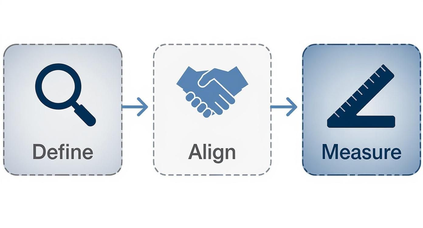
This visual really drives the point home. If you don't define clear objectives and get buy-in from your stakeholders, all your measurement efforts will be aimless.
Translating Objectives into Measurable KPIs
Once you have a clear understanding of the business goals, the next step is to translate them into tangible Key Performance Indicators (KPIs). A fuzzy objective like "improve brand awareness" doesn't become actionable until you attach a concrete metric to it.
This process of translation is what makes your reporting truly powerful. By connecting high-level business goals to specific marketing KPIs, you can see exactly how your day-to-day work contributes to the bigger picture.
Translating Business Goals Into Actionable KPIs
| Business Goal | Marketing Objective | Primary KPI | Example Metric |
|---|---|---|---|
| Increase customer retention | Improve post-purchase engagement | Email Click-Through Rate | Achieve a 5% CTR on three consecutive customer-only newsletters. |
| Grow market share in a new region | Increase brand visibility in the target area | Branded Search Volume | See a 20% quarter-over-quarter increase in organic searches for the brand name. |
| Boost product adoption | Drive new feature trial and usage | Feature Adoption Rate | Get 1,000 active users to try the new "Project Templates" feature within the first month. |
| Reduce Customer Acquisition Cost | Optimize top-of-funnel ad spend | Cost Per Lead (CPL) | Lower CPL on LinkedIn campaigns from $75 to $60 by the end of Q3. |
This kind of granular approach ensures every single piece of data you put in your report has a purpose. It proactively answers the "so what?" question before anyone even has a chance to ask it. Of course, this relies on solid data collection, so it helps to have a good grasp of what web analytics is and how it all works.
With marketing teams juggling more information than ever—using 230% more data than in 2020, according to some reports—this focus is non-negotiable. And yet, a staggering 56% of marketers say they don't have enough time for proper analysis. That's a huge disconnect, and it underscores why building efficient, goal-oriented reports is so critical.
A report without a clear objective is just a collection of numbers. The foundational work of defining goals and KPIs is what transforms data into a narrative that proves marketing's impact on the bottom line.
Picking the Right Metrics for Each Channel
Once you have your big-picture goals locked in and everyone's on the same page, it's time to get into the weeds of each marketing channel. This is where a lot of reports go wrong. Throwing the same set of metrics at SEO, paid ads, and social media just doesn't work. Each channel has a unique job to do, and your reporting needs to respect that.
What looks like a home run for a PPC campaign—like a low cost-per-click—is totally meaningless for your organic social media efforts. The trick is to choose metrics that not only measure how a specific channel is doing but also clearly connect back to the larger business objectives you've already defined. This way, you start to tell a cohesive story where every channel’s contribution is crystal clear.
Key Metrics for SEO Reporting
Search Engine Optimization is a marathon, not a sprint. Your reports have to reflect this reality. While it's tempting to celebrate a sudden traffic spike, the real value of SEO is demonstrated through steady, sustained growth over months and years. Your report should be focused on telling that story of growing authority and organic reach.
Here are the SEO metrics I always keep a close eye on:
- Organic Traffic: This is your foundation. You need to know how many people are finding you through search engines, and more importantly, how that number is trending over time.
- Keyword Rankings: Are you climbing the ladder for the keywords that actually matter to your business? Tracking your position for high-value terms is a direct signal that your content and technical SEO work are paying off.
- Backlink Velocity: This is a slightly more advanced metric that measures how quickly new domains are linking back to your site. A healthy, consistent increase tells search engines that you're becoming an authority.
- Conversion Rate from Organic Traffic: At the end of the day, traffic is only useful if it converts. You must track how many of those hard-earned organic visitors actually complete a goal, whether that's signing up, downloading a resource, or making a purchase.
Essential Metrics for PPC Campaigns
Unlike the slow burn of SEO, paid search campaigns are all about immediate impact and efficiency. Your PPC reporting needs to be sharp and laser-focused on one thing: return on investment. Every dollar spent has to be accounted for.
For paid campaigns, the metrics that matter are the ones tied directly to your budget and performance:
- Click-Through Rate (CTR): This tells you if your ads are actually compelling. A high CTR means your copy and creative are hitting the mark with your target audience.
- Cost Per Click (CPC): This is a fundamental efficiency metric. You need to know what you’re paying for each click so you can optimize your bids and avoid wasting money.
- Conversion Rate: What percentage of people who click your ad actually do what you want them to do? This is the ultimate test of your landing page and offer.
- Cost Per Acquisition (CPA): This is the bottom line. How much does it cost you to get a new customer through this channel? This is the number your CFO will care about.
To get truly reliable data here, proper campaign tagging is non-negotiable. You can check out our guide on using UTM parameters to make sure every single click is tracked correctly. It's the only way to get a clean, accurate picture of what's working.
Measuring Social Media Impact
Reporting on social media can feel a bit fuzzy. Its impact often isn't as direct as a PPC click, so the focus shifts to things like engagement, community building, and brand awareness. Your report should tell the story of how you're building relationships and shaping conversations online.
With the social media ad market expected to jump by 12% in 2025 and 76% of people saying social content influences their purchases, this channel's power is undeniable. That makes tracking engagement and its link to conversions more critical than ever. You can see the full 2025 statistics report to understand how these trends are shaping the industry.
For social media, engagement isn't just a vanity metric; it's a leading indicator of brand health and audience loyalty. A report that only shows follower count misses the entire point of the channel.
Your social media report should feature metrics like these:
- Engagement Rate: This is the big one—likes, comments, shares, and saves. It's a direct measure of how much your content is resonating.
- Reach and Impressions: How many unique eyeballs saw your content, and how many times was it shown in total? This helps you understand your overall visibility.
- Audience Growth Rate: Don't just show the total number of followers. Tracking the percentage of growth shows momentum and tells a much more powerful story.
- Website Clicks: How good is your social media at actually driving people back to your site? This is how you connect social activity to real business goals.
Critical Metrics for Email Marketing
Even after all these years, email marketing often delivers the highest ROI of any channel. Your email reports should be tightly focused on subscriber engagement and, most importantly, the actions they take after they open your message.
It’s time to look past simple open rates and dig into what really matters:
- Open Rate: A decent starting point to see if your subject lines are working, but it's just the first step.
- Click-Through Rate (CTR): This is far more important. It means your message was compelling enough to make someone take action.
- Conversion Rate: Of the people who clicked, how many actually completed your goal? This metric directly ties your email campaigns to revenue.
- Unsubscribe Rate: Keep an eye on this. A high or rising rate is a clear sign that your content isn't relevant or you're sending too many emails.
Designing Reports That Tell a Clear Story
Let's be honest: raw data is just noise. A cluttered spreadsheet crammed with numbers doesn't help anyone make better decisions. More often than not, it just causes confusion and paralysis. The real skill in digital marketing reporting is turning that raw data into a clear, compelling story that moves your team from observation to action.
This is where thoughtful report design and smart data visualization come in. Your goal isn't just to present numbers; it's to create a document someone can understand in minutes, not hours. It needs to tell a story about performance, shine a light on what’s working, and clearly point to what we should do next. A well-designed report builds confidence and proves the strategic value of your work.
The Anatomy of an Effective Report
Before you even think about dropping charts onto a page, you need a blueprint. A great report has a logical flow that serves up the most important information first, with deeper context available for those who want to dig in. It's all about creating an information hierarchy.
From my experience, a structure that works for nearly any audience has three core parts:
- The Executive Summary: Start with the bottom line. This is a one-page snapshot summarizing the most critical findings, major wins, and key challenges from the reporting period. It should be concise enough for a busy CEO to get the gist instantly.
- Channel Deep Dives: Here’s where you break down performance by individual channels like SEO, PPC, and social media. Using the specific metrics you already identified, you can show exactly how each area is contributing to the bigger picture.
- Key Insights and Recommendations: This is the most important section by far. Don't just show the data; interpret it. You need to answer the "so what?" question by explaining what the numbers actually mean and proposing clear, actionable next steps.
This simple framework ensures your report is valuable to everyone, from the high-level exec who only has time for the summary to the channel manager who will pore over every detail.
Choosing The Right Chart For Your Data
The way you visualize your data can be the difference between an "aha!" moment and a confused stare. Different charts tell different stories, and picking the right one is absolutely essential for clarity. A common mistake I see is people defaulting to a pie chart for everything when a simple bar chart would have done a much better job. Each visual has a specific purpose.
To make this easier, here's a quick guide to pairing your data with the right visual.
Choosing The Right Chart For Your Data
| Chart Type | Best Used For | Marketing Example |
|---|---|---|
| Line Chart | Tracking performance over time to show trends. | Showing the month-over-month growth of organic search traffic over the last year. |
| Bar Chart | Comparing different categories or groups against each other. | Comparing the conversion rates of three different PPC campaigns. |
| Pie/Donut Chart | Showing parts of a whole or percentage breakdowns. | Illustrating the percentage of website traffic from different sources (Organic, Paid, Direct). |
| Heat Map | Visualizing user behavior on a webpage to see where they click. | Identifying which call-to-action buttons on your homepage get the most engagement. |
Using the right visual tool makes your data instantly digestible. It turns an abstract number into a concrete insight that people can quickly process and act on.
A report is not a data repository; it's a communication tool. The ultimate test of your report's design is whether a non-marketer can look at it and understand the story you're trying to tell.
Crafting a Narrative with Data
Think of your report as a story with a beginning, a middle, and an end. The beginning (your executive summary) sets the stage. The middle (your channel deep dives) provides the supporting evidence and plot points. The end (your insights) delivers the conclusion and sets up the sequel—what you’ll do next.
For instance, instead of just stating that "traffic from social media decreased by 15%," your report should tell the whole story. You could show a line chart illustrating the drop, then immediately follow it with an insight like this:
"Our social media traffic saw a 15% dip this month, primarily driven by a recent Instagram algorithm change that reduced post reach. We recommend reallocating 10% of our social budget to test short-form video content, which the platform is currently favoring."
This approach connects the "what" with the "why" and the "what now." It transforms your reporting from a passive summary into a proactive, strategic document that drives the business forward. For more inspiration, check out some examples of a great web analytics dashboard to see how data can be presented for maximum impact.
Automating and Sharing Your Marketing Reports

Let's be honest: manual marketing reporting is a soul-crushing time sink. The hours you spend exporting CSVs, fighting with spreadsheet formulas, and pasting screenshots are hours you're not spending on actual strategy. It’s not just tedious; it's a recipe for costly mistakes and stale insights. By the time you've finished building a manual report, the data is already out of date.
The only way to win this game is to switch from a manual grind to an automated system. This shift frees up your team to do what they're actually paid for: thinking, analyzing, and making smart decisions. Automation turns reporting from a backward-looking chore into a forward-looking strategic asset.
Building Your Automated Reporting Engine
The heart of any good automated system is a central dashboard that pipes in data directly from all your sources. Whether you're using Google Data Studio, a specialized reporting tool, or a privacy-first platform like Swetrix, the goal is the same: create a single source of truth that's always on.
This gives you a unified view of performance, which is absolutely critical. You can finally see how your SEO efforts are influencing email sign-ups or how a social media campaign is driving direct traffic. This kind of proactive communication is a huge deal—nearly 40% of marketing agencies say it's their top reason for client retention.
A live, centralized dashboard means you get real-time information at a glance. Instead of waiting for a report, you can see trends as they happen, making you far more agile.
Finding a Consistent Reporting Rhythm
Once your dashboards are live, you need to get the information into the right hands automatically. The idea is to set up a consistent delivery cadence so stakeholders are always in the loop without you having to lift a finger. Most platforms make it easy to schedule reports and email them out.
Here’s a simple, effective schedule I’ve seen work wonders:
- Weekly Pulse Checks: Send out an automated, high-level snapshot every Monday morning. It should cover the big stuff: total traffic, conversions, and ad spend. Quick, digestible, and perfect for leadership.
- Monthly Deep Dives: On the first business day of the month, send a more detailed report. This is where you bring in the channel-specific breakdowns and trend analysis we talked about earlier. This is for the marketing team to chew on.
- Quarterly Strategy Reviews: Dashboards are for the day-to-day, but a quarterly review is still essential for big-picture planning. This can be more of a narrative document, using the data from your automated reports to tell a story and set future goals.
This tiered approach makes sure everyone gets the right level of detail at the right time. Your CEO gets the highlights, and your team gets the data they need to optimize.
Automation isn't about replacing the analyst; it's about empowering them. By removing the burden of manual data collection, you give your team the time and mental space to uncover the strategic insights that drive growth.
Setting Up Proactive Alerts
Scheduled reports are great, but the real magic of automation is being proactive. A great system doesn’t just tell you what happened last week—it alerts you the moment something important is happening right now.
Think of alerts as your digital tripwires. You set them to go off when key metrics hit a certain threshold, good or bad. This is a total game-changer for staying on top of campaign health.
A few critical alerts you should set up immediately:
- Sudden Traffic Drop: Get an instant notification if site traffic plummets by more than 20% in 24 hours. This could be a broken tracking code, a server issue, or a penalty—and you need to know ASAP.
- Conversion Spike: If a landing page's conversion rate suddenly doubles, you want to know why. An alert lets you jump on it, figure out what's working, and maybe pour more budget into that channel.
- Ad Spend Anomaly: Create a trigger if a PPC campaign’s daily spend blows past its target by 15%. This helps you catch budget pacing problems before they turn into a five-figure mistake.
The best part is you can often pipe these alerts directly into Slack, Telegram, or Discord. This gets the information to the right people instantly, turning your reporting from a passive activity into a real-time monitoring system.
How to Interpret Results and Drive Action

This is where all your hard work pays off. A report that just sits in an inbox gathering digital dust is a failure, no matter how beautifully designed or automated it is. Its real value comes to life when it sparks a conversation, challenges an old assumption, and ultimately, pushes your team to take smart, decisive action. The numbers are just the start; the real magic happens in the analysis.
Getting from raw data to a real decision isn't an accident—it's a process. It’s about learning to spot trends, question weird outliers, and relentlessly ask "why" until you get to the bottom of things. This is how a report stops being a simple look in the rearview mirror and becomes a strategic roadmap for growing the business.
Beyond the "What" to the "Why"
Your report shows you what happened. Your job, as a marketer and analyst, is to uncover why. This is the single most important step in turning numbers into insights. Simply announcing that website traffic is up is great, but it’s not particularly useful on its own. The gold is always found by digging a layer or two deeper.
Let's say a report flags a 25% jump in website sessions. High-fives are great, but the real work starts now. You need to ask some questions:
- Where did this new traffic come from? Did a specific channel like organic search take off? Was it a referral from a new partner?
- Was it good traffic? Did these new visitors actually stick around and engage, or did they bounce immediately?
- Did it move the needle? If traffic is up but your goal completions are flat, you might have a problem with your landing page experience or the audience you're attracting.
Answering these questions transforms a flat data point into a compelling story. Maybe you find out a single blog post got picked up by a niche community, driving a flood of passionate but low-converting visitors. That’s a powerful insight that can completely reshape your content strategy for the next quarter.
Identifying Trends and Spotting Anomalies
When you report consistently over time, you establish a baseline for what "normal" looks like. Once you have that baseline, two things become incredibly valuable: long-term trends and sudden anomalies. Both are flashing signals that demand your attention.
A trend is a slow, steady pattern. For instance, maybe your email click-through rate has been inching down for three straight months. That’s a trend, and it could point to an issue with content relevance or list fatigue.
An anomaly, on the other hand, is a sharp, unexpected spike or dip. A sudden 400% surge in traffic from a country you don't even operate in is a classic anomaly—and it probably means you've got a bot problem to investigate.
Your job isn’t just to report the numbers; it’s to contextualize them. Is this number good or bad? Is it expected or surprising? This context is what gives data meaning and guides your next steps.
Turning Insights Into Actionable Next Steps
Every single insight you uncover has to lead to a concrete recommendation. This is the final, crucial bridge between your analysis and real-world action. Without a clear "what's next," your report is just an interesting piece of trivia.
Don't just say, "We should improve our SEO." A truly actionable recommendation is specific, measurable, and has someone's name on it. It sounds more like this:
"Our conversion rate from organic traffic dropped 10% last quarter. Looking into it, our top three landing pages have slow load times. My recommendation is to task the dev team with optimizing these pages, aiming for a load time under two seconds by the end of the month."
This approach builds accountability and makes sure your digital marketing reporting directly fuels a cycle of continuous improvement. It’s what turns your reporting from a chore into the engine that drives your entire strategy forward.
Answering Your Toughest Digital Marketing Reporting Questions
Even with a perfect plan, you're going to hit some tricky questions when it comes to reporting. I've been there. Getting the small details right—like how often to send a report or what to do when your boss asks for vanity metrics—is what separates a useful report from one that just gets archived.
Let's walk through some of the most common questions I get asked.
How Often Should I Actually Create These Reports?
Honestly, there’s no magic number. It all comes down to who you're talking to and what you're trying to achieve. The frequency needs to match the pace of the channel and the strategic needs of the person reading it.
For instance, a fast-moving Google Ads campaign might need a weekly or even daily check-in to stay on track. But if you try to report on SEO performance every week, you'll just drive yourself crazy looking for changes that haven't had time to happen. A long-term play like SEO is much better suited for monthly or quarterly reviews.
Here’s a quick guide I use to frame reporting schedules:
- Weekly Reports: These are for the people in the trenches—the tactical teams and channel managers. Focus on the immediate stuff: ad spend, lead volume, website traffic. The goal here is to spot short-term problems and jump on quick wins.
- Monthly Reports: This is the sweet spot for marketing leadership and key stakeholders. You'll summarize performance, show how you're tracking against monthly KPIs, and, most importantly, connect your marketing activities to actual business results.
- Quarterly Reports: Think big picture. This one is for your executive team or C-suite. It’s your chance to zoom out and tell the story of major trends, overall ROI, and how the marketing strategy is pushing the company's long-term goals forward.
What's the Real Difference Between a Report and a Dashboard?
I see this one trip people up all the time, but the distinction is incredibly important. While they both show data, they do completely different jobs.
A dashboard is your live, real-time pulse check. Think of it as the speedometer in your car—it tells you exactly what’s happening right now. Dashboards are brilliant for quick, at-a-glance monitoring and catching issues the moment they pop up.
A report, on the other hand, is a static analysis of a specific period, like the past week or month. Its job is to provide context, analysis, and a compelling narrative. It doesn't just present the numbers; it interprets them and answers the crucial "so what?" question with insights and clear recommendations.
A dashboard shows you the what. A report tells you the why and the what's next. You absolutely need both to run a smart marketing operation.
How Can I Make Sure My Reporting Is Privacy-Compliant?
In today's world of GDPR and heightened consumer awareness, privacy isn't optional. It's table stakes. Relying on traditional analytics tools that use invasive cookies is quickly becoming a major liability. The last thing you want is to build your beautiful reports on a shaky foundation of non-compliant data.
The most direct path to compliance is to switch to a privacy-first analytics platform. Tools like Swetrix are built from the ground up to give you the insights you need without collecting personal data or dropping cookies. This approach doesn't just keep you on the right side of the law; it builds trust. It shows your audience you respect them, and that's becoming a powerful way to set your brand apart.
What Are the Most Common Reporting Mistakes I Should Avoid?
Knowing what not to do is just as important as knowing what to do. I’ve seen so many well-intentioned reports fall flat because they stumble into a few common traps.
Here are the biggest mistakes that I see teams make over and over:
- Chasing Vanity Metrics: This is the classic error. Reporting on things like "likes" or "impressions" without tying them to an actual business outcome is a waste of everyone's time. Your data must always connect back to a meaningful KPI, whether that's conversions, revenue, or customer acquisition cost.
- Forgetting the Narrative: A report that’s just a jumble of charts is a data dump, not a strategic tool. You have to be the storyteller. Always include a short executive summary and clear insights that explain what the numbers actually mean for the business.
- Skipping the Actionable Insights: What's the point of a report if it doesn't lead to action? If your report doesn't end with a clear set of recommendations for what the team should do next, it hasn’t done its job.
Steering clear of these mistakes will transform your reports from a simple summary into a powerful tool that guides strategy and proves your team's undeniable value.
Ready to build reports that are both powerful and privacy-friendly? Swetrix gives you the actionable insights you need without compromising user privacy. Start your 14-day free trial and see the difference.