- Date
A Practical Guide to A/B Testing for Landing Pages
 Andrii Romasiun
Ever felt that sinking feeling when you pour money into ad campaigns, get a ton of clicks, but see hardly any conversions? Your landing page is leaking money, and it's a common, frustrating problem. This is exactly where A/B testing stops being a "nice-to-have" and becomes a critical part of your growth strategy.
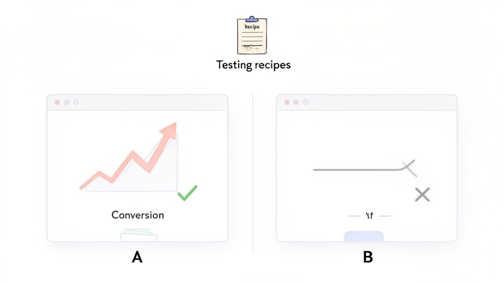
A/B testing, at its core, is a simple concept: you compare two versions of your webpage to see which one works better. You show your original page (version A) to one half of your visitors and a new, modified version (B) to the other half. Then, you measure which one gets you more of what you want—be it sign-ups, sales, or downloads.
Why A/B Testing Your Landing Pages Is a Game Changer
Think of your landing page like a sales pitch. Your current page is your go-to script, but what if a different opening line, a stronger closing, or even a change in your tone of voice could dramatically improve your results? A/B testing lets you try out these variations on a small scale before you roll them out to everyone.
It's the most effective way to understand what actually resonates with your audience and make your existing traffic work much, much harder for you.
To get started, it helps to understand a few key terms that you'll see again and again.
Key A/B Testing Concepts at a Glance
| Term | What It Means for Your Landing Page Test |
|---|---|
| Control | This is your original landing page (Version A). It's the baseline you're trying to beat. |
| Variation | This is the modified version of your page (Version B). It contains the change you're testing. |
| Conversion | The specific action you want a visitor to take, like filling out a form or making a purchase. |
| Conversion Rate | The percentage of visitors who complete your desired action. This is your main success metric. |
| Statistical Significance | The mathematical confidence (usually 95% or higher) that your test results are not due to random chance. |
Understanding these basics is your first step toward running tests that deliver real, reliable insights.
The Real-World Impact of Small Tweaks
The true power of A/B testing is how it can produce huge wins from seemingly minor adjustments. You’re no longer guessing what might work; you're letting your users show you exactly what they prefer through their actions.
This isn't just about making your page look prettier. This data-driven approach directly impacts your bottom line. Did you know that consistent A/B testing can boost sales by an average of 49%? While the average landing page converts at a dismal 2.35%, the top performers are hitting 11.45% or more. Yet, shockingly, only about 17% of marketers are actually doing this. That gap is your opportunity. You can explore more insights on conversion optimization over at Data-Mania.
The goal isn’t just to find a “winner.” It’s to build a continuous cycle of improvement where every test, successful or not, gives you valuable insight into how your customers think.
Building Trust While You Test
In an age where people are rightly concerned about their digital privacy, how you run your tests matters. This is why leaning on a privacy-first analytics tool is a smart move.
Tools like Swetrix let you gather all the critical performance data you need for your A/B tests without using cookies or invasive personal tracking. You get the clear, actionable insights needed to improve your landing page while respecting your audience's privacy. It's a true win-win that helps you build a more sustainable, trustworthy brand.
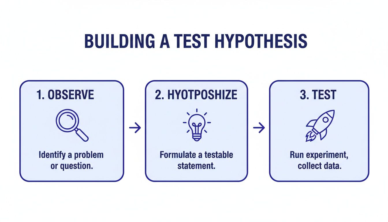
Building a Test Hypothesis That Actually Works
Jumping into A/B testing without a solid plan is a rookie mistake. It's easy to get caught up changing button colors or tweaking headlines, but without a clear why, you're just throwing things at the wall to see what sticks. The best, most impactful experiments don't come from random ideas; they're built on a strong, data-backed hypothesis.
A weak hypothesis sounds something like, "Let's test a green button instead of blue." It’s a shot in the dark. Even if it wins, you don't really learn anything meaningful about your audience. A powerful hypothesis, on the other hand, is a clear statement connecting a specific change to an expected outcome, with a solid reason behind it.
The "Because" Is Your Secret Weapon
To stop guessing and start making strategic moves, you need a framework. I've used this simple structure for years to ground every single test I run:
By changing [X], I expect [Y] to happen, because of [Z].
- [X] is the Change: This is what you're actually altering. Think specific. For example, changing your headline from being feature-focused to benefit-focused.
- [Y] is the Expected Outcome: This is the metric you're trying to move. Be ambitious but realistic, like aiming for a 15% increase in free trial sign-ups.
- [Z] is the Rationale: This is the magic ingredient. It's the why behind your test, rooted in analytics, user feedback, or even well-known psychological principles.
This simple sentence forces you to justify every experiment. That "because" is what elevates a random tweak into a calculated, educational test.
Finding Your "Why" in the Data
So where do you find that all-important rationale? You listen to your users. Or, more specifically, you watch their behavior through your analytics. Your data is a goldmine of clues, showing you exactly where your landing page isn't living up to expectations.
It’s time to put on your detective hat. Dig into your analytics dashboard and hunt for friction points. Tools like Swetrix are perfect for this, letting you visualize user flows and funnels to see exactly where people are bailing.
Let's walk through a real-world scenario. Say you're looking at your sign-up funnel and see a jaw-dropping 60% of users drop off on your pricing page. That's not just a data point; it's a giant, flashing red light. People are interested enough to see your pricing, but something on that page is sending them running.
Key Insight: Your pages with the highest drop-off rates aren't failures—they're your biggest opportunities. They point directly to where user confusion or hesitation is killing your conversions.
Crafting a Data-Driven Hypothesis
Now that you have this insight, you can build a hypothesis that actually has teeth. You've pinpointed the problem area (the pricing page), so you can start forming theories. Are the plans confusing? Is the value proposition unclear? Are you hitting them with too much jargon?
From there, you can craft a hypothesis like this:
- By changing [our complex, feature-heavy pricing tiers to simplified, value-based descriptions],
- I expect [the sign-up conversion rate to increase],
- because [user behavior data shows a massive drop-off on this page, suggesting the current descriptions are causing confusion and decision paralysis].
See the difference? Suddenly, your test has a clear purpose. You're not just moving pixels around; you're directly addressing a problem you've verified with data.
If the test wins, you've just proven your assumption right. But even if it loses, you've learned something valuable: pricing clarity wasn't the main issue. That lets you form a smarter hypothesis for your next test. This is the heart of true conversion rate optimization. To go deeper, check out our complete guide on conversion rate optimization best practices. Every experiment, win or lose, becomes a lesson that gets you closer to understanding what your customers really want.
Setting Up Your Experiment for Reliable Results
You've got a solid hypothesis. Now it's time to design an experiment that gives you data you can actually trust. This setup phase is where the magic happens in a/b testing for landing pages. Get the details right, and you can be confident that any change in performance is because of your brilliant idea, not just random noise.
Think of it as creating a controlled environment. The goal is to isolate your change so you can clearly see its impact.
Choosing Your Key Performance Indicator
First things first: you need a North Star metric. This is the single, most important number that will tell you if your test is a success.
For a SaaS landing page, that's probably a "Free Trial Sign-up." If you're selling products, it's likely "Add to Cart." It’s tempting to track a dozen different things, but you have to resist. Pick one primary Key Performance Indicator (KPI) to declare the winner. Any more than that and you'll end up with a messy, confusing analysis.
Of course, that one metric doesn't tell the whole story. That's why you should also pick a few secondary metrics to add context. These won't decide the winner, but they can reveal unintended consequences.
For example, say your primary KPI is form submissions. A great secondary metric would be "Time on Page." What if your new design gets more sign-ups but people are spending way less time on the page? That could be a red flag that something is confusing them, even if it's converting better for some strange reason.
A few other helpful secondary metrics include:
- Bounce Rate: Is the new version scaring people away faster?
- Scroll Depth: Are users actually seeing less of your page now?
- Clicks on other elements: Did your change cannibalize clicks from another important link, like your pricing page?
This is all part of a simple, powerful process: you observe user behavior, form a hypothesis about how to improve it, and then design a test to see if you're right.
Following this flow keeps you grounded in what users are actually doing, not just what you think they'll do.
Calculating Sample Size and Duration
Two of the most common—and critical—questions I hear are: "How many people do I need for my test?" and "How long should it run?" Answering these incorrectly is one of the fastest ways to ruin an A/B test. Calling a test too early based on a small sample size is a classic blunder that leads to false positives.
Luckily, you don't need a PhD in statistics. There are plenty of online sample size calculators that do the math for you. You'll just need to plug in a few numbers: your page's current conversion rate, the minimum lift you want to be able to detect (e.g., a 10% increase), and your desired statistical significance (the standard is 95%). The calculator will spit out the number of visitors you need for each variation.
My Personal Rule of Thumb: No matter what the calculator says, never run a test for less than one full business cycle. For most companies, that's seven days. This simple rule helps you avoid getting skewed results by accounting for the natural ebbs and flows in traffic between a Tuesday morning and a Saturday night.
Once you know how many people you need and how long to run the test, you can get everything configured. This means setting up custom conversion goals in your analytics tool to track your KPI. With a privacy-focused platform like Swetrix, you can define these goals without invasive cookies, which is a huge win for building user trust. Using a UTM generator tool is also a good practice to precisely track traffic coming from specific campaigns.
This disciplined approach is what separates the pros from the amateurs. It’s a bit of upfront work, but the payoff is massive. Surprisingly, only about 17% of marketers actively A/B test their landing pages for paid campaigns. Yet, a whopping 60% of businesses that do use data-driven strategies like this report higher conversion rates. That's a huge opportunity just waiting for you.
Getting Your Test Live with Swetrix
You've done the strategic work: your hypothesis is solid and you know what success looks like. Now comes the fun part—actually setting your experiment live. This is where the rubber meets the road, and thankfully, tools like Swetrix make the technical side of a/b testing for landing pages far less painful than it used to be.
The basic goal here is to split your audience cleanly. You need to show Version A to one group of people and Version B to another, all while making sure no one gets mixed up. There are a couple of common ways to pull this off.
Client-Side vs. Server-Side: What's the Difference?
Before you dive in, it’s helpful to understand the two main ways to deploy a test. Choosing the right one depends on what you're testing.
- Client-Side Testing: This is the most popular route for a reason. The original page loads in the user's browser, and then a small script (usually JavaScript) kicks in to make the changes for your test variation. It’s quick to set up and perfect for visual tweaks—think new headlines, different hero images, or a brighter CTA button.
- Server-Side Testing: This method is a bit more heavy-duty. The decision about which version a user sees is made on your server before the page is even sent to their browser. It’s the way to go for bigger changes like testing a new pricing structure, overhauling an onboarding flow, or making significant functional changes.
For most landing page tests, client-side is all you need. But if you're testing something complex, server-side gives you more control and avoids that "flash" of the original content you sometimes see with client-side tools.
Using Feature Flags for a Flawless Split
One of the cleanest and most reliable ways to manage an A/B test, especially if you're going server-side, is with feature flags. Think of a feature flag as a simple on/off switch buried in your code. It lets you decide who sees a new feature or page variation with pinpoint control.
Swetrix has this functionality built right in, so you can roll out your landing page variant to a specific slice of your audience without any guesswork.
Let's say you're testing that new, punchier headline. With Swetrix, the process would look something like this:
- Create a Feature Flag: Give it a clear, descriptive name like
new-headline-test. - Set the Traffic Split: Configure the flag to be "on" for 50% of your users. Swetrix takes care of randomizing this to keep the groups unbiased.
- Implement in Your Code: Your website's code simply checks the status of this flag. If it's on for that user, they see the new headline (Variant B). If it’s off, they get the original (your Control).
This approach creates a perfectly clean separation between your test groups, which is absolutely essential for getting data you can actually trust.
The Swetrix dashboard makes it easy to manage your experiments and see how users are behaving, which is key for both brainstorming ideas and analyzing your results.
Don't Forget to Define Your Conversion Event
Splitting your traffic is just one piece of the puzzle. You also have to tell your analytics platform what a "win" actually is. In Swetrix, you do this by setting up a custom event that lines up with your primary KPI.
If your main goal is to get more free trial sign-ups, then your conversion event should fire the moment a user successfully submits that sign-up form.
You could, for example, create a custom event named trial_signup. Once a user completes the form, your site pings Swetrix with this event. The platform automatically logs it and attributes the conversion to whichever page variation that user saw—the control or the new headline.
My Two Cents: Always, always test your event tracking before you launch the full experiment. Use a test environment or run a tiny internal test to make sure conversions are firing correctly for both Version A and Version B. One little tracking mistake can render your entire experiment useless.
With your traffic split handled by a feature flag and your conversion event firing correctly, you're officially ready to go. Now you just have to hit the launch button, let the test run for the time you calculated, and—most importantly—resist the temptation to check the results every five minutes. Let the data come to you.
Making Sense of Your Test Results
The test has run, the data is collected, and now it's time to see what you've learned. This is the moment where you put on your analyst hat and figure out what the numbers are really telling you. The goal isn't just to see what happened, but to dig into the why behind the results.
Your first stop will always be your primary KPI. Did your new version outperform the original? By how much? But the most important question to answer is whether that difference is legitimate or just a fluke. This is where statistical significance becomes your best friend.
What Is Statistical Significance, Really?
Think of statistical significance as a confidence score. When a result is 95% statistically significant, it means you can be 95% sure the difference in performance was because of your changes, not random chance. That leaves only a 5% possibility that it was a fluke. This is the gold standard for declaring a winner in the A/B testing world.
Thankfully, you don't need a degree in statistics to figure this out. Modern tools like Swetrix handle the heavy lifting and calculate this for you. Your job is to look for that high confidence score before you make any decisions. If your test doesn’t hit that 95% threshold, you can’t confidently say one version is better, even if it has a slightly higher conversion rate on the surface.
Key Takeaway: Never declare a winner based on raw conversion rates alone. A test without statistical significance is just an interesting observation, not an actionable insight.
The results you see in your analytics dashboard are the final word on your hypothesis. For an even deeper dive into interpreting your metrics, check out our guide on building a powerful web analytics dashboard.
When Your Test Is a Clear Winner
Congratulations! Your variation hit statistical significance and clearly beat the control. This is the best-case scenario. It confirms your hypothesis was on the right track and gives you a green light to roll the winning design out to 100% of your audience.
But don’t pop the champagne just yet. The real win is understanding why it won. Your success validates the user insight that sparked the hypothesis in the first place. For instance, if you bet that a benefit-driven headline would resonate more than a feature-focused one, and you were right, you’ve just learned something huge about your audience’s motivations. You can apply that same logic to emails, ads, and other pages.
This iterative approach is incredibly powerful. Companies that consistently use a/b testing for landing pages see conversion rates up to 300% higher than those who don't. While the average landing page converts at a meager 2.35%, a disciplined testing program can push that to 11.45% or even higher. It’s wild that only about 17% of marketers bother testing their paid traffic landing pages, which means there’s a massive opportunity for those willing to do the work.
What to Do with Inconclusive or Losing Tests
Sooner or later, it’s going to happen: a test will be a dud, or your new creation will flat-out lose to the original. This isn't a failure—it's just as valuable as a win, sometimes even more so.
An inconclusive result usually means your change wasn't big enough to make a real difference. That tells you the element you tested probably isn’t a major pain point for your users. Time to move on to a different hypothesis.
A losing test is pure gold. It actively proves your hypothesis wrong, saving you from deploying a change that would have tanked your conversions. This is your cue to go back to the drawing board and rethink your assumptions about user behavior.
Here’s how to turn these outcomes into your next big idea:
- Segment Your Results: Don't just look at the overall numbers. Did the variation win with mobile users but lose on desktop? Did it perform better for new visitors versus returning ones? Segmentation can often uncover hidden wins within a losing test.
- Review Session Recordings: Fire up your session replay tool and watch how real users interacted with both versions. Were they getting stuck? Did the new design cause confusion or hesitation? The visual evidence is often revealing.
- Formulate a New Hypothesis: Take what you’ve learned from the data and the user behavior and build a smarter, bolder hypothesis for your next experiment.
Every test, win or lose, gives you another piece of the puzzle. It gets you one step closer to truly understanding what makes your customers tick.
Common A/B Testing Pitfalls and How to Avoid Them
Even with the best intentions, it's easy to make mistakes that can completely invalidate your test results. I've seen it happen time and time again. Here are some of the most common traps and, more importantly, how to sidestep them.
| The Pitfall | Why It's a Problem | How to Prevent It |
|---|---|---|
| Ending the Test Too Early | You see a spike in conversions and declare a winner, but it's just random variation. This is called "peeking." | Calculate the required sample size and test duration beforehand and stick to it, no matter what the early results say. |
| Testing Too Many Things at Once | If you change the headline, the button color, and the main image, you have no idea which change actually caused the lift (or drop) in conversions. | Stick to testing one significant change per experiment (a multivariate test is a different, more complex beast). |
| Ignoring Statistical Significance | You choose the variation with a slightly higher conversion rate, even though the confidence level is only 60%. The "win" is likely just noise. | Set a significance threshold (95% is standard) before you start and only declare a winner if your results meet it. |
| Not Running the Test Long Enough | Running a test for only a day or two ignores natural fluctuations in user behavior (e.g., weekend vs. weekday traffic). | Run your test for at least one full business cycle, typically one to two weeks, to account for these variations. |
| Forgetting About External Factors | You run a test during a major holiday, a PR crisis, or a new marketing campaign launch. | Be aware of your business calendar. Try to test during "normal" periods to ensure outside events aren't skewing your data. |
| Polluting Your Sample | Your own team's visits or bot traffic get included in the test results, skewing the data. | Filter out internal IP addresses and use bot detection to ensure you're only measuring real user behavior. |
By being mindful of these common issues, you can ensure the data you collect is clean, reliable, and leads to genuinely smart business decisions. Every test is a chance to learn, but only if you run it the right way.
Common Questions About Landing Page A/B Testing
Even with a solid plan, you’re bound to have questions as you dive into a/b testing for landing pages. That’s a good thing—it means you’re thinking critically. Let's tackle some of the most common ones I hear, so you can move forward with confidence.
Think of this as your go-to FAQ for turning those nagging questions into real-world conversions.
How Much Traffic Do I Really Need to Start A/B Testing?
This is the classic chicken-and-egg question, and the honest answer is: it depends. There's no magic number that works for every site. The traffic you need is tied directly to your current conversion rate and how big of a change you expect your new variation to make.
A subtle test, like changing a button color from blue to green, might need thousands of visitors per variation just to prove a winner. The expected impact is so small that you need a massive sample size to detect it reliably.
On the other hand, if you’re testing something bold—like completely overhauling your headline and value proposition—you could see a clear winner with far less traffic. Bigger swings in your creative often lead to bigger, more obvious swings in user behavior.
My Advice: Before you launch any test, use a sample size calculator. It will ask for your baseline conversion rate and the minimum improvement you're hoping to detect. This one simple step takes all the guesswork out of the equation and tells you exactly how many visitors you need for a statistically significant result.
Don't get discouraged if your landing page has lower traffic. Just focus your energy on high-impact changes that are likely to produce a significant lift, rather than getting lost in the weeds with tiny tweaks.
What Are the Best Elements to Test on a Landing Page?
It’s tempting to want to test everything, but your time is valuable. If you want the biggest bang for your buck, start with the elements most directly tied to your value proposition and your main call to action.
These are the heavy hitters—the parts of your page that can dramatically influence a visitor's decision to convert.
Here are the top five areas I always recommend focusing on first:
- Headline & Subheadings: This is your first impression, and you only get one. Test different angles. Does a benefit-driven headline beat one that focuses on features? Your headline has to grab attention and promise a solution in seconds.
- Call to Action (CTA): The words on your primary button matter. A lot. Test the button text ('Get Started for Free' vs. 'Create My Account'), its color, size, and even its placement on the page.
- Hero Image or Video: The main visual sets the tone for everything. Experiment with different types of media. Does a clean product shot work better than a photo of a happy customer? How does a short explainer video compare to a static image?
- Social Proof: How you display trust signals can make or break a conversion. Test the placement of testimonials, which customer logos you feature, or whether a detailed case study summary is more effective than a simple star rating.
- Form Fields: For any lead generation page, the form is a huge point of friction. Try reducing the number of fields, changing the field labels, or redesigning the layout to feel less intimidating.
Save the minor stuff, like background colors or font styles, for later. Nail these core components first.
What Do I Do if My A/B Test Is Inconclusive?
First off, don't panic. An inconclusive result, where neither version shows a statistically significant win, is not a failure. It’s a valuable piece of data.
Before you jump to any conclusions, double-check your numbers. Did you actually run the test long enough to hit the sample size you calculated? If you cut it short, the result is basically meaningless.
If you did everything by the book, an inconclusive result usually means one thing: the change you made wasn't impactful enough to sway user behavior. This tells you the element you tested probably isn't a major pain point or a key decision-driver for your audience. That in itself is a crucial insight!
Your next move is to go back to your original hypothesis. Look at your analytics data again. Maybe you misinterpreted the user behavior that inspired the test in the first place. Perhaps there’s a different area of the page—a spot where users are rage-clicking or dropping off—that points to a bigger, more urgent problem. Use what you learned to form a new, bolder hypothesis and try a more substantial change next time.
Can I Run Multiple A/B Tests on the Same Page at Once?
As a general rule, you really shouldn’t. Running multiple A/B tests on the same landing page at the same time can "pollute" your data, making it impossible to know what really caused a change.
Imagine you're testing a new headline (Test A) and, at the same time, a new CTA button (Test B). If conversions go up, was it the headline? The button? Or some specific, magical combination of the two? You have no way of knowing for sure. This "interaction effect" just muddies the waters and leaves you with ambiguous results you can't act on.
The standard, most reliable approach is to run one test at a time. This keeps your results clean and your learnings clear. Once a test concludes, you implement the winner and then move on to forming a hypothesis for your next experiment.
However, it's worth knowing that more advanced teams sometimes use Multivariate Testing (MVT). MVT is a more complex method that tests multiple combinations of elements at once to find the single best-performing combo. For anyone just starting out with a/b testing for landing pages, my advice is to stick with sequential, one-at-a-time A/B tests. It's the best path to clear, actionable insights.
Ready to stop guessing and start making data-driven decisions? With Swetrix, you can run powerful A/B tests, track your key metrics, and find what truly resonates with your audience—all while respecting their privacy. Start your free 14-day trial today and turn your traffic into conversions.