- Date
Build Web Analytics Dashboards That Drive Growth
 Andrii Romasiun
Think of a web analytics dashboard as your digital command center. It’s where all the scattered pieces of data—traffic, user behavior, and conversions—come together in one place, giving you a clear picture of what’s happening on your website. No more guesswork, just real-time metrics to help you make smart decisions.
Navigating Your Digital Command Center

Picture a pilot in a cockpit, scanning gauges and dials to guide a plane safely. A web analytics dashboard does the exact same thing for your website or app. It pulls together data from different sources—like where your visitors are coming from, what they do on your site, and how they move through your sales funnel—and presents it as a single, coherent story.
With a well-designed dashboard, you can:
- Monitor in real-time to catch trends as they happen.
- Diagnose performance issues and uncover hidden bottlenecks.
- Spot opportunities to improve conversions.
- Set custom alerts for any significant changes in your data.
It's no surprise that the global web analytics market was valued at USD 6.67 billion in 2024. Experts project it will soar to USD 24.79 billion by 2033, growing at a 14.93% CAGR from 2025 to 2033, according to research from IMARC.
If you're new to this, we have a great foundational guide on our blog that covers the basics: What Is Web Analytics.
A dashboard without accurate data is like flying with a broken compass—dangerous and misleading.
By pulling all your data into one place, these dashboards allow your team to slice and dice metrics without constantly switching between different tools. This means marketing, product, and leadership can each have their own custom view showing only the numbers that matter most to them.
Key Gains From Effective Dashboards
So, what’s the real payoff?
- Faster issue detection because visuals make problems pop.
- Unified reporting that gets everyone on the same page.
- Data-driven strategy that aligns the entire company.
- Less time spent on tedious, manual data pulls.
In a real-world scenario, a quick glance at your funnel’s drop-off rates can spark an immediate A/B test. A sudden spike in traffic, flagged by an alert, can signal a huge opportunity for your growth team to jump on high-intent visitors.
Real-Time Insights in Action
Imagine a marketing manager notices a sharp drop in traffic from a social media campaign just minutes after it goes live. Or an operations team sees an alert about rising error rates and immediately rolls back a recent update to keep the site running smoothly.
The process is simple and fast:
- Identify the anomaly with an alert.
- Investigate the pages or sources behind it.
- Execute a fix or a new plan.
These quick cycles of detecting, deciding, and deploying are what keep a business agile. And with tools like Swetrix, you can set up privacy-first alerts that let your team act fast while still respecting user privacy.
From Data Points to Decisions
Ultimately, a dashboard’s job is to turn raw numbers into a compelling story that guides your strategy. It helps you:
- Pinpoint conversion lags at every stage of your funnel.
- Allocate your budget to the marketing channels that actually work.
- Forecast growth by looking at clear trendlines.
When you build your dashboard with actionable panels, you shift from just reporting on what happened in the past to planning for what you’ll do next.
Why Teams Can't Skip Dashboards
Without a unified dashboard, teams are often stuck juggling spreadsheets, running SQL queries, and logging into half a dozen different platforms just to answer a simple question. This mess leads to delayed reactions, misaligned strategies, and a dangerous reliance on gut feelings instead of hard data.
This fragmentation causes:
- Slow responses to market shifts.
- Data silos that prevent collaboration.
- A higher risk of errors in manual reports.
- Lost opportunities because insights come too late.
A dashboard acts as that single pane of glass, bridging the gaps so everyone—from the founder to the marketer to the developer—can monitor, analyze, and act on web metrics instantly. In the next sections, we’ll dive into how to choose, design, and implement dashboards that drive real, measurable growth for your business.
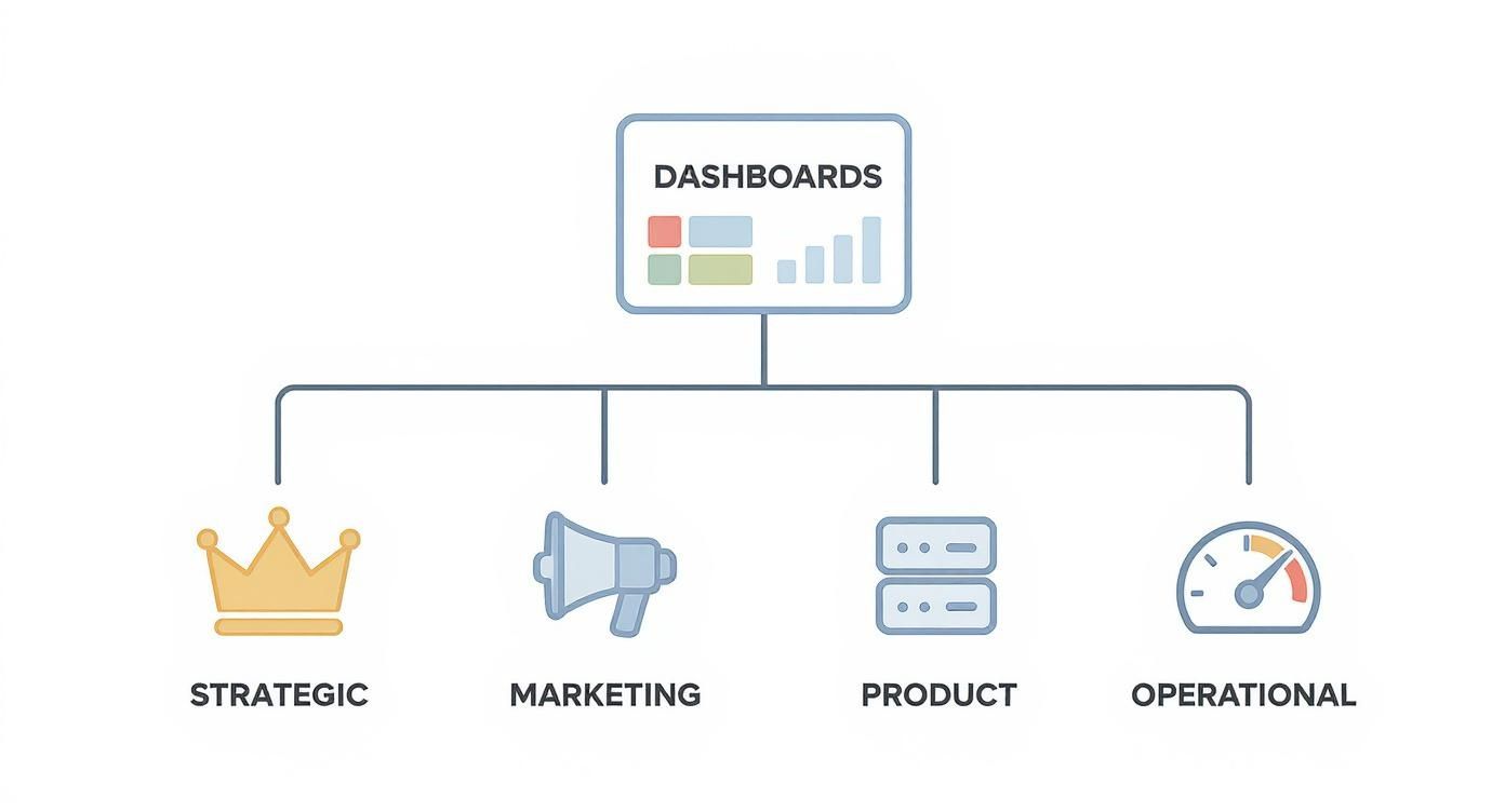
Choosing the Right Dashboard for Your Team
Let's be honest, not all web analytics dashboards are built the same. Trying to make a single, one-size-fits-all dashboard serve every team is like trying to use a screwdriver to hammer a nail—it’s clunky, inefficient, and you'll probably just make a mess. The real trick is to give each team a dashboard tailored to their specific needs, showing them the data that matters for their role without all the extra noise.
Think of your business like a ship. The captain doesn't need to know the real-time oil pressure of the engine; they need to see the ship's heading, speed, and proximity to the destination. The engineering crew, on the other hand, lives and breathes that engine data. Each role requires a different view to do their job well, and the same goes for your business teams.
The Strategic Dashboard For Leadership
The Strategic Dashboard is the 30,000-foot view designed for your C-suite, investors, and top-level managers. It’s all about the big picture and long-term business health, focusing on high-level KPIs that tie directly back to company goals. This dashboard is built to answer one simple question: "Are we on the right track?"
It doesn't get bogged down in daily fluctuations. Instead, it tracks performance over months, quarters, and even years to help leadership make smart calls on market strategy, major investments, and resource allocation.
- Who uses it: CEOs, board members, department heads.
- What it tracks: Customer Lifetime Value (CLV), Customer Acquisition Cost (CAC), revenue growth, and market share.
- Its purpose: To guide long-range planning and inform strategic shifts based on core business trends.
The Marketing Dashboard For Growth Teams
This is the command center for your marketing and growth specialists. The Marketing Dashboard is a daily, sometimes hourly, check on campaign performance and lead generation. It answers the crucial question, "Are our marketing efforts actually paying off?"
This is where you connect the dots between all your channels—social media, paid ads, SEO, and email—to see what's really driving traffic and conversions. It’s absolutely vital for optimizing campaigns on the fly and making sure every dollar of your ad spend is working as hard as it can. Finding the right platform is key, and exploring a range of top-tier site analytics tools can help you build the perfect dashboards for your team.
A great marketing dashboard connects every dollar spent to a measurable outcome, turning creative campaigns into predictable revenue streams.
The Product Dashboard For Development Teams
Built for product managers, UX designers, and engineers, the Product Dashboard zooms in on how people actually use your website or app. It's less about how they got there and more about what they do once they arrive. This dashboard is all about answering, "How are people engaging with our product?"
Here, you'll visualize user journeys, see which features are a hit (and which are a miss), and track user retention over time. By monitoring custom events and user flows, product teams can spot friction points, prioritize their roadmap with confidence, and make improvements backed by real user data.
The Operational Dashboard For Technical Teams
Last but certainly not least, the Operational Dashboard is the real-time health monitor for your technical and IT teams. Its job is to keep an eye on the immediate performance and stability of your digital assets. This dashboard answers the make-or-break question: "Is everything working as it should be right now?"
It streams live data on things like server response times, uptime, error rates, and the number of active users. When something goes wrong, this is the first place the team looks. Setting up automated alerts tied to this dashboard is a game-changer, allowing your team to jump on technical issues before most users even know there's a problem.
Let's break down how these different dashboards stack up against each other.
Comparison of Dashboard Types
| Dashboard Type | Primary Purpose | Audience | Key Metrics | Ideal Use Case |
|---|---|---|---|---|
| Strategic | Track long-term business health and goals | C-Suite, Investors, Department Heads | CLV, CAC, Revenue Growth, Market Share | Quarterly business reviews and annual strategic planning sessions. |
| Marketing | Monitor campaign performance and lead generation | Marketing Managers, SEO Specialists, Ads Experts | Conversion Rate, ROAS, Cost per Lead, Channel Performance | Daily stand-ups and weekly performance meetings to optimize active campaigns. |
| Product | Understand user behavior and feature adoption | Product Managers, UX Designers, Engineers | Feature Adoption Rate, User Retention, Session Duration | Sprint planning and feature validation meetings. |
| Operational | Monitor real-time system health and performance | IT, DevOps, Technical Support | Uptime, Server Response Time, Error Rate, Active Users | Live monitoring in a Network Operations Center (NOC) for incident response. |
Ultimately, matching the right dashboard to the right team is the first step in turning raw data into a powerful tool for growth. Each type serves a unique function, empowering every part of your organization with the specific insights they need to do their best work.
Selecting Metrics That Truly Matter
A cluttered dashboard is a useless dashboard. When you're drowning in a sea of “vanity metrics”—numbers that look impressive but don't actually tell you anything—you lose focus. It's like trying to navigate a ship with a broken compass.
The key to a powerful dashboard is to be selective. Think of yourself as a strategist, carefully choosing the metrics that are directly tied to your most important business goals. Not every number deserves a spot on your dashboard. Only the ones that can trigger a meaningful decision should make the cut.
Differentiating Strategic and Operational Metrics
Not all metrics serve the same purpose. Some give you the 30,000-foot view, while others zoom in on the day-to-day details. It's crucial to understand the difference to build dashboards that serve everyone, from the C-suite to the front-line teams.
Strategic metrics are the big-picture numbers that tell you if the business is heading in the right direction. Think Customer Acquisition Cost (CAC) or Customer Lifetime Value (CLV). These are the KPIs executives track to make long-term budget and strategy decisions.
Operational metrics, on the other hand, are all about the here and now. They track things like page load times, specific button clicks, or API error rates. These are the numbers your product and marketing teams live by to keep the engine running smoothly and optimize user experiences.
The secret is to give each team the specific data they need without overwhelming them. Executives don't need to know about a minor bug, but the engineering team certainly does.
Key Metrics and Their Business Impact
To help you get started, here's a breakdown of some of the most essential metrics. This table explains what they are, why they matter for your business, and how they look in the real world.
| Metric Name | Definition | Business Importance | Example |
|---|---|---|---|
| Conversion Rate | The percentage of visitors who complete a desired action (like a purchase or signup). | Directly measures the effectiveness of your marketing campaigns and website design. | A product page has a 5% conversion rate from visitor to buyer. |
| Customer Lifetime Value (CLV) | The total revenue you can expect from a single customer over their entire relationship with you. | Guides how much you should spend on acquiring new customers and retaining existing ones. | The average CLV for a SaaS subscriber is $1,250 over two years. |
| User Retention Rate | The percentage of users who return to your site or app within a specific timeframe. | A strong indicator of product-market fit and customer satisfaction. | 40% of new users returned to the app within the first month. |
| Session Duration | The average amount of time a user spends on your site during a single visit. | Helps gauge how engaging and relevant your content is to your audience. | The average session duration for blog readers is 4 minutes and 15 seconds. |
Use this table as a reference when you're deciding what to include in your dashboard. Always ask yourself: "Does this number help me make a better decision?" If the answer is no, leave it out.
Focus only on metrics that drive action, not just numbers that look impressive.
This approach ensures your dashboard tells a coherent and valuable story. For a deeper dive into tracking specific user interactions, check out our guide on event tracking to learn how to set up and analyze custom events.
The growing reliance on these visual tools is clear. The web analytics tools market was valued at an estimated USD 4.5 billion in 2023 and is projected to skyrocket to USD 13.2 billion by 2032, growing at a 12.5% CAGR. This massive growth underscores just how critical well-crafted dashboards are for modern businesses. You can find more details in the web analytics tools market findings.
Putting Metrics into Practice
Once you've chosen your metrics, the work isn't over. You need to operationalize them. This means setting up a rhythm for reviewing them and creating systems to alert you when something needs your attention.
Here are a few practical tips:
- Set smart alerts. Don't stare at your dashboard all day. Set thresholds for your key metrics that trigger notifications—via Slack, email, or another tool—when a number suddenly spikes or drops.
- Automate your data. Your dashboard should always have the freshest data. Use API integrations to pull in real-time information automatically. For instance, the Swetrix API lets you programmatically fetch custom event data to keep your widgets up-to-date without any manual work.
- Establish a review cadence. Decide how often different teams will review their dashboards—daily, weekly, or monthly. Consistency is what turns data from a passive report into an active decision-making tool.
By making your metrics a part of your team's regular workflow, you transform your dashboard from a decorative piece of wall art into a genuine engine for growth. Start by auditing your current dashboards. Be ruthless. If a metric doesn't tie directly to a business outcome, get rid of it.
Designing Dashboards People Actually Use

A great web analytics dashboard should feel less like a spreadsheet and more like a well-organized workbench. Everything you need is right where you’d expect it, making insights obvious at a glance. But getting to that point takes thoughtful design.
The secret is a strong visual hierarchy that naturally guides the eye. You want your most important, top-level numbers to jump out first, followed by trend charts that add context, and finally, the detailed tables that allow for deeper digging.
Visual Hierarchy and Layout
Before you even touch a dashboard builder, grab a piece of paper (or a digital whiteboard) and sketch out a simple grid. Think of it like a newspaper's front page—you're deciding what's "above the fold" and what can sit further down.
Use that grid to map out your widgets in a logical flow. A classic, effective approach is to put your big-picture KPIs, like total sessions and conversion rate, right at the top. From there, the eye naturally drifts downwards, which is the perfect spot for trend charts.
A good rule of thumb for organizing your layout:
- Top Left: This is prime real estate. Put your most critical metric here for immediate visibility.
- Middle: This area is ideal for line or bar charts that show performance over time.
- Bottom: Reserve this space for detailed tables, lists, or filters that people can use to explore the data.
A clear structure isn’t just about looking good; it reduces cognitive load and helps your team get from data to decision faster.
Choosing the Right Charts
Not all charts are created equal. Picking the right visualization for your data is what transforms a pile of numbers into a clear story. Line charts are fantastic for tracking changes over time, bar charts are perfect for comparing different categories, and pie charts work well for simple breakdowns.
Here's a quick cheat sheet:
| Chart Type | Best Use | Example |
|---|---|---|
| Line | Trends Over Time | Daily Active Users |
| Bar | Category Comparison | Traffic Sources |
| Pie | Proportional Breakdown | Device Type Share |
Color Usage Without Confusion
Color can be your best friend or your worst enemy. Used well, it highlights what's important. Used poorly, it just creates noise. I always recommend sticking to a limited color palette—maybe 3 accent colors against a neutral background.
A few tips to keep in mind:
- Use intuitive colors like green for positive trends and red for alerts or negative changes.
- Always check your color contrast to make sure everything is readable for all users, including those with visual impairments.
- If you have a lot of categories, consider using patterns or icons alongside colors to avoid confusion.
Remember, 73% of users are just skimming their dashboards. They rely on those clear color signals to tell them what needs attention.
Privacy-First Dashboard Design
In a world of GDPR and growing user awareness, privacy isn't an afterthought—it's a core design principle. Building trust starts with protecting user data, and your dashboard is a direct reflection of that commitment.
The key is to aggregate or anonymize any Personally Identifiable Information (PII) before it ever hits a widget.
- Set thresholds for segments and show rollups for smaller groups to avoid singling out individuals.
- Make sure each widget clearly labels its data sources and the consent status behind it.
- Implement privacy filters that automatically hide metrics for groups that are too small to be anonymized.
Tools like Swetrix are built with this in mind, handling consent and secure data storage by default so your dashboards stay compliant right out of the box.
Spacing and Typography
Good design is often invisible. Proper spacing, or whitespace, is one of those things you don't notice until it's wrong. It gives your metrics room to breathe and prevents the dashboard from feeling cluttered and overwhelming. Be consistent with your margins and the padding around your panels.
Typography is just as important.
- Pick a clean, sans-serif font for maximum clarity on screens.
- Establish a clear hierarchy for font sizes—headings should be largest, followed by subheadings, and then body text.
- Use bold text sparingly. It's for making your most critical numbers pop, not for decorating paragraphs.
When you nail the fundamentals—hierarchy, charts, color, privacy, and typography—you create a dashboard that feels intuitive and actionable. It becomes a tool people actually want to use to make better decisions.
Putting Your Dashboard into Action
Designing a beautiful dashboard is just the first step. The real magic happens when you connect it to live data and turn it into a dynamic tool your team actually uses. A dashboard is only as good as the information flowing into it, and making that happen means getting your hands dirty with integrations, APIs, and a bit of automation.
Think of it like building a custom car. You’ve designed the chassis and picked out the perfect gauges for the instrument panel. Now, you have to actually connect the engine, fuel lines, and sensors so those gauges give you real-time feedback. Without that, you just have a pretty shell.
This is where modern analytics platforms shine. Cloud-based tools have become the industry standard for a reason—they're built for connectivity. In 2024, these platforms grabbed a whopping 78.23% of the web analytics market and are growing at a blistering CAGR of 16.37%. You can read the full web analytics market research to see just how fast this space is moving.
Connecting Your Data Sources
First things first: you need to hook up your data streams. For most of us, this means pulling data directly from our analytics provider. Platforms like Swetrix make this surprisingly simple with native integrations and a robust API.
Using an API, you can pull core metrics directly into a custom dashboard you build yourself. This gives you total freedom to mix and match your web analytics data with information from other tools, like your CRM or sales platform, creating a truly unified view of your business.
Here are the essential connections you'll want to make:
- Website Traffic Data: This is your foundation—sessions, page views, and user counts.
- Custom Events: You need to track the actions that matter, like button clicks, form submissions, or video plays.
- Performance Metrics: Don't forget real-user metrics like page load times and Core Web Vitals.
- Error Logs: Streaming in-browser errors helps you catch technical glitches the moment they happen.
When you centralize these feeds, your dashboard becomes the single source of truth. No more jumping between five different tabs to figure out what's going on.
Building Your First Dashboard: A Step-By-Step Guide
Once data is flowing, it's time to start arranging your widgets. Let’s walk through a quick example of setting up a marketing performance dashboard in a tool like Swetrix.
- Start with the Big Picture: Place your most important KPIs right at the top. Think Total Visitors, Bounce Rate, and Average Session Duration. These give you an instant at-a-glance health check.
- Show the Trends: Underneath the KPIs, add line charts that show how these metrics have changed over time. A 30-day view is a great default for spotting recent patterns. Are things trending up or down?
- Break Down Your Traffic: Add a bar chart or table to show where your visitors are coming from—Organic Search, Social, Referral, Direct, etc. This is critical for knowing which marketing channels are actually working.
- Highlight Top Content: Include a table listing your most popular pages by page views. This tells you what content is hitting the mark with your audience and where you should double down.
- Track Your Goals: If you’re tracking conversions like newsletter sign-ups, add a dedicated widget to display that count. This ties your analytics directly to real business outcomes.
Here's an example of what a simple, clean layout might look like.
This layout gets right to the point. Key metrics are on the left for a quick read, while the trend graph on the right provides immediate context.
Automating Insights with Alerts and Reports
Let’s be honest—a dashboard you have to remember to check every day is a dashboard that will eventually be forgotten. To make it a core part of your workflow, you have to bring the insights to your team.
An automated alert transforms your dashboard from a passive reporting tool into an active monitoring system that works for you 24/7.
Set up alerts that notify you when something important happens. For instance, you could create a rule that sends a Slack message if your bounce rate suddenly spikes by 20% or if a key landing page sees a 50% drop in traffic. These notifications empower your team to react immediately to problems and opportunities.
You should also schedule automated email reports. A weekly performance summary sent to all key stakeholders every Monday morning keeps everyone in the loop without them having to log in. It’s a simple way to make data a regular part of the conversation.
So, What's Next? Putting Your Data to Work
We've covered a lot of ground, from the different types of dashboards to the nitty-gritty of design and metrics. Now it's time to pull it all together and turn those concepts into a powerful tool that drives real-world decisions. Remember, a great dashboard isn't just a collection of charts; it's a clear, focused story about what's happening on your website.
A Simple 5-Step Plan to Get Started
Think of this as your launch checklist. It’s a straightforward way to move from theory to a functional, valuable dashboard.
- Know Your Audience: First, decide who this is for. Are you building an overview for the whole team, a marketing dashboard for your campaign manager, a product dashboard for the dev team, or a high-level executive summary? The answer dictates everything that follows.
- Choose Your "North Star" Metrics: Don't drown in data. Pick just 3–5 core KPIs that truly matter for your goals. This could be conversion rate, session duration, or user retention—anything that tells you if you're winning.
- Sketch It Out: Grab a pen and paper (or a whiteboard). Seriously. Before you touch any software, sketch a rough layout. This helps you think through the visual hierarchy and decide which charts will tell your story most effectively.
- Hook Up Your Data & Set Up Alerts: Connect your data sources using an API or a built-in integration. The real magic happens when you automate real-time alerts to notify you of significant spikes or dips, so you're always ahead of the curve.
- Review and Refine: A dashboard is a living document, not a one-and-done project. Schedule regular check-ins to make sure it's still relevant and helping your team make smart choices. Tweak as needed.
Once you’ve got a handle on the basics, you can always go deeper.
Where to Learn More
If you're ready to level up your skills, these resources are fantastic places to continue your journey:
- Swetrix Documentation: Dive into our official guides for detailed setup instructions and API examples.
- Dashboard Design Handbook: A great read for anyone who wants to master layout patterns and the psychology of color in data visualization.
- Web Analytics Blog Posts: Nothing beats learning from others. Find case studies and practical tips from people who have been in the trenches.
The goal isn't just to see the data, but to find the actionable insights hiding within it. Keep iterating, keep asking questions, and keep improving.
Following this path will help you create dashboards that do more than just report numbers—they'll empower every person on your team to make confident, data-backed decisions without delay.
Now it's your turn to build something great.
Ready to build your first dashboard? Try Swetrix with a 14-day free trial and see what you can discover.